


Day 3 of Dashboard Week brought a serious curveball... Power BI! Our task of the day was to replicate a high quality business dashboard originally built in Tableau in Power BI, making it look and function exactly the same as the original. We had the option to choose among three different dashboards published on Tableau Public by Ellen Blackburn, from which I chose her "Broker Portfolio Redesign". I have attached a picture of the original below, with a bit of annotation to represent the interactivity:
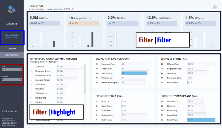
As you can see above, my first task of the day was trying to get a strong understanding of the workings behind the dashboard, both in terms of aesthetics, functionality, and interactivity. I identified places where filter actions applied, where highlight actions applied, and text that was made to be dynamic based on filter selections.
Next was the data collection process, which was a bit circuitous! It went as follows:
- I downloaded the original workbook from Tableau Public
- I renamed the .twbx file as a .zip to extract the packaged elements from it
- I opened the new zip and redownloaded the underlying data as a .hyper file
- Power BI cannot recognize .hyper files, so I opened the above file in Tableau desktop, and extracted the data as a .csv
- Last, I loaded that .csv into Power BI and was ready to build!
The main realization of the day was the (near) impossibility of exact transfer from Tableau to Power BI. Although strong in their own ways, some things are fundamentally different, such as container logic in Tableau or a lack of string parameters or table highlight actions in Power BI. Instead of banging my head against that too much, I called it a day on my Power BI product around 12:00 pm and focused on advocating the situation to stakeholders. I put together a presentation where I described "the easy, the hard, and the incompatible" of Tableau to Power BI migration, which is essentially what I described above. The goal of stakeholder support is to guide towards more efficient insights, so I put a lot of thought into conveying that message (and conveying the impossibility of perfect replication).
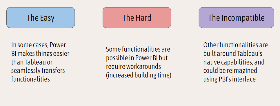
Under "the easy", I listed formatting (Power BI's drag and drop is very efficient), field selection (which is very similar across the softwares), and filtering (which uses the same classic filter logo that appears upon clicking a chart in a dashboard in both softwares).
Under "the hard", I noted the difference in table calculations. In Tableau, a rank calculation, which is a table calculation, often looks as simple as RANK(Sum(Sales)), with a bit of extra configuration as to how that rank is computed. Power BI does not have native table calculations in the same way, so I calculated a rank using a couple of its foundational functions:

I also identified customizable KPI labelling as a "hard" part of the migration, since Tableau allows for custom text where the field value can be slotted in, but Power BI needs a calculated field to achieve that same goal.
Then there's what I named the "incompatible" parts of the migration. It turns out that in order to have multiple columns to the left of the bars in a bar chart, a table is required. Unfortunately, highlight actions cannot apply to tables in Power BI, so the original functionality of preserving the rank, name, and bars, with highlighting, was impossible to reproduce exactly in Power BI.
Faced with this situation, I decided to go back to basics and try to understand what the original purpose of that highlight action was. As I understand it, the highlight sought to understand the relative ranking and specific performances of a chosen broker across categories. With a filter action, the exact same thing is achieved – we get their rankings and performances across the metrics, only losing the context of the brokers similar to them (which was nonessential to the analysis). The bottom line of the day for me is that when perfect replication proves impossible or needlessly cumbersome, it is good to return to the motivations behind the first dashboard in order to make this second "replica" dashboard a useful product.
I am looking forward to one more day of Dashboard Week before I officially complete training!