


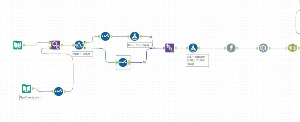
The penultimate day of dashboard week had DS12 looking at drought data in the US since the year 2000. Find my viz here. As has been a common theme this week, the data had to be obtained from an API call to the United States Drought Monitor. There were a range of parameters you could call from the API, such as land coverage and % land coverage. This could also be obtained on a national level, a state level or even a county level. I decided to go for a county level, as this was the lowest level of granularity. This returned A LOT of data, as it was bringing back data for every US county, for every week in the last 19 years. In the end the Alteryx workflow took a mere 15 minutes to run, but I got there in the end.
To call a given county, I had to use it’s five digit FIPS code in the API endpoint. Kindly Brian sent me a CSV he had of all of these codes, so I appended these my URL and then used a replace function to build them into the individual URLs. As I mentioned, there was a lot of data, during the workflow the file got up to a massive 45 GB in size, I was fearing for my laptop’s health. However, after a bit of prep and clean up the data was ready to go, with just the 6 million rows compared to the 80 million or so I had earlier in the workflow.
As Andy had touched on in his blog, I thought it would be good to pull in some additional data to investigate whether climate change was having an effect on drought conditions in the US. I found some indicators from the world data bank, for all the countries in the world. This contained data about greenhouse gas emissions and CO2 emissions, which are recognised indicators of climate change. I downloaded this data, cleaned it up in Alteryx and got to work in Tableau.
I wasn’t sure which path to go down with all of the data I had. I decided to focus on 2018 in particular, as I noticed large amounts of news reports that highlighted this as being a particularly bad year for droughts. I wanted to look at whether this was true, and whether climate change was having an effect on this.
I used separate density maps to highlight the different severities of drought on a county level. I then used sparklines to highlight the changes in greenhouse gas levels in the US, unfortunately my data only ran up to 2014, but I couldn’t find a better data set in the time given. Finally I used some line charts to highlight the change in the different levels of drought over time, and how different they were from the first year in the data.
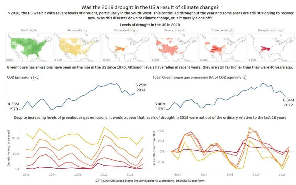
I didn’t quite get the desired outcome from the story I was trying to tell but sometimes that is the story! Drought levels in 2018 weren’t particularly different to other years gone by.
Final day tomorrow under much tighter time conditions… we’ll see how that goes.