Every Data School member has a soft spot for their first Tableau dashboard. Not only did we get a job through it, but it's a great reminder of the progress that we've made. With that in mind, DS37 were tasked with improving on their first viz now that we've started our training.
In my case, this meant returning to the squirrel survey of New York's central park (circa October 2018). Here is the interview-ready version of my dashboard, and although I'm very proud of it, there are improvements to be made. The key takeaway I was given during the interview was that I showed the data, but there was no story for the audience to read.
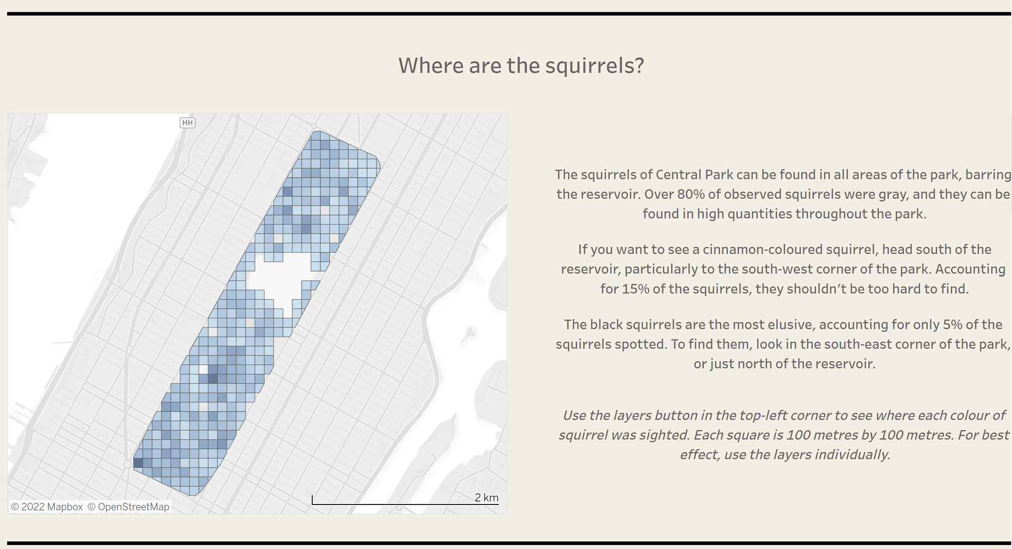
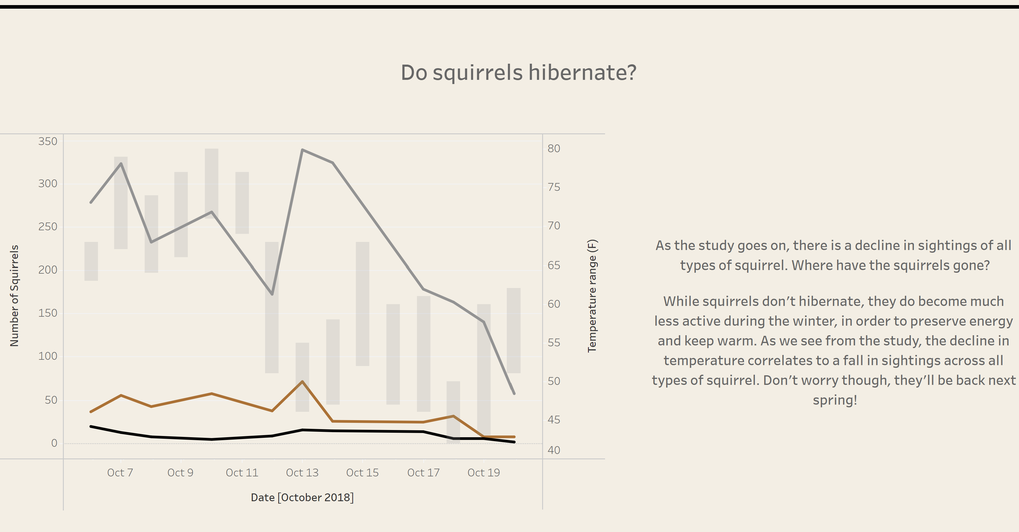
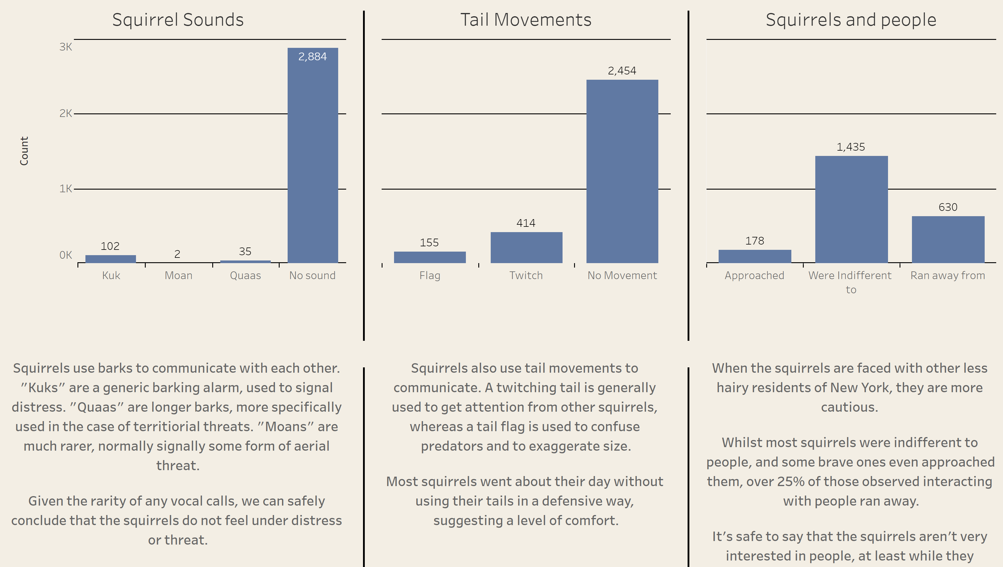
The charts had real insight. The map in particular was a point of pride, as I worked through the night to learn which parts of Alteryx which grouped individual squirrel sightings into a grid. The line graph was also a solid start, clearly showing declining squirrel sightings as the temperature dropped in New York. Even the bar charts were a good starting point for building an informative viz.
However, I had missed some crucial points. Data viz is foremost the practice of communicating complicated patterns in an accessible way. The rapid growth in software like Tableau is largely due to the human brain's inability to process large tables of numbers, or paragraphs of text. I had some good ideas, but I was writing about them rather than showing them. I even talked through some insights, which is great for a presentation, but really limits the usefulness of my dashboard to anyone I couldn't present to.
I also failed to tell a story. Some people just love looking at interesting charts and maps, but the best dashboards bring together complementary visualisations which demonstrate more about the underlying data together than separately. It's never simple, but doing it successfully can be the difference between a good dashboard and a great dashboard.
So, lets try and make this better. What story do we want to tell? From building the dashboard before, I know that different types of squirrels behave very differently. In particular, the colour of squirrels (a shorthand of species), provides some really interesting contrasts. Knowing this, it makes sense for squirrel colour to be a core feature of the dashboard. Using the BANs as filters, so the user can isolate each type of squirrel, should really help to focus the user on how distinct these groups are.
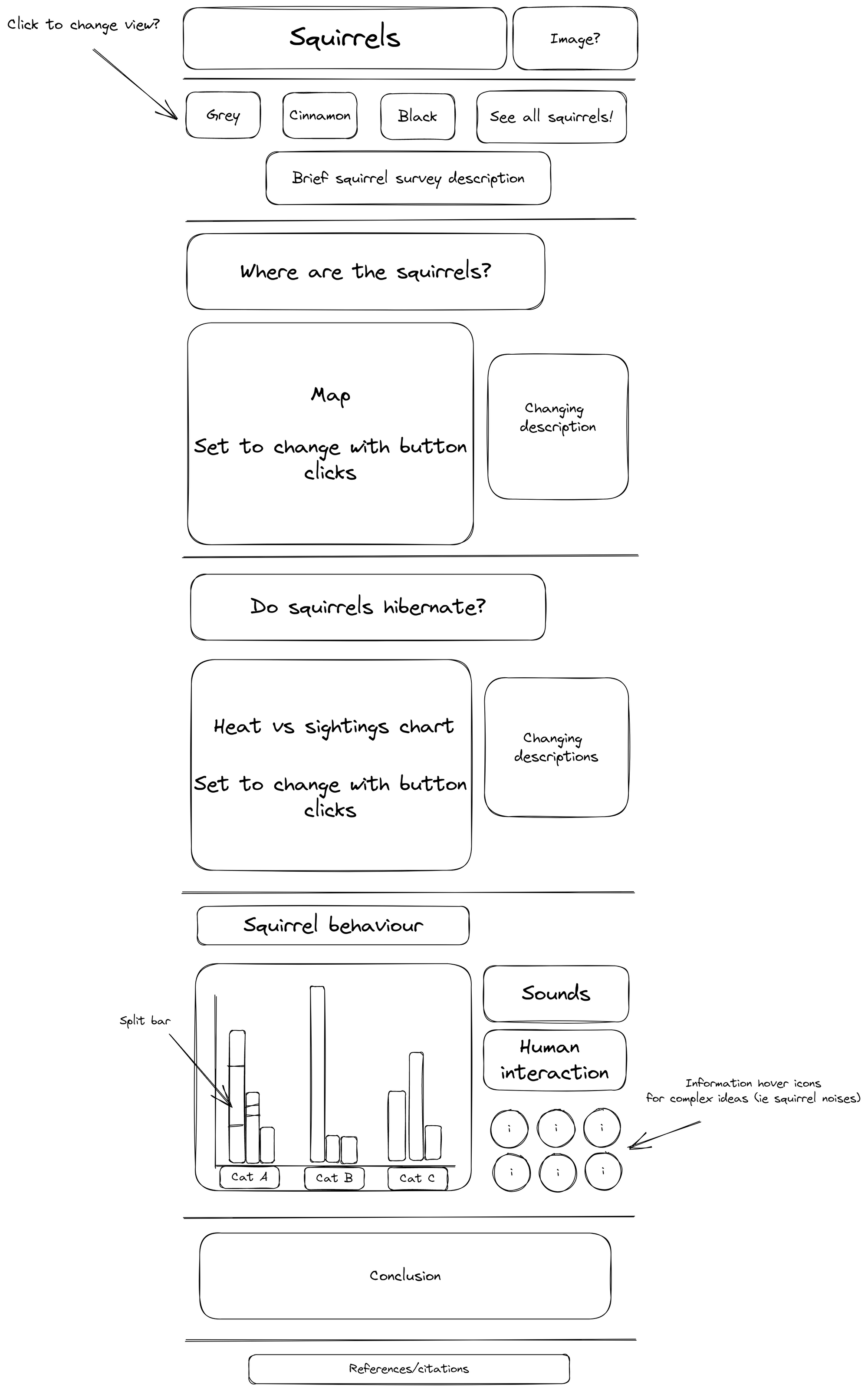
This feature required major adjustments to the map and line graph, and a carefully build set of parameters and calculated fields to ensure that the maps responded to the user interaction correctly. The bar charts were just too messy to be useful in their current form, so it would be prudent to add buttons to only show one set of information at a time.
Additionally, limiting the text on screen at any one time is a top priority. Although squirrel calls are a fascinating area of study, not every user will care about the subtle difference between squirrel calls. To this end, information buttons can be used, allowing the devoted user to get the full background while the casual user is left unburdened by the minutiae of squirrel-based behavioral science. The text besides the line chart and map can also be filtered, to ensure pertinent information is always available to the user.
So, how much have I applied? Thus far I've only had a few hours to make progress, but I have successfully built the filters for both the line graph and map, utilising the BANs as buttons to allow intuitive changes to the respective visualisations. This also changes the text next to the map to reflect the squirrel colour (or a lack of choice) and work is in the pipeline for the same next to the line graph.
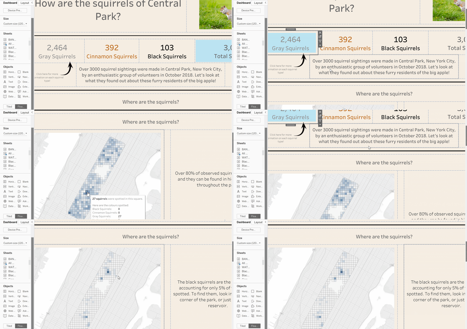
I have only just begun implementing this solution, and there is plenty to do, but you can see my progress here. I intend to keep improving, so check back in for more!
