


On day 3 of dashboard week, we were offered the challenge of examining some basketball data utilising PowerBI. We were required to bring in a minimum of 20 tables, ideally through multiple URLs, and to build dashboards to reflect our findings.
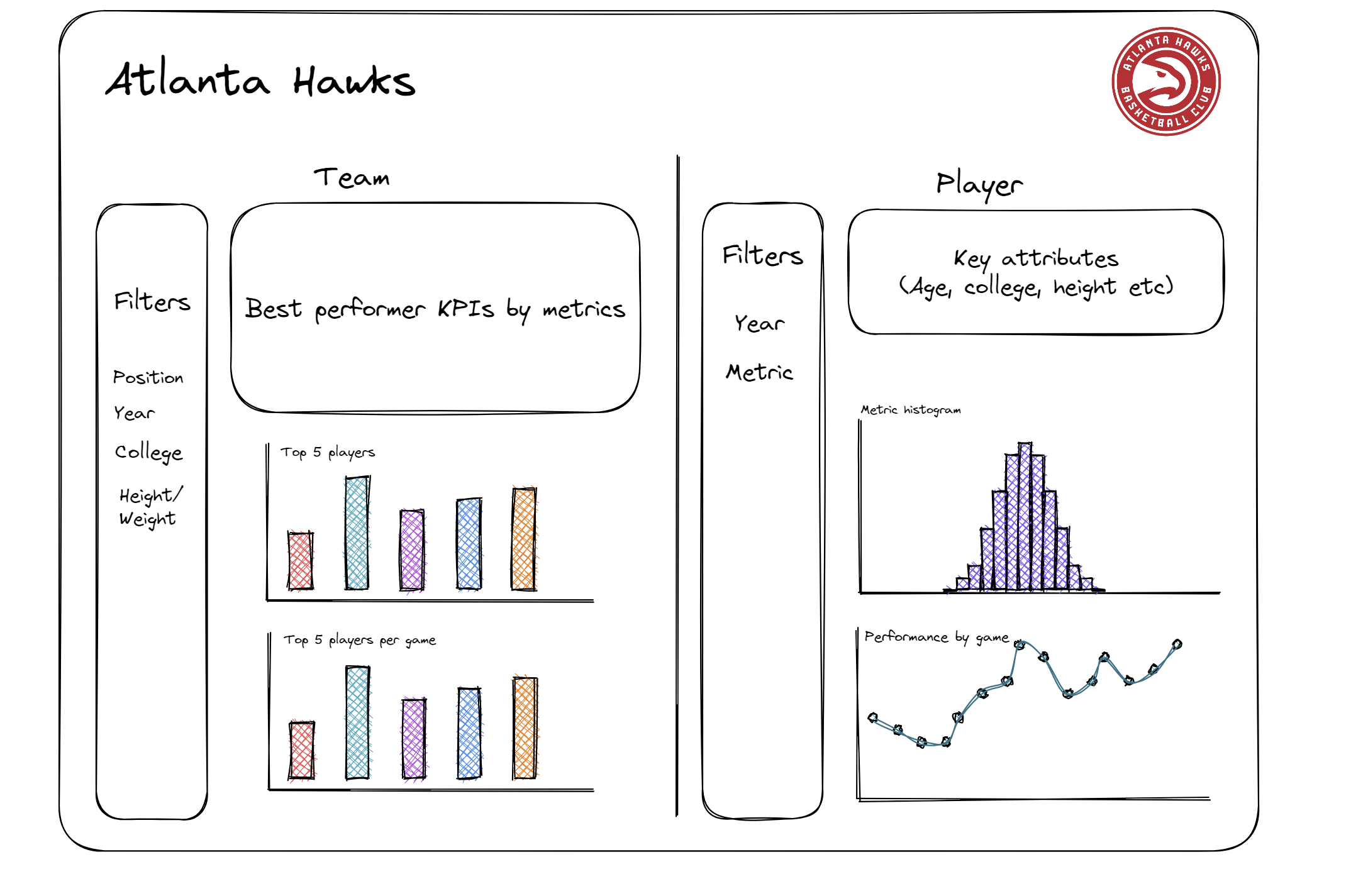
My original idea was to look at the makeup of the team over time, alongside the ability to examine how individual players had performed in the team. Although there are many different metrics, a core focus on the points scored and the number of appearances felt the simplest to interpret.
With this in mind, I worked on importing the data I would need. I was fortunate to quickly determine that there was a method on importing the same table from multiple URLs, and with a huge amount of help from some very helpful guides (HT: https://www.youtube.com/watch?v=s_5Jk8_fHjA) I was able to get data from 33 years for the Atlanta Falcons into PowerQuery. However, PowerQuery repeatedly cited errors with reading the data into PowerBI, relating to the way data types had been recorded in the input. Converting all fields to text types in the advanced editor resolved the issue.
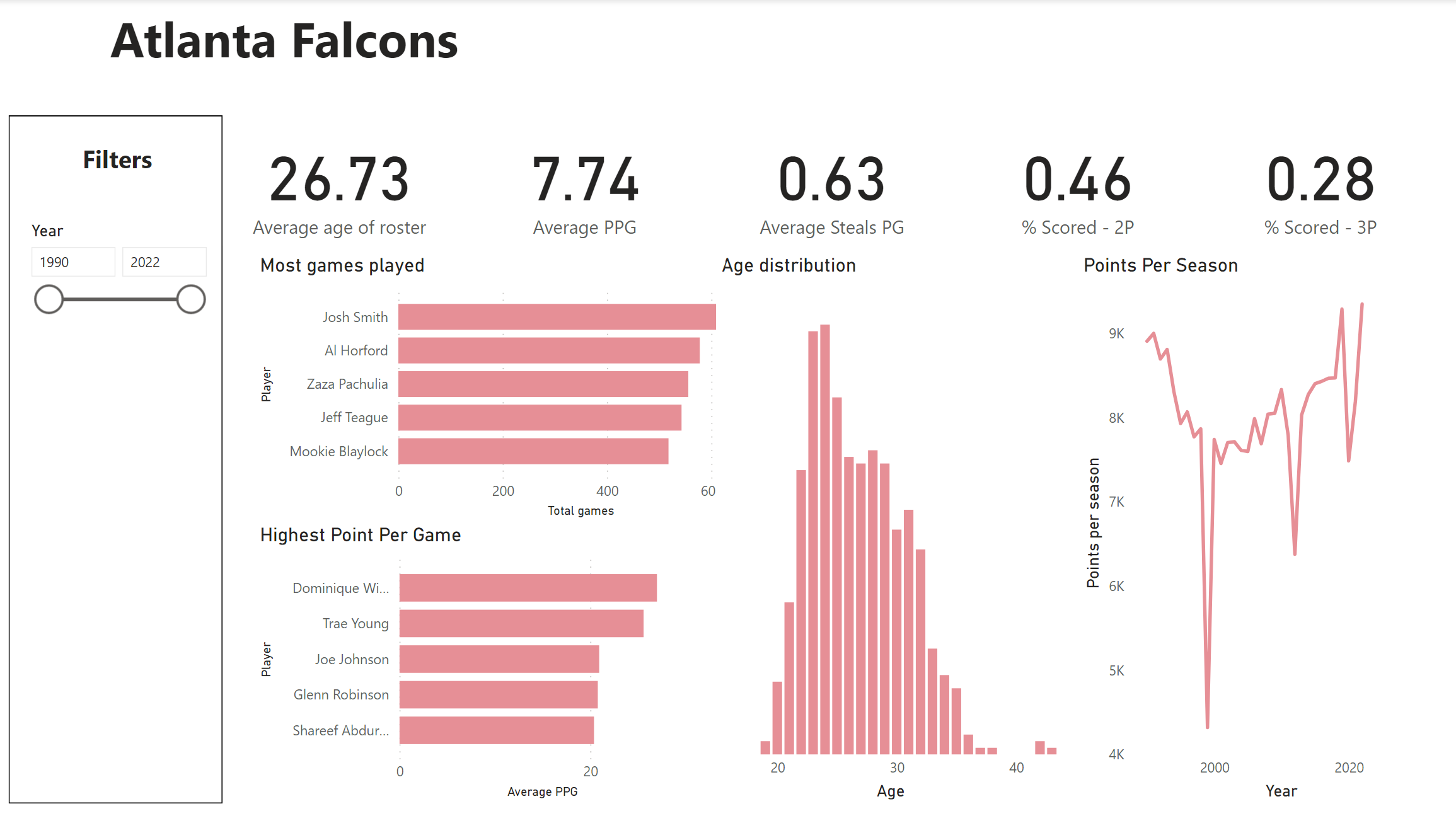
Once that was completed, it was time to dashboard. I decided to split the dashboards in two, reflecting the team as a whole and individual players' careers at the Hawks. The team dashboard was filterable through all 32 years of data scrapped from the website, as well as team average statistics during the period. My initial plan, to incorporate choices about which metrics were included in each chart, will have to wait for another day.
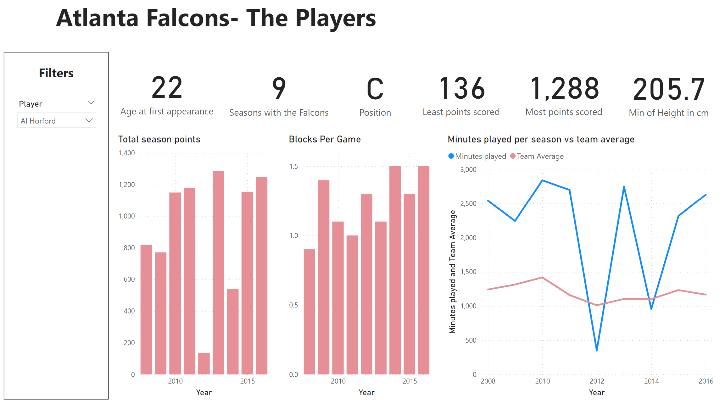
For the player dashboard, the focus was more player-centric statistics, such as the age they signed for the Falcons, their position and their height. I also brought in a comparison with the rest of the team, in terms of minutes played, which demonstrates the relative performance of a player in respect of their team.
In all, this has been a project to stretch my ambition. I'm delighted to have figured out the web scraping features of PowerBI, but I found myself wishing I knew more visualisation techniques. It's emphasised to me the ease of the use of certain tableau features regarding user interaction, but also renewed my resolve to persevere with PowerBI as I found myself grateful for it's considered structure.