To kick off dashboard week, on Day 1, we were tasked with developing our data preparation skills using SQL in Snowflake and creating insightful reports using Power BI. We were required to query datasets surrounding Lego parts and choose a subsample from the full data set available as well as join and prepare the data in Snowflake.
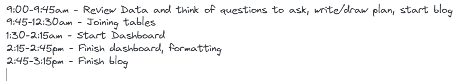
As this was the first day, I thought planning was going to key so I created a plan for the day as follows:
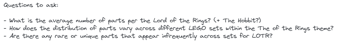
I started the day by briefly reviewing the data available to see what kind of data was available and how it would join together, then designing a plan with what questions I could ask. I decided on choosing a particular Lego theme, in this case, The Lord of the Rings and The Hobbit Lego Series as its a firm favorite on mine in the fantasy genre. I decided to look at the distribution of the types of Lego Parts used for each Lego Sets with the following questions:
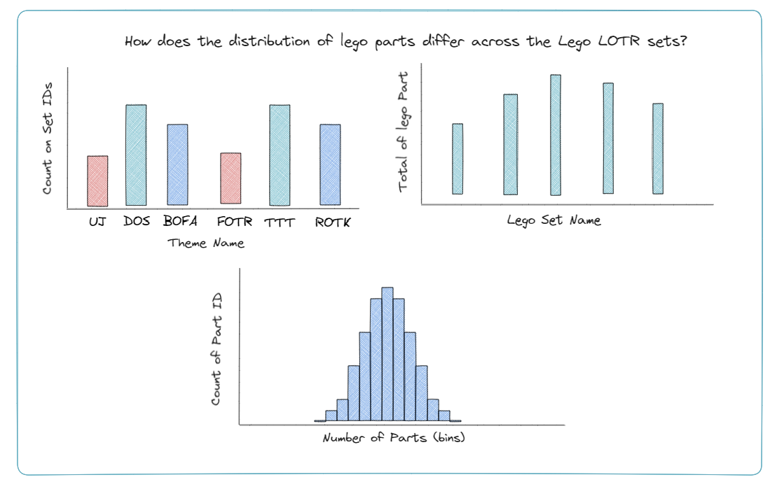
I then created a sketch to see how I could answer these questions and a sketch of how I expected the data to look in the table.
I then got to work attempting to join the data, which I struggled with. Although, I had previously done some basic SQL before, its not my strongest suit so it provided a good challenge. I attempted to join five different tables and I was expecting my data to be duplicated a lot but I was actually getting only 9 rows coming through. After seeking help from Robbin and examining the datasets I wasn't planning to use, I found another table that I used to join which gave me roughly the number of rows I was expecting.
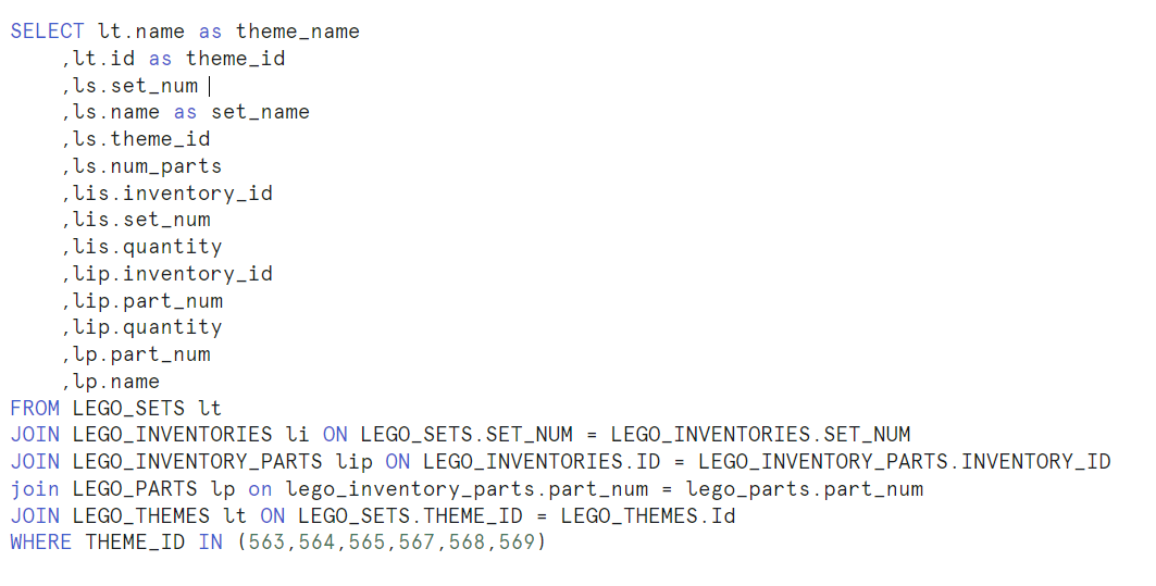
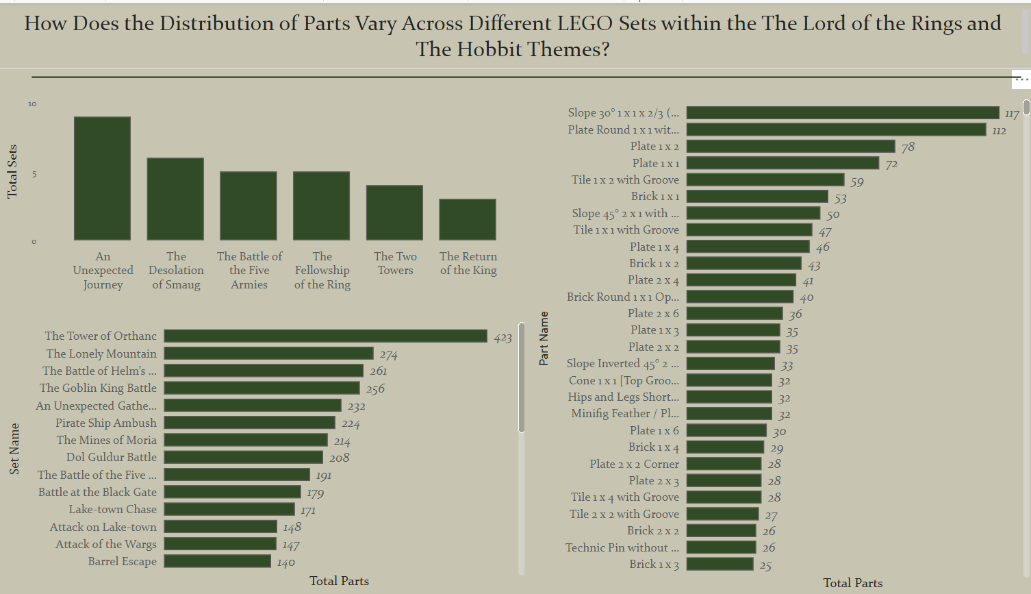
I then began creating my report, which was relatively easy once I had the data. At first I thought to only concentrate on the Lord of the Rings Trilogy Lego Sets but, then I added in The Hobbit trilogy to see if there were any major differences between the two trilogy sets. I also wanted to add in a histogram
Despite the many datasets, there were mainly ID fields rather than data I found particularly helpful to provide insights. Another issue I had was that I wanted to add a histogram depicting the distribution of parts used for each set but I found that creating bins was more difficult in Power BI than I anticipated so had to make this as a bar chart instead showing the most used parts within each set.
My final dashboard is presented below. I did want to add an image but unfortunately the images I found were too large for Power BI to handle.