


Here is a quick blog on 4 ways to show change over time using Superstore data! Hopefully this will be helpful for anyone to look at the DAX I've used here and replace any fields with their own.
(1) Sales by Month and Year on legend
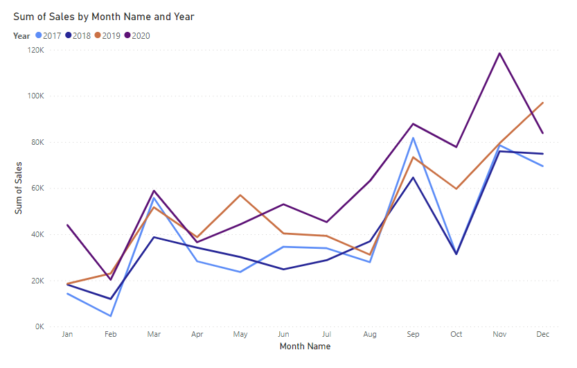
This is the most straight-forward of the list as no additional work needs to be done. All you need is the following:
X-Axis - Month
Y-Axis - Sum (Sales)
Legend - Year
(2) Running Total of Sales by Month Year
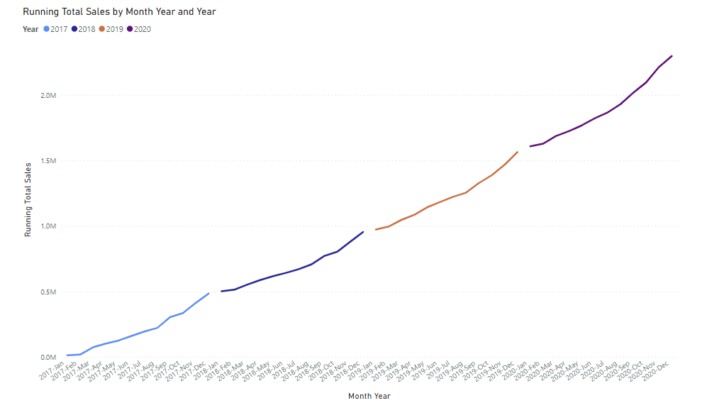
This graph (along with the rest) requires a date table - if you're unsure about creating one, I've made a blog post on it which you can view here. This one requires a calculated field as follows that you can copy/paste:
Running Total Sales = CALCULATE( SUM(Orders[Sales]) , REMOVEFILTERS() , Orders[Order Date]<= MAX(Orders[Order Date] ))
X-Axis - Month Year (from the date table)
Y-Axis - Running Total Sales
Legend - Year
(3) Running Total of Sales by Month and Year
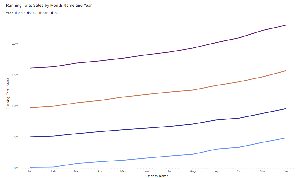
This one is identical to the graph above, but instead of Month Year on the X-Axis, we now have Month Name (or just Month) instead.
(4) Running Total Sales from 0 by Month
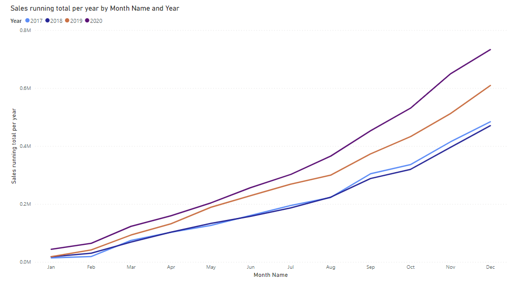
This graph requires another calculated field as follows:
Sales running total per year = CALCULATE( SUM('Orders'[Sales]), FILTER( CALCULATETABLE(SUMMARIZE('_date', '_date'[Month], '_date'[Month Name]), ALLSELECTED('_date') ), ISONORAFTER( '_date'[Month], MAX('_date'[Month]), DESC, '_date'[Month Name], MAX('_date'[Month Name]), DESC ) ))
Following this we need:
X-Axis - Month
Y-Axis - Sales running total per year
Legend - Year
I hope this helps!