


After successfully working with the Sankey diagram template in a previous customer project, I wanted to try the next template because I thought the chord diagram looks very nice and fits very well with my use case of showing transit passengers at an airport moving from one gate to another.
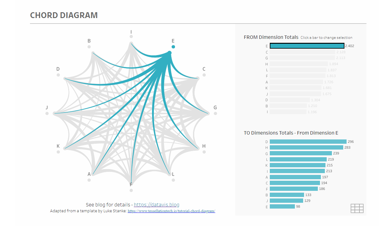
Two templates of the chord diagram dominate on Tableau Public, this one by Mark Reid, which is also very well explained by Ruth Amarteifio (TIL UK).
The other one, which is much more clicked on, is the one by Noah Salvaterra, which you can see here:
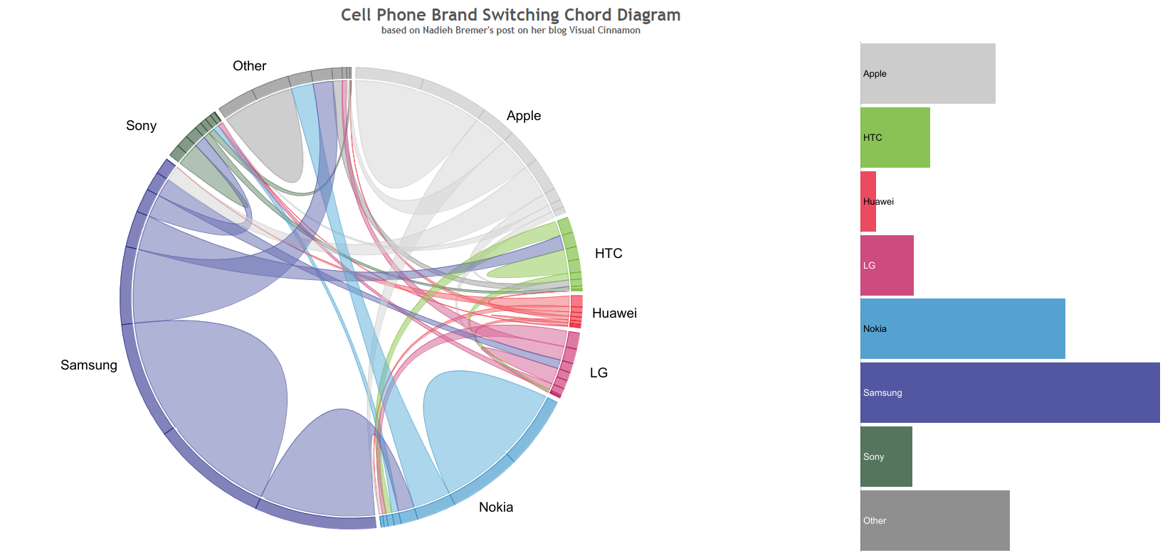
From a design point of view, I liked the second variant a bit better, so I chose it. In the end, I would have had the same problems with the first variant anyway.
It takes a bit to prepare the data, but it works quite well with Tableau Prep and in the end the data has to be in this form, with all columns named exactly the same.
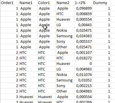
My big problem at the end was that each flow (e.g. from Apple to Samsung) can only have one number in the "1->2%" field. If you have more rows, you have to aggregate them in the prep workflow, otherwise the numbers won't be right in the end.
In my use case, I wanted the chart to be able to change by a time range, incoming airlines, and outgoing airlines, but since I was only allowed to have one row for each flow, I had to aggregate those fields, which of course caused them to be lost.
Another problem is performance in the dashboard. The template joins the dataset to itself to get all the flows, but this multiplies the rows tremendously. I initially used a dataset with about 200,000 rows, and just by replacing the existing tables in the data source, this self-join generated almost 1 billion rows. At the time, I didn't know that all rows needed to be aggregated and waited in vain for a chart.
The bottom line is that you can use this chart if you don't need filters or interactive elements in your dashboard, because I think it still looks pretty impressive, but without interactivity, the chord chart gives away Tableau's greatest potential and therefore has limited use cases.
You can see my final result with mock data here on Tableau Public: https://public.tableau.com/app/profile/heinrich.preu./viz/ChordChartAirport/AirportChordChartDashboard