


I've always been interested in renewable energy and the role it can play in creating a more sustainable future. As countries look for ways to reduce their reliance on fossil fuels, I find it interesting to explore how the use of renewable energy differs across different parts of the world.
For this project, I wanted to focus on Africa and explore the share of modern renewables in final energy consumption across different countries. Using data from the International Energy Agency (IEA), I found a relatively simple dataset: one value for each country showing its share of modern renewables in 2022.
Although the dataset itself was straightforward, looking alone at a table of country codes and percentages doesn't immediately tell much of a story. I wanted to turn it into something that made it easier to answer questions such as:
Which countries have the highest shares?
Where are they located?
And how does an individual country compare with the African average?
This was my starting point: a small table containing just 35 countries and their respective percentages.
Table to Visualisation
The data was already clean and easy to understand, but that simplicity presented an interesting challenge. Finding the highest value meant scanning through the rows, comparing two countries meant moving back and forth between percentages, and there was no geographical context at all.
Making Comparison Easier
The first thing I wanted to make clearer was the ranking. Turning the table into a ranked bar chart immediately changed how the data could be read.
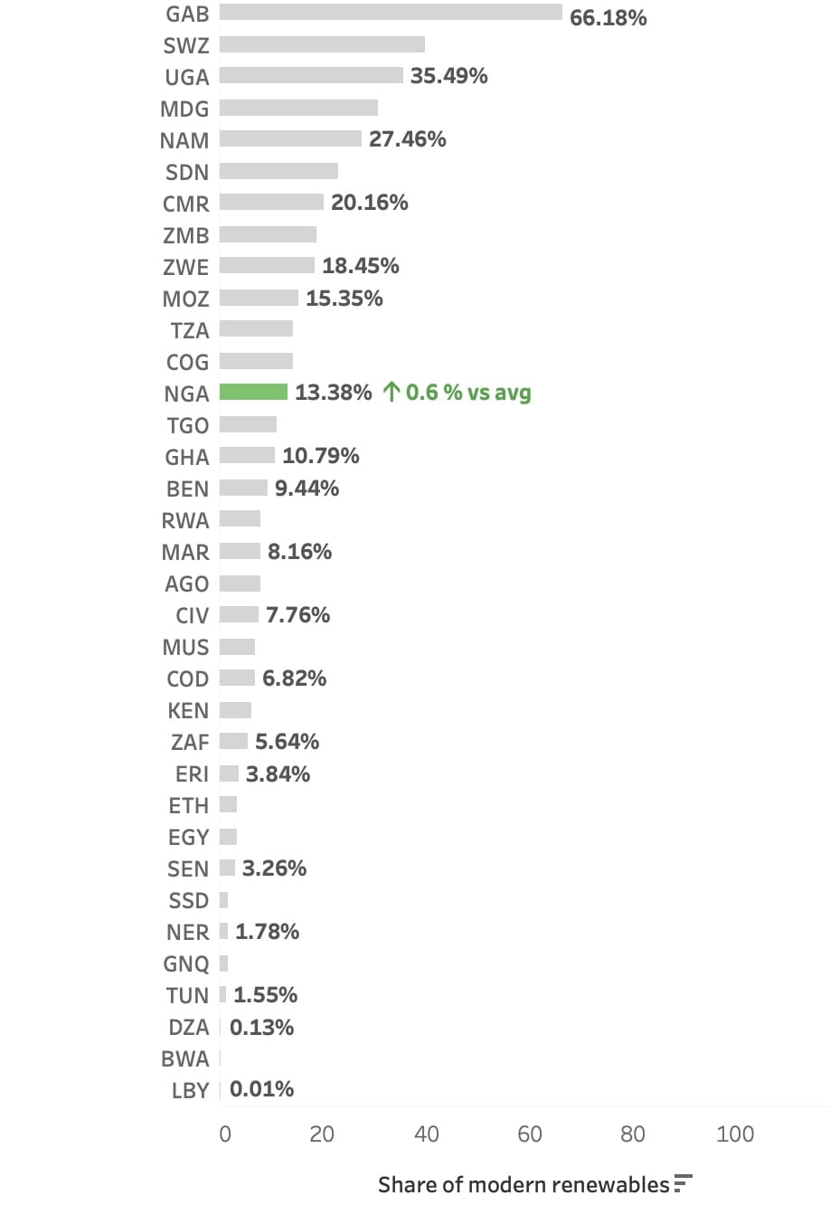
Gabon immediately stood out with the highest share of modern renewables at 66.8%, followed by Eswatini and Uganda. At the opposite end of the chart, several countries countries had shares of less than 2%. What I liked about the bar chart was that it kept the simplicity of the original dataset, only presenting the same values in a way that comparison was easier.
Bringing geography into the picture
Since the data focused entirely on Africa, adding a map felt like a natural way to give the numbers some geographical context.
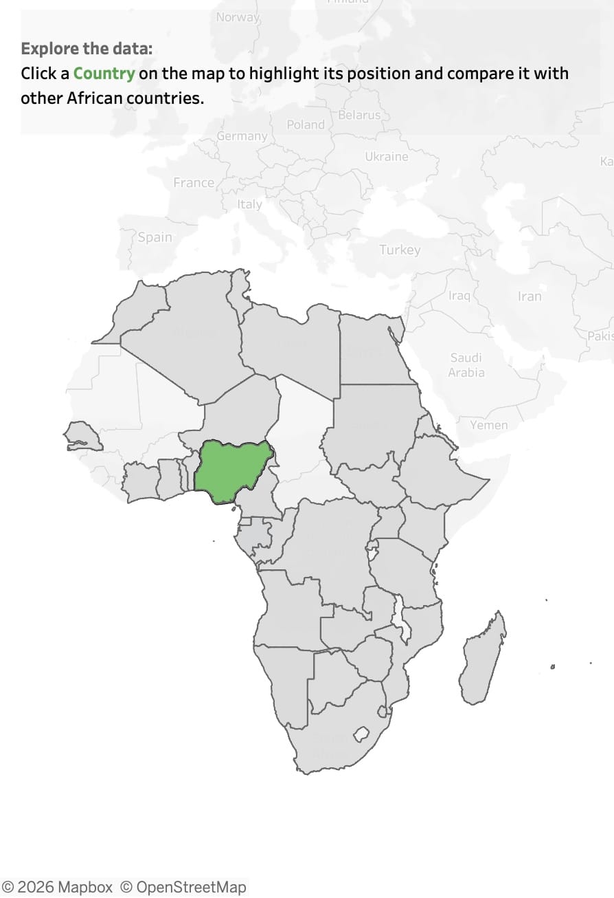
Using a map, gave me the opportunity to make the dashboard more interactive. Instead of expecting someone to search for a country in a long list, I wanted them to be able to explore the map and select whichever country interested them.
When a country is selected, it is highlighted in green on both the map and the bar chart, while the remaining countries stay grey.
One decision I made here was to keep all the countries visible after a selection. I didn't want clicking a country to filter everything else away, because the other countries provide the context needed to understand its position. For example, knowing that Nigeria has a 13.38% share is useful, but seeing Nigeria alongside every other country makes that number much easier to interpret.
Adding another layer of context
That led me to my final question: how does an individual country compare with the African average?
Initially, I considered adding an average reference line to the bar chart. While this would have worked, I felt it added another visual element to a chart that I wanted to keep as clean as possible.
Instead, I decided to build the comparison directly into the selected country's label.

I liked this approach because the extra information only appears when it is relevant. The rest of the chart remains simple, while the country the user is actively exploring receives additional context.
The final result
Bringing these ideas together resulted in my final dashboard:
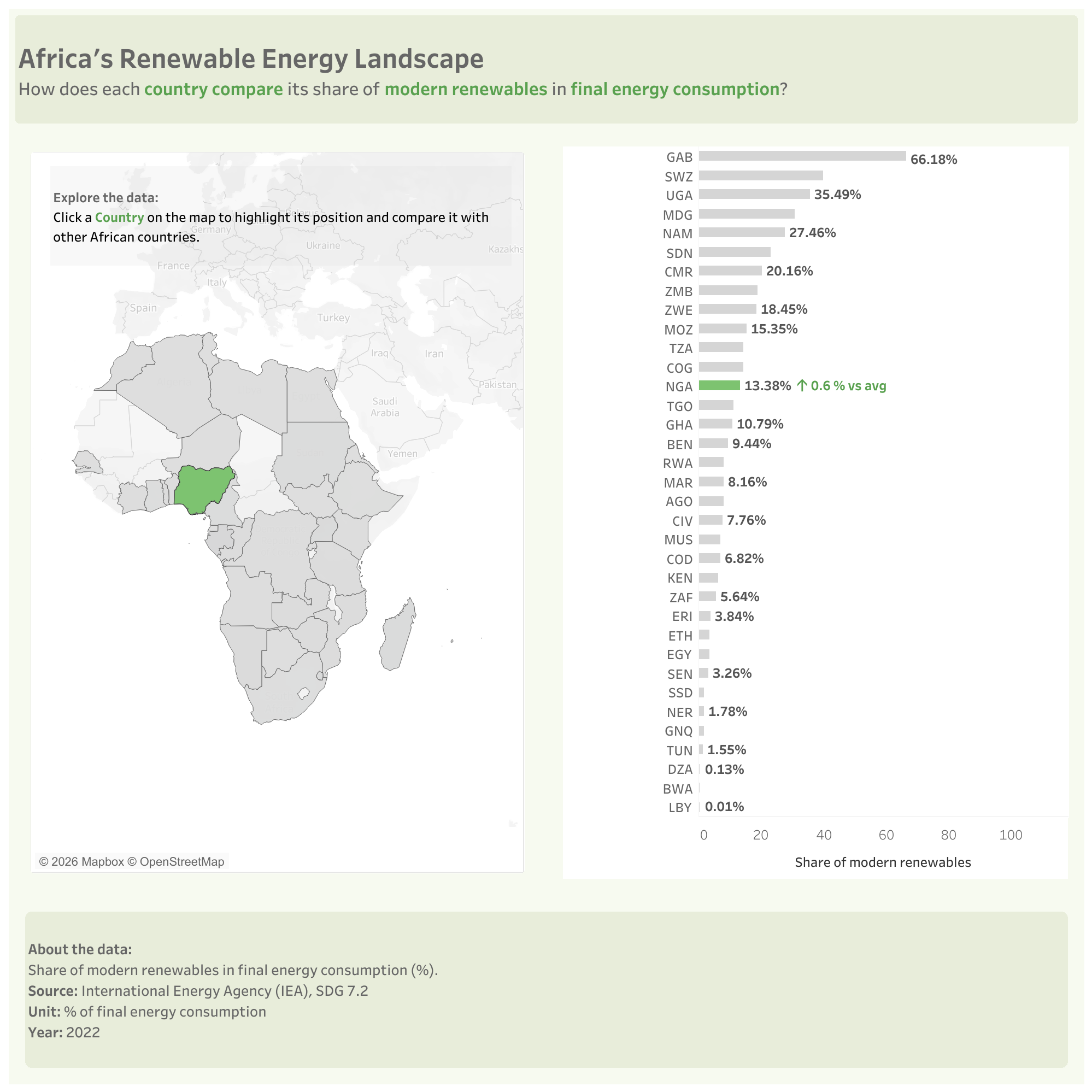
What started as a table of 35 rows became an interactive way of exploring the same information. For me, one of the biggest takeaways from this project was that a dataset doesn't need to be large or complicated to produce an interesting visualisation. The underlying data remained exactly the same throughout the process, what changed was the way it was presented and the questions it became possible to answer at a glance.