


For one of our projects at the Data School. We had to design and create a dashboard on a fictional company’s IT service help desk data. I created a dashboard that was aimed at helping the companies HR team find out who uses the service desk, for what reasons and any extra support that could be applied.
Here is my original output:
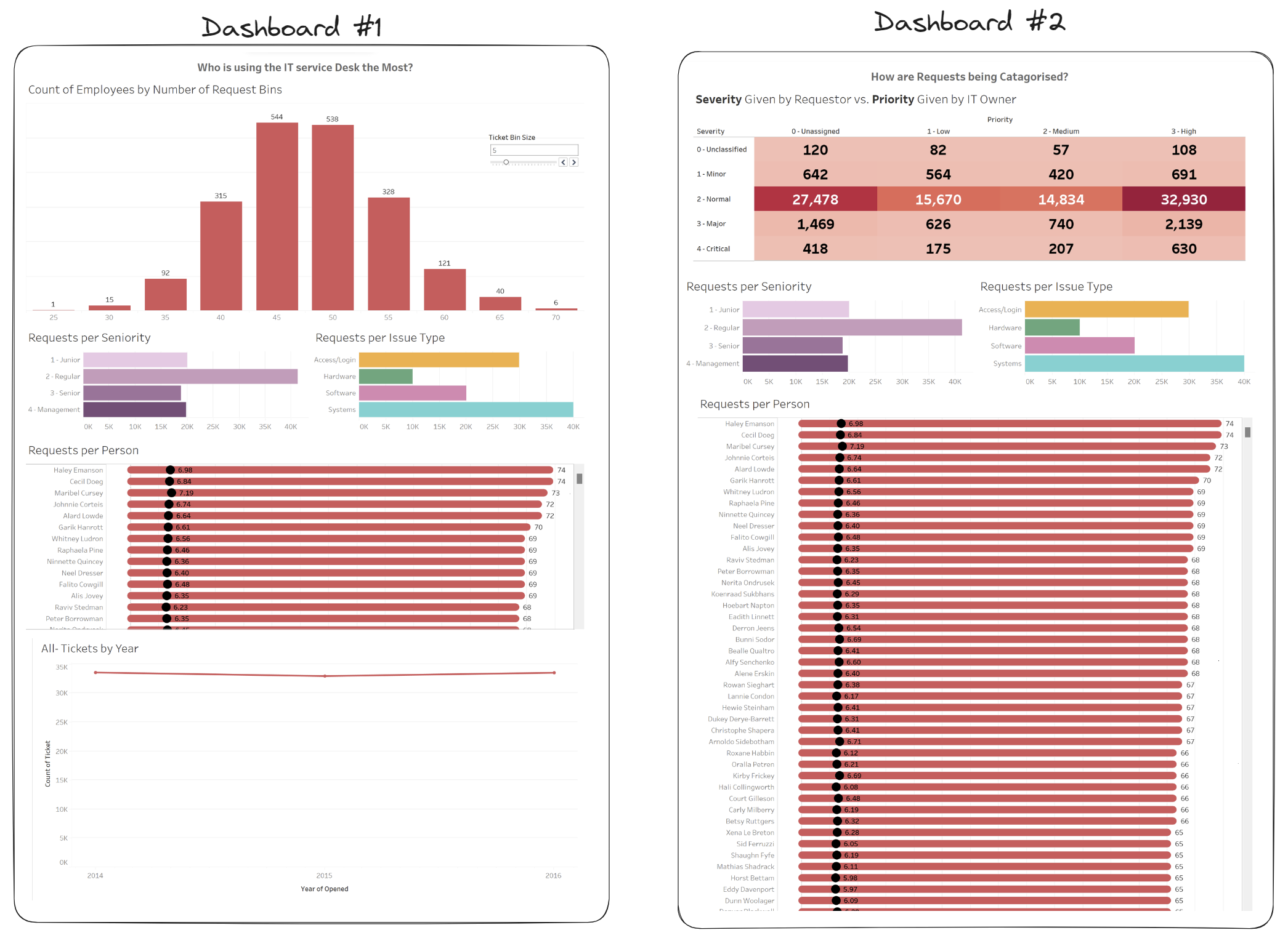
Whilst I was happy with the actual charts and the analysis within my dashboard, I received a lot of feedback on the design. After taking on the feedback, I realised I didn’t have to change much about the actual dashboard, rather altering the aesthetic and layout!
Here is the new and improved dashboard!
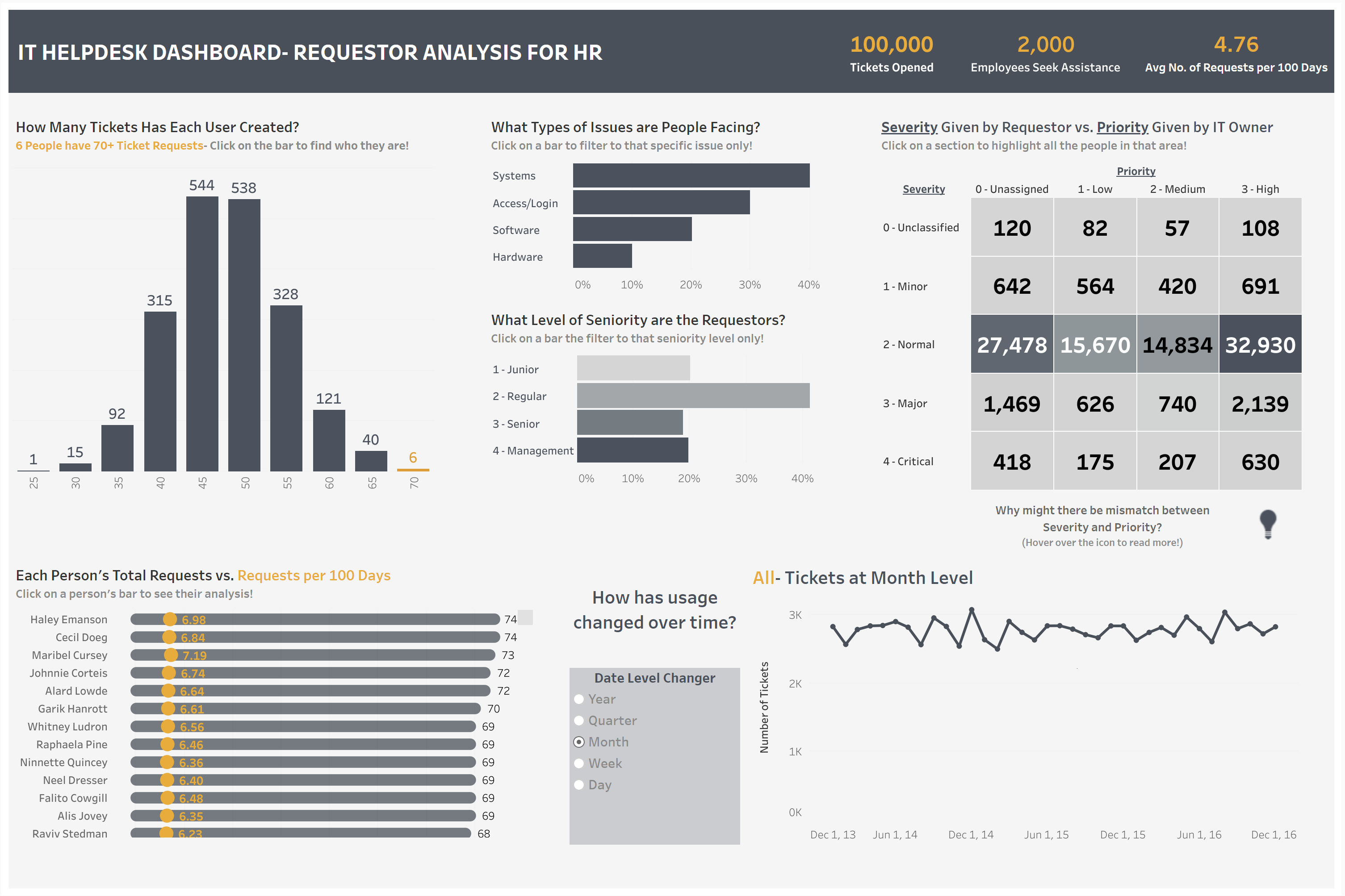
Here were some key areas I changed:
- Initially, I divided the dashboard into two separate entities, focusing on IT helpdesk users and those mislabelling their issues. However, the realisation struck that a consolidated approach would yield a more cohesive and interactive outcome, eliminating redundancy and offering an extra layer of context.
- The initial color scheme, dominated by a vibrant red, proved to be overwhelming and counterproductive for a dashboard intended for repeated use. Recognising the need for clarity and visual comfort, I revamped the palette, opting for a neutral grey background with a secondary orange accent to highlight key points.
- The time chart, featuring a drill-down functionality allowing users to navigate from year to day levels, seemed impressive in theory but hindered the ability to discern trends across time. To enhance user experience, I restructured the chart to change the level of detail dynamically, ensuring a more intuitive exploration of temporal patterns.
- Addressing the issue of chart titles lacking thoughtful labels/tooltips, I not only reworded them to encourage exploration but also integrated additional written analysis directly into the dashboard. This was especially important on the histogram which are notoriously difficult to understand at a glance! This strategic move sparked curiosity and prompted users to delve deeper into the data.
- Finally, recognising the need for immediate insights, I introduced key performance indicators (KPIs), providing at-a-glance information and guiding attention to critical points within the dashboard.
In conclusion, the journey from separated chaotic dashboards to a unified, interactive layout, has transformed my initial creation into a powerful tool for HR professionals. This journey also shows how a few small changes as well as a better understanding of the user's needs can help deliver a truly engaging and insightful experience.