


Last week on our client project, I worked on the footfall side of the dashboard.
The brief was based on a fictional rail company called Love to Travel, using public data. We had daily footfall data from 2023 to 2026 for 18 of the biggest stations in the UK, and the goal was not just to show total footfall, but to understand what “normal” footfall looks like for each station and then identify the days that fall outside of that. That sounds simple enough, but the more we looked at it, the more obvious it became that “normal” depends on what you are comparing it to. Here's the finished product, and I'll explain how it was made below:
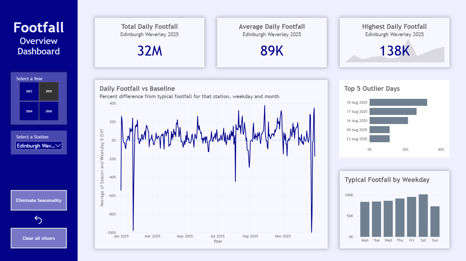
Embedded iFrame
Starting with a weekday baseline
A typical Thursday at Leeds is not the same as a typical Thursday at Euston. But also, a typical Thursday at Leeds is not the same as a Sunday at Leeds.
That was the main idea behind the direction we took. Rather than using one average per station, we used Power BI’s group by function to calculate a baseline footfall for each weekday at each station. So instead of asking whether a day was high or low against one overall average, we were asking how it compared to what is typical for that station on that day of the week.
From there, we calculated the variance as a percentage difference from that weekday baseline. That gave us a much more useful view of where daily footfall was unusually high or low.

The first issue we ran into
When we showed this to the client, he made a really good point.
On the graph, as we got towards the end of the year, lots of the December days were sitting above the baseline. The calculation was technically doing what we had asked it to do, but it highlighted a flaw in the logic. If an entire part of the year is consistently higher than average, maybe the baseline itself needs to reflect that.
Adding a seasonal version
To deal with that, we created another version of the baseline that grouped by month as well.
So instead of comparing a Monday in December with every Monday in the full dataset, we could compare it with other Mondays in that month across the whole period of data. That meant we had two views:
One baseline based on weekday only
One baseline based on weekday and month
This gave the client the option to eliminate some of the seasonal effect and get a better sense of true outliers.
We built that into the report as a toggle, so you can switch between the two views and see how the shape of the data changes.
Using Edinburgh as an example
Edinburgh was a clear example of why this mattered.

On the first graph, the spikes in August are huge, which makes sense because of the Fringe. But while it is useful to know about it, it happens every year, and these huge spikes drown out other outliers that would be interesting to consider. Once seasonality is taken into account, it becomes easier to see unusual days across the rest of the year as well, rather than everything being dominated by one obvious busy period.
Building out the dashboard
Alongside the main variance chart, I also included a top 5 outlier days section for the selected station and year, plus a chart showing typical footfall by weekday. That means the dashboard is not just showing whether a date is above or below baseline, but also giving some context around what “typical” actually looks like for that station.
There is also some interaction built in. If you click on a date in the graph, you can compare that day directly with the typical value for that weekday. The user can also change the station and year using the controls on the side.
What I liked about this piece of work
What I liked most about this part of the project was that the final approach came from thinking about the data properly, rather than forcing a calculation to work.
At first, a weekday baseline felt like a good answer, and it was a lot better than using one simple average. But the client feedback made it clear that it still was not quite enough. Adding the seasonal version created a new layer to the analysis.
I also felt like this was probably my most confident week presenting so far. Because the problem was a bit more involved, I felt like I really understood the logic behind what we had built and why we had taken it in that direction.