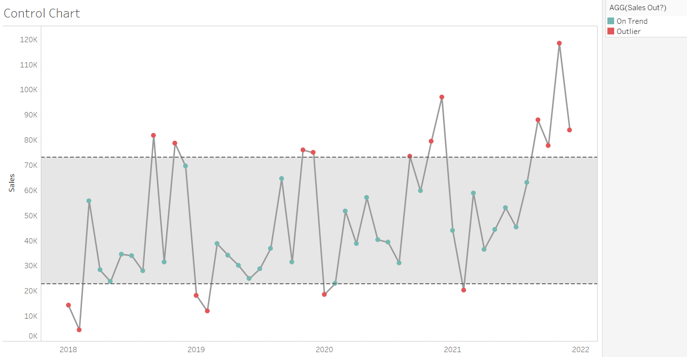
Control charts are a great way to show significant outliers from the average results in your dataset, both those far above average and those well below. I will explain a simple method to build one of these charts (using Superstore data), as well as the colouring system to show outliers as clearly as possible.
Control charts are made of 3 parts: a distribution band, a line chart and a circle chart. The distribution band makes up the threshold indicator (i.e. a band across the chart to show the region in which expected values would appear).
First, we will build out the foundation of the graph. Start by right-clicking and dragging Order Date onto the columns shelf, and then selecting continuous Months (one of the green options near the bottom). This will build the X-axis of the chart. On the rows shelf, you then want to drag on Sales (this will default to SUM, which is what we want). Change the mark type to a line if Tableau does not do this automatically. This will give you a simple line chart.

Next, we can choose one of two methods: either calculate the values for the distribution band ourselves (the lower and upper bounds), or use the automatic settings inside the distribution band to do it for us. I will run through the hard method first, and then the easier (but less dynamic) option second.
Calculated Fields Option
The first calculation (I called this "Upper Bound") works to calculate the average sales value for the whole chart, and then find what one standard deviation (SD) above this looks like. Standard deviations show where the data is distributed: were this normally distributed data, 68% of all the values would be within 1 SD either side of the average, and 95% within 2 SDs. SDs are often used as indicators for outliers in data. The calculation goes as follows:
WINDOW_AVG(SUM([Sales])) + WINDOW_STDEV(SUM([Sales]))
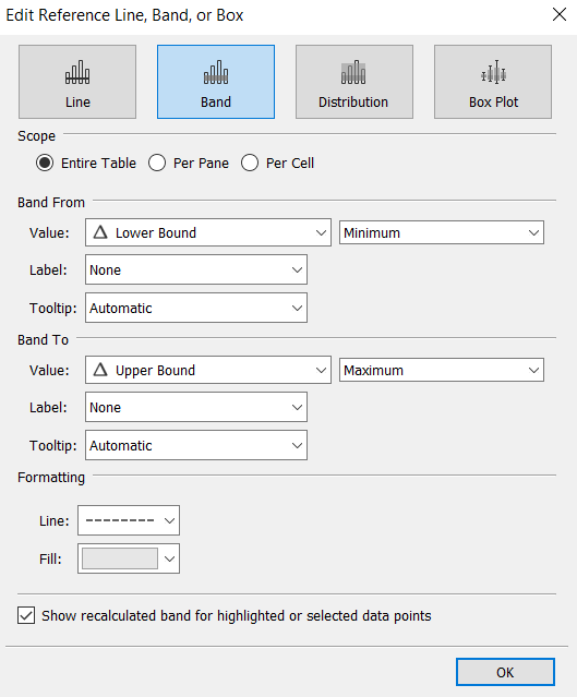
This is a calculation of the window average (i.e. the average of what is being displayed on the chart) of the sum of Sales (the measure you will have in your rows), hence the average Sales of the chart. This is then added to 1 SD, giving the value 1 SD from the window average. For the "Lower Bound", you will simply need to duplicate this formula and change the + to a -. Bring both of these fields onto Detail on the Marks card, and then move to the Analytics pane. Here, by dragging on a Reference Band, you can set the limits to your two new fields, and they will create the banding for outliers!

Using Calculated Fields may be seen as the more adaptable of the two methods, as this gives the opportunity for the SDs to be multiplied (i.e. by a parameter) to increase or decrease the scope for outliers.
Distribution Band Only Option
Whilst much simpler, this is a less flexible version of the method above. Instead of using any Calculated Fields, you can simply drag on a Distribution Band from the Analytics pane, set the values to Standard Deviation, and you have your band. This does not, however, allow the user to set their own limits, so has drawbacks. Furthermore, for the colouring aspect (something I will speak about later in this blog), you will need the Calculated Fields anyway, so it may be worth using them here.

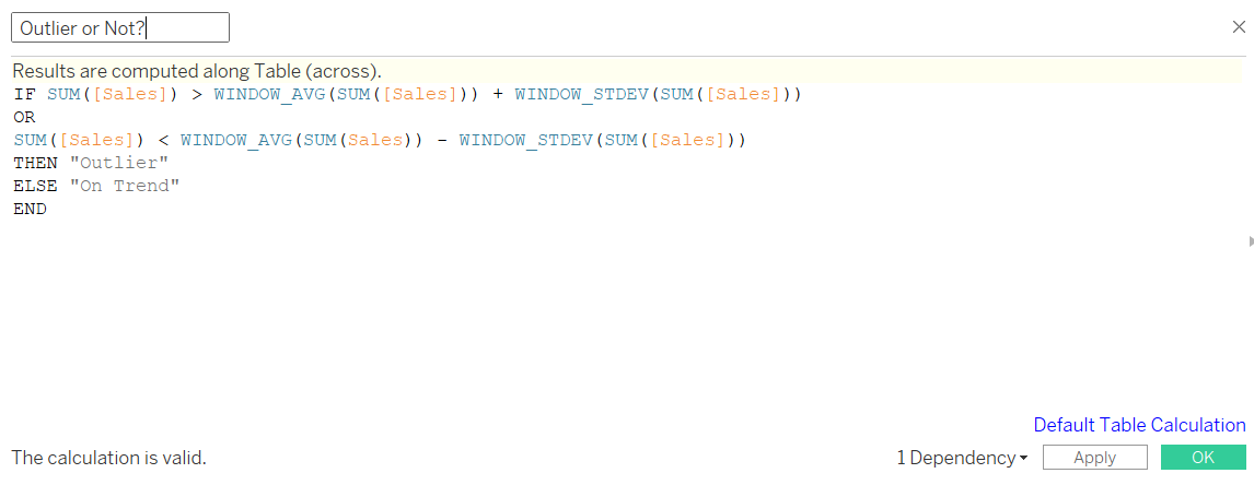
To create the colouring (to show whether a value is an outlier), create another Calculated Field named "Outlier or Not?". Here, we will write:
IF SUM([Sales]) > [Upper Bound] OR SUM([Sales]) < [Lower Bound]
THEN "Outlier" ELSE "On Trend"
END
This uses the fields from before, simply to calculate whether a value falls within those SDs one either side of the average. If you did not write the formulae before (i.e. you used the Distribution Band method), the formula is:
IF SUM([Sales]) > WINDOW_AVG(SUM([Sales])) + WINDOW_STDEV(SUM([Sales]))
OR
SUM([Sales]) < WINDOW_AVG(SUM(Sales)) - WINDOW_STDEV(SUM([Sales]))
THEN "Outlier"
ELSE "On Trend"
END

Now, the final pieces come together. CTRL + drag SUM(Sales) next to itself on the Rows, right click one of them and select 'Dual Axis'. Click on either axis and synchronise, before heading to the Marks card and changing the second SUM(Sales) to a circle mark type (rather than line). Finally, put your new field "Outlier or Not?" onto colour for the circles, and you have a fully-functioning control chart!

