


Today's challenge was to join two data sets on boybands and build a dashboard visualising this data. This was our first day where our main focus was to build a dashboard with limited data prep. I expected this to be akin to Makeover Monday challenges of the past, however I found it a bit harder than initially expected.
Step 1 - Data Prep
As the data was in two .csv files I decided to bring them both into Alteryx, do some cleansing and join them together before outputting them into Tableau.
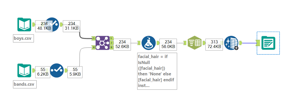
I used Select Tools to change Data Types and remove any columns I did not plan on using in my Dashboard. I then used A Formula Tool to deal with the majority of the Null values and used Text to Columns to split the 'Accessories' column into rows before removing extra whitespace.
I decided to leave the DoB column as a string for the moment as the input style made it hard for Alteryx to recognise a date or to convert into one using the DateTime tool.
Step 2 - Plan
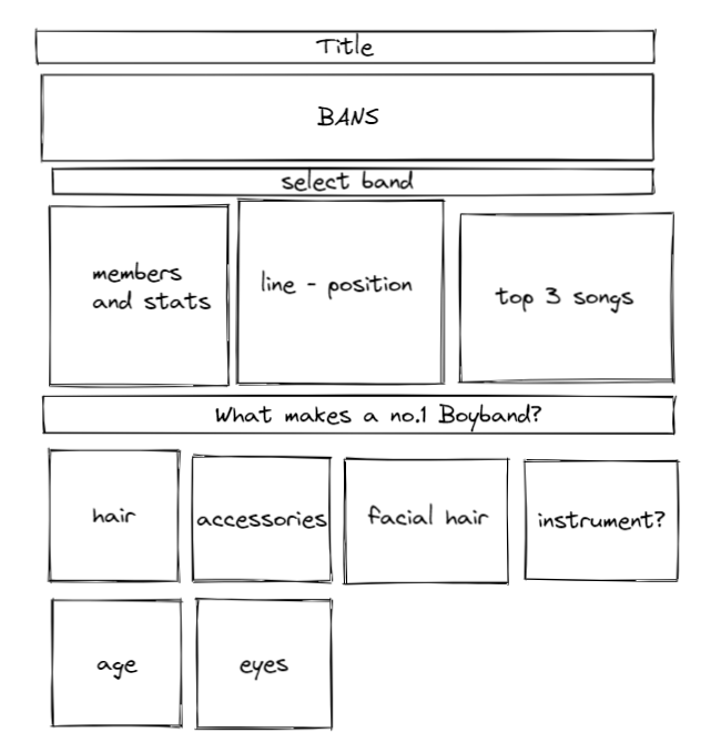
There probably hasn't been enough of this this week. Before starting to build my dashboard, I had a think about what I wanted to incorporate. Normally my finished dashboard looks nothing like the original plan but it's a good place to start.
Step 3 - The Dashboard
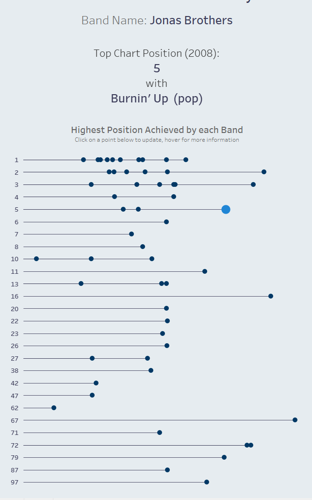
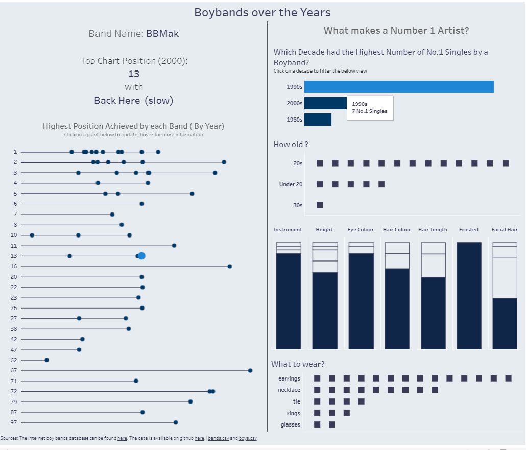
I started playing around with charts and decided on splitting my dashboard into two, not dissimilar to my original plan. However, when I started looking at the stats available for the individual Bands I realised it was more limited than I had initially estimated. I instead decided to show the Top Song for the chosen Band and show how that fits in with the rest of the data. This section is run by a parameter and updates as a mark is clicked on.
For the other side of my dashboard I decided to have a bit of fun with the data and complied a sort-of 'look profile' for members of a band that had achieved a No.1 in the selected decade.
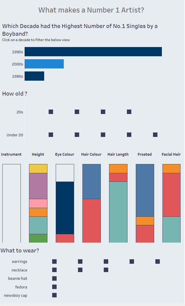
For the percentage of total bars I wanted the maximum value for each to be highlighted.
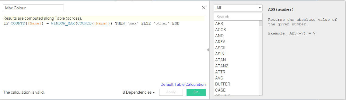
I got a bit stick here, forgetting that Tableau defaults to computing Table Calculations 'Across'. Once I was reminded of this, I changed it to compute using the field values and it worked fine!
I found this more difficult than I originally expected, mainly because I struggled to think of ways to visualise the data I had. With more time, I would have researched additional data and joined it to what I already had. Perhaps an analysis of the performance of one or multiple boybands over time.