Building a timeline:
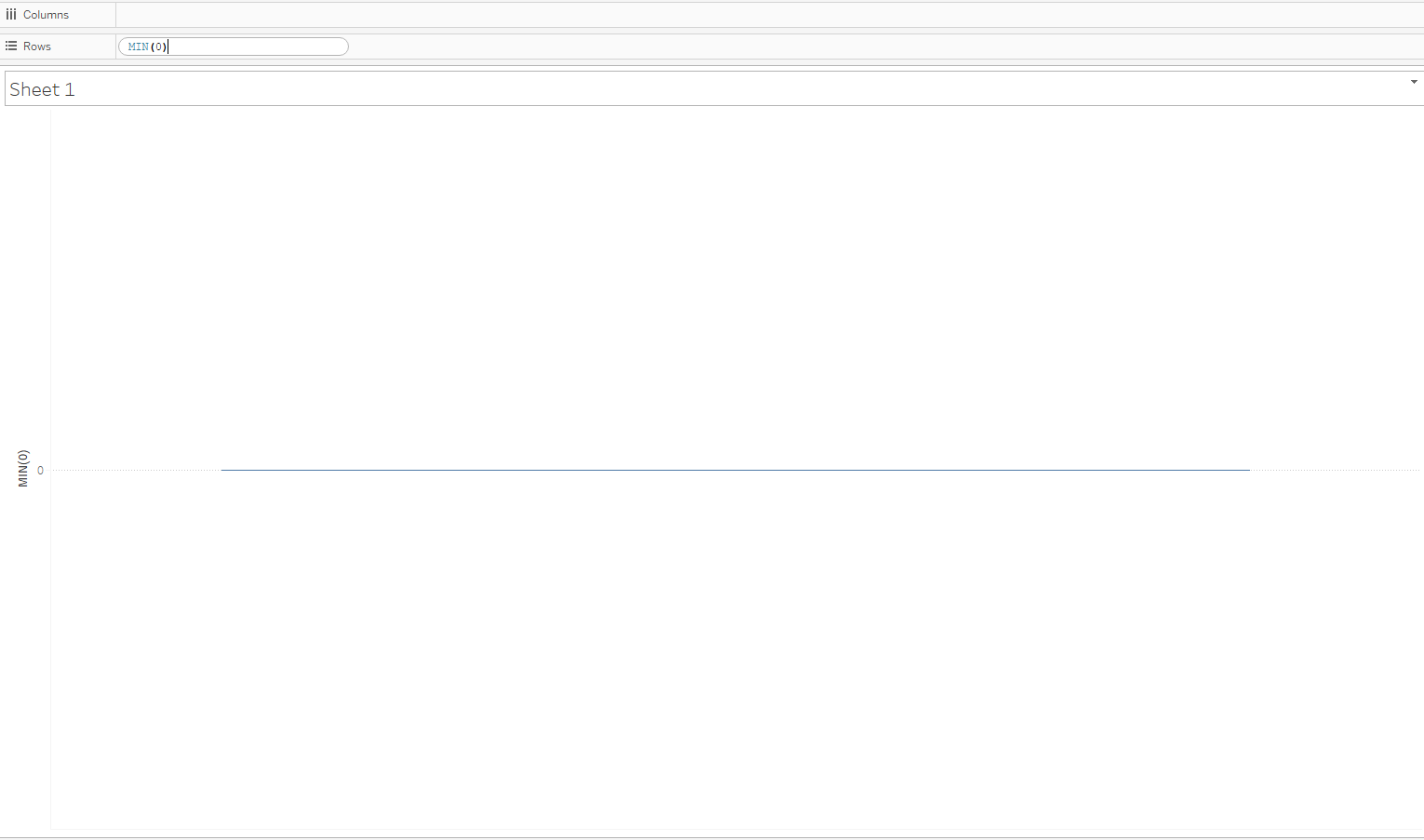
The first step is to create a calculated field that will serve as a placeholder. This will eventually be used to make all of the dates line up in a straight line. This can be done directly in the rows shelf as below:
Next, place the date field that you want to use as your timeline on the columns shelf. At this step, I usually use the most granular date available (in this case, day) and use the field as continuous.
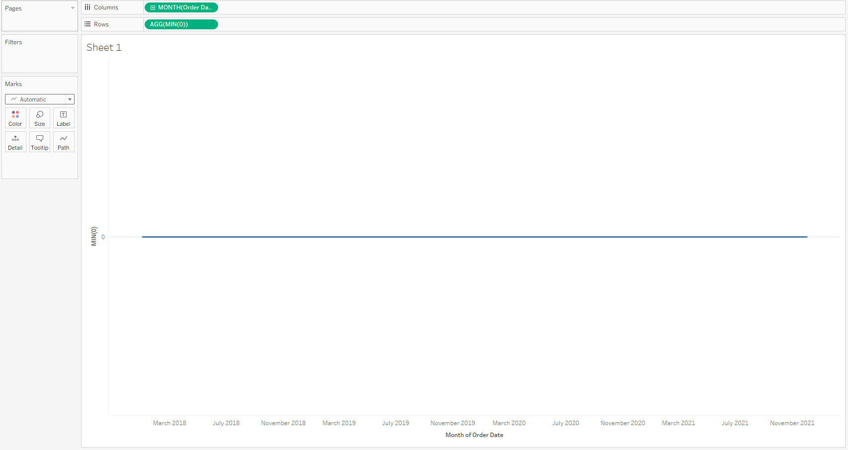
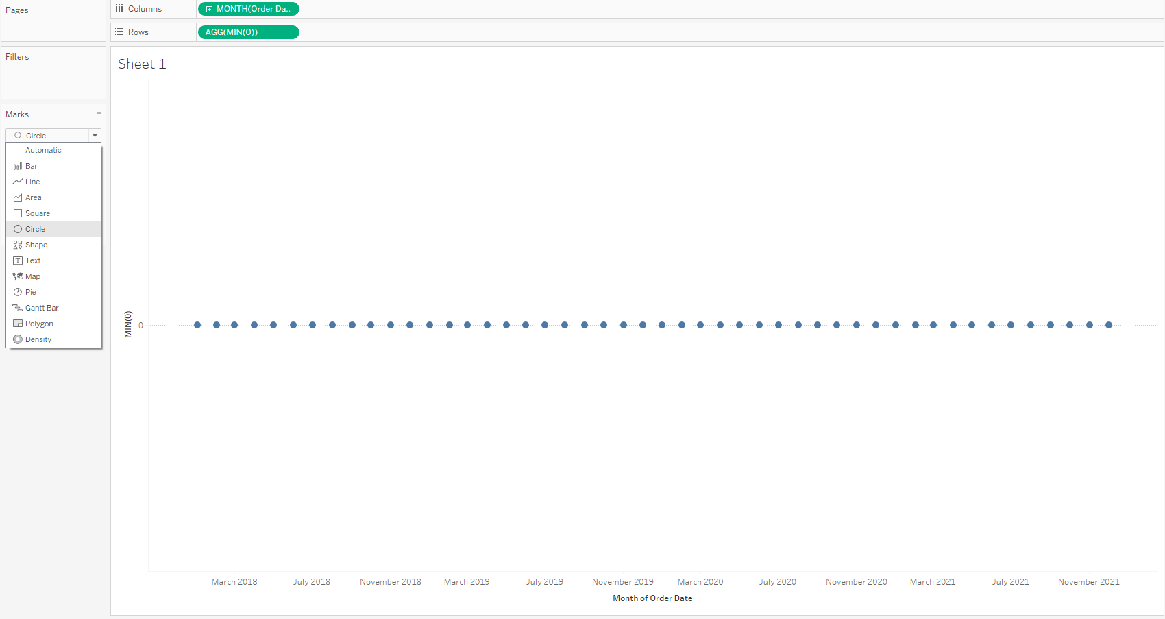
Change the mark type from automatic to your chosen format. I usually use circle, but squares, arrows and custom shapes can be used.
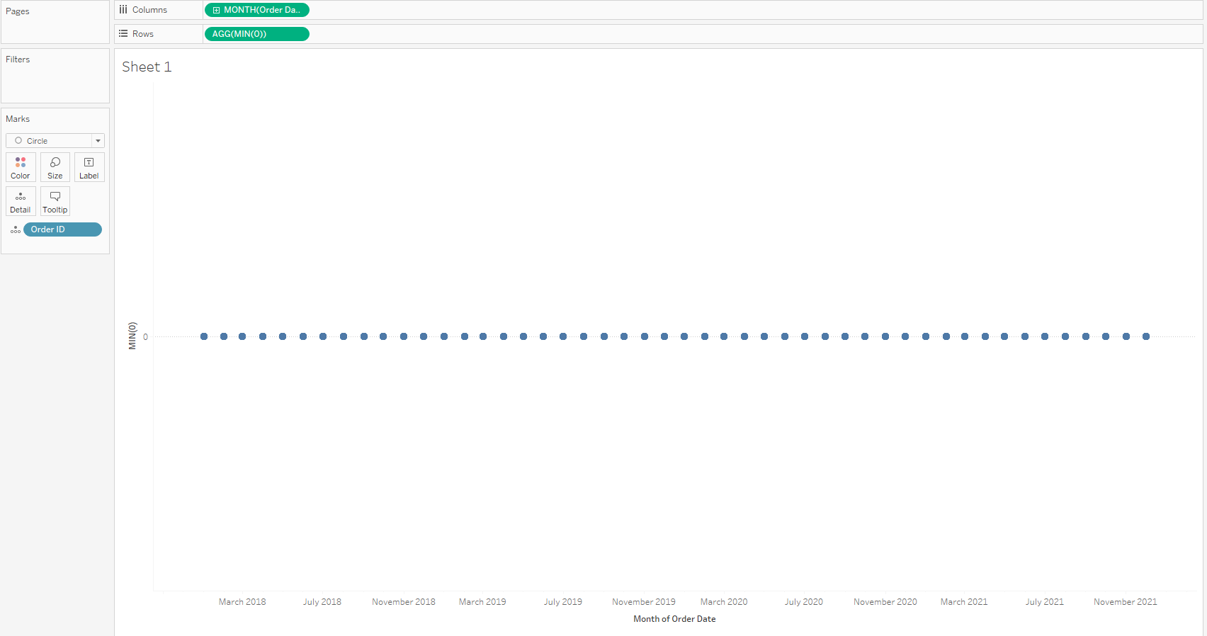
To display events on the timeline, drag your dimension that represents your events to the detail marks card. For this to work, each 'event' needs to have corresponding data with the date field in your column shelf.
Change the formatting of the zero lines to give a solid line and remove headers for the placeholder.
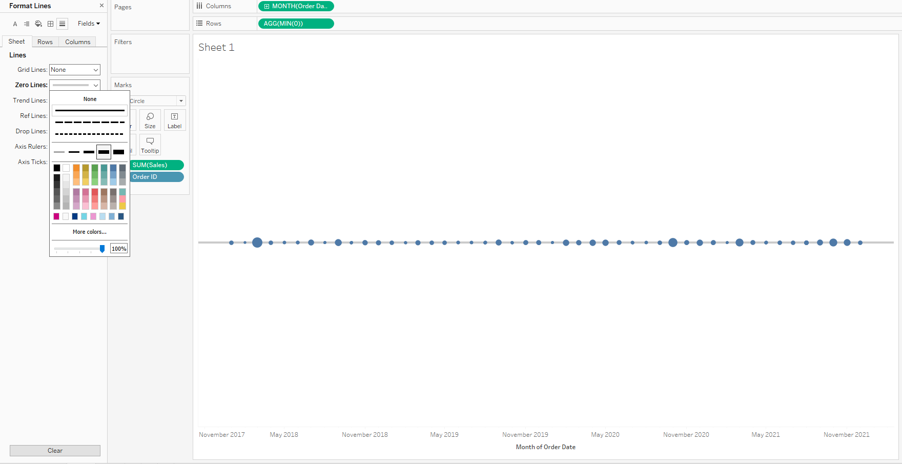
In this example I have also chosen to put Sales on size however, this is dependent on what you want your timeline to show.
All that's left do do is format the timeline as you like, this can include using colour for a continuous measure or a highlight colour. You can also remove the date axis and include in the tooltip or labels.
Adding Reference Lines:
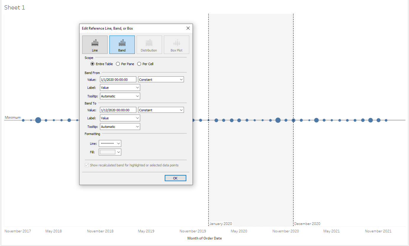
Sometimes you want to use the timeline to demonstrate density within a certain date range. For this reference lines and bands are a fantastic tool.
Simply drag a line or band onto your table and set your value to either a field or constant, edit your tooltips and/or labels and format your line and shading. Here I have chosen to highlight all the 'events' within 2020.
Timelines can also in a slightly different context; below is an example of a timeline I created for Makeover Monday Week 8:
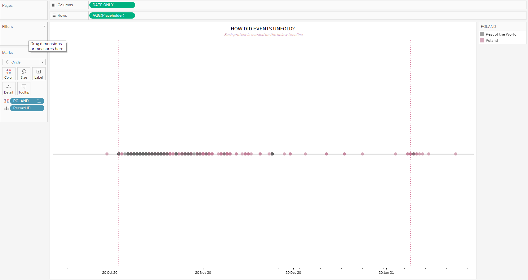
This follows the same process. We can see the placeholder and date field on the rows and columns shelves and my chosen dimension on the detail marks card. I have used reference lines to illustrate key dates that influenced the subsequent events and have dragged my country field onto colour.
As this is a different set of data, we can see that there is a less even distribution of events than in the Superstore example.
Timelines are a versatile tool and can be tailored to suit your visualisation - just think about what you want the viewer to get from them and make your choices accordingly!
