Following on from my previous blog on how to create a drill-down chart using set actions, this blog will show some ways to format the chart to make it more attractive and intuitive.
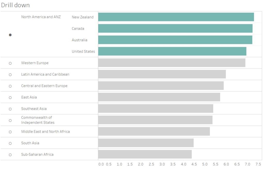
When you have created a set it functions as a Boolean field which returns ‘In’ or ‘Out’ depending on whether the option is in the set or not. You can drag the set directly onto the colour mark to distinguish the breakdown between region and countries. This makes it really clear that a set and its breakdown has been selected.
Adding Symbols
Another key tip is to add symbols to the rows which represent whether the set has been selected and subsequently broken down into its member constituents. To do this we need to create an if calculation to tell tableau what symbol/character to show when or when not the set is selected.

This tells tableau to show a filled in dot when the region set is selected and a hollow dot when it isn’t.
Adding Labels
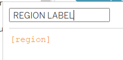
I then go and create a region label just so I can position the region after the dot in my rows. For this I duplicate the region dimension and call it ‘REGION LABEL’.

I will then place this to the right of my REGION DOT field in my rows. My set up should look something like this now:

I tend to hide the original ‘region’ field but I still have it there so that I can sort using it.
As covered in the previous blog the countries field is the following calculation:
If [Region Set] then [Country Name] else ‘’ end
The reason that I don’t combine my Region Dot and Region Label into a single calculation is that I have the flexibility to format my dots and make them larger without changing the text format of my labels.
Using these tips my chart goes from this:

To this!

