How did my first day in Power BI go?
Power BI is Tableau’s Desktop, whilst Power Query is Tableau’s Prep. Power Query allows you to do your cleaning steps. The first thing you need to do is ‘Get Data’.

Once connected, press TRANSORM. This is now your data-prep step. Multiple tables will pop up and you need to select which one(s) you want based on your dataset. Power BI does a good job of showing you what you will want. For example, we did some web-scraping from a URL and a list of different tables popped up, allowing you to select for the one we wanted to focus on.
Navigating the Toolbar
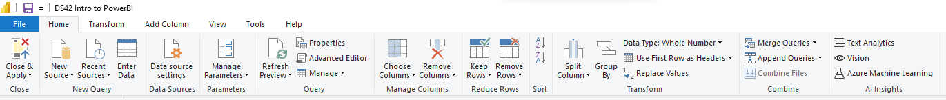
The toolbar consists of the following tabs: Home, Transform, Add Column, View, Tools and Help.
‘Transform’ vs ‘Add Column’
These toolbar tabs are very similar, in that you can broadly do the same things to your data fields from these locations. The difference is, if you do your step in the ‘Transform’ tab, you overwrite the data field in question. In comparison, if you so the same step from the ‘Add Column’ tab, you keep your data field AND a new data field is created.
What key ‘steps’ can you do?
Extract
Take out the data you need from each cell based on a selection (that you can click), such as ‘after delimiter’. If you were to press this option, then you can specify the delimiter you want to extract your information from. E.g. London-Oxford Street à Oxford Street. The delimiter here would be the dash (-).
Split
Define by delimiter, at what point you want to split your data field into two separate ones.
Index vs Conditional column
Inserting an ‘Index Column’ is very helpful. It just gives each record a number, which is great for making a row ID or ranking. You can specify if you want it to start from 0 or 1.
A conditional column allows you make a new data field by walking you through an IF() statement based on an existing data field.
Data type
Change your data type as part of the cleaning process. If you don’t, it can limit your next steps, such as filtering.
The cheat code…‘Column from examples’

You can access this button from the ‘Transform’ or ‘Add Column’ tab. You can teach Power Query to make a new data field. Make sure you press the click down and select ‘From Selection’, to specify what data field you want to take from. It is intuitive, so will learn what you want the data field to look like from what you put in. (Make sure you name the data field you make). This tool will also show you the function it used to get you to that point, so you can learn as you go. With time, maybe you could be the predictive tool!
Power BI
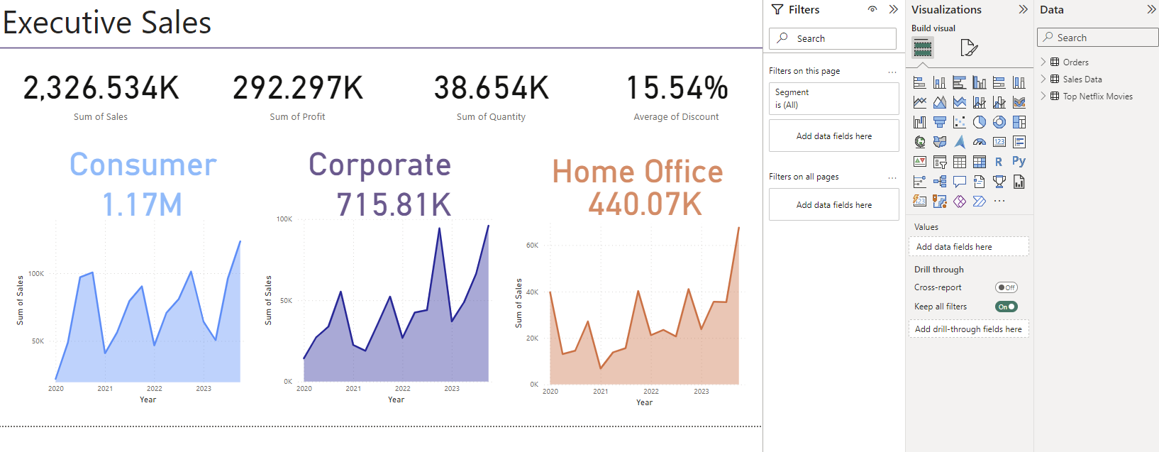
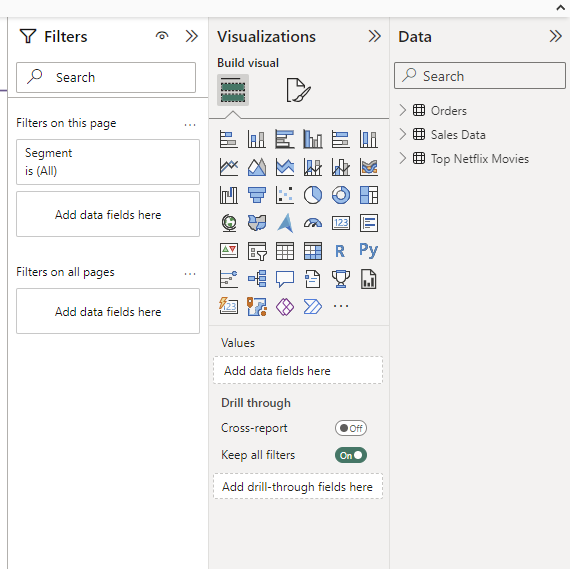
There is familiarity here from the use of the Microsoft office suite, particularly icons. It is intuitive to build a graph- just drag and drop a graph template onto the canvas. Then underneath, you can simply drag your X and Y axes on, and change the count method depending on your requirements (e.g. count, average, sum). Filters are also intuitive, and revolve around a filters tab that sits next to the graph visualization section.
The bit that is pain-snakingly annoying is formatting what you create. Who knew you would want to throw your computer at a wall because you wanted to colour a graph title. Something so easy in Tableau is suddenly a mine field in Power BI!
An overall view in Power BI...