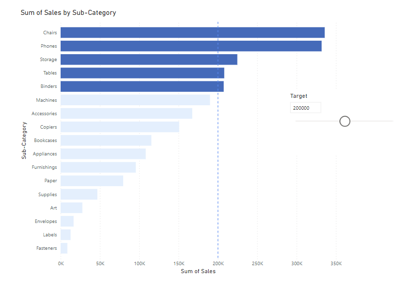
Learn what it takes to make the following bar chart in Power BI. (Please make a bar graph before you follow these steps).

Skill 1: Making a Parameter
A parameter is essentially a constant number; a value from outside the data source that the client can input. For example, a target number. What is handy about a parameter is that you can make it in such a way that you can change the value, and therefore replicate a constantly adjusting target. This replicates a real-life scenario.
Click:
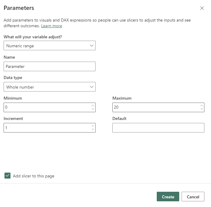
Modelling --> new parameter --> numeric range (so you can adjust the numbers) --> Name the parameter and fill out the extra info it requires...

Skill 2: Making a Constant Line that Adjusts with the Parameter
Click the bar graph, and orient yourself to the analytics icon in the visualizations pane (the magnifying glass)...

Go to make your constant line as normal, but instead of making it a fixed value, click the fx button and select 'field value.' Then select your 'parameter value'. Now your constant line will move in accordance with the value you set the parameter.
Skill 3: Different Colours if the Bar Passes the Parameter Value
To make different categories in a bar chart different colours, you need at least two values to set the colours to. (To set colours, go to: Format --> Bars --> Colours). In comparison, our parameter is a single value, that is subject to change... no good trying to set colours to this!
How can we make a parameter binary? An IF statement.
Home --> New Measure --> IF()

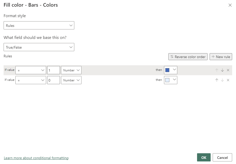
Then, when you go to change the colours of the bar graph, you can select by the measure you made (True/False for me)...

Ta-da.
