I was always impressed whenever someone had an actual chart/view whatever you want to call it in the tooltips. In my opinion, it’s a great way to go into more detail for those interested without cluttering the dashboard. After one of the Friday projects, one of our coaches, Carl, showed me how easy it is in Tableau. Brace yourselves to have your minds blown.
What’s the hype about?
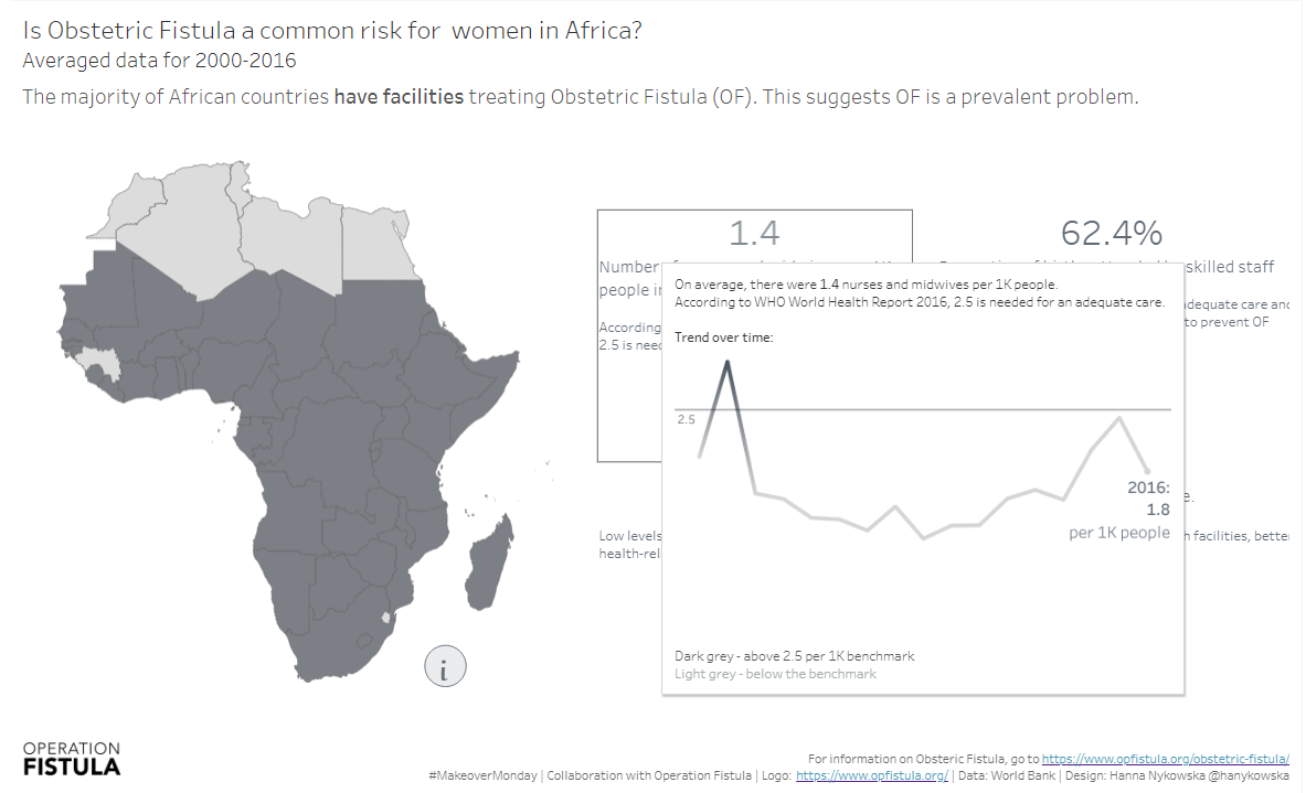
If you’re not sure what this whole tooltip viz is, I’ll use my submission for this week’s #makeovermonday:

The dashboard itself is fairly simple, which is what I wanted. I wanted something that is not overwhelming (I’d found the topic itself quite overwhelming so a lot of white space was important for me, to breathe I guess…). But when you make something simple you may lose some key information. For those interested in how the metrics in the view changed over time I added the time trends in the tooltips.
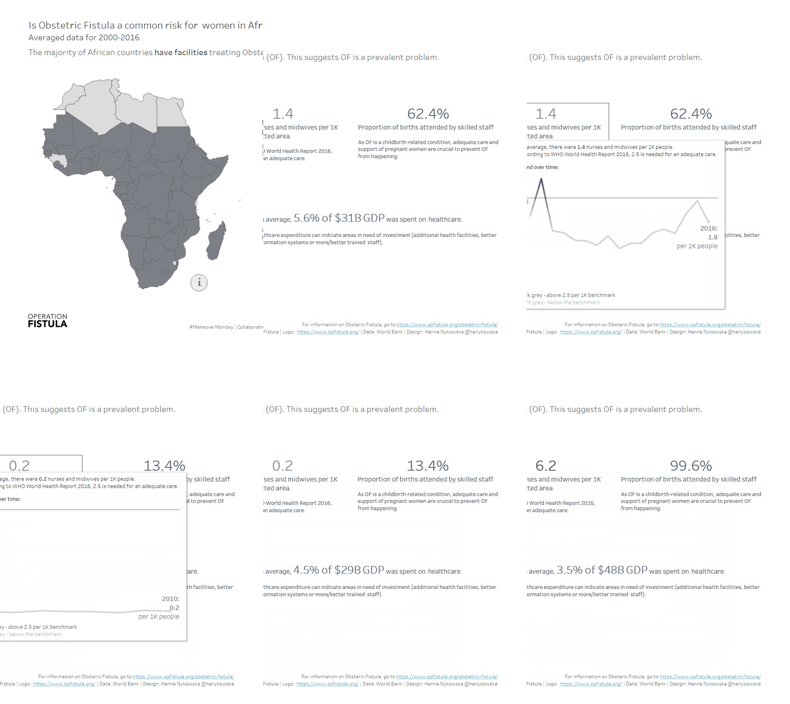
In the gif above, you can see the tooltip viz changing, it’s due to dashboard actions that filter the data. I’ll get to it shortly.
How to
If you want to create a tooltip viz, you’ll need at least two sheets: one with the view you want to show in the tooltip and one where you want to have the tooltip on.
The former needs to be fairly easy to read because if you want to have responsive tooltips (the default setting, they show instantly), you won’t be able to hover on top of that tooltip, so you can’t get nested tooltips. Even if you select tooltip on hover, you still won’t get nested tooltip, so just make that graph easy to read.
To actually set the tooltip viz, click on Tooltip on marks card and edit the tooltip how you want it to look like apart from the extra view. Once that is done, place your cursor where you want to have your view, go to Insert -> Sheets. You should be able to see all of your sheets now:

What is quite helpful here, are appropriate names for the sheets so you can easily find what you’re after.
Ok, here’s something similar to what you’d get after selecting the sheet of choice:

I think it’s fairly self-explanatory: Sheet name indicates which sheet we’re inserting, maxwidth and maxheight limit the size of the view, in filter you’re likely to have <All Fields> rather than anything specific.
If you click OK and check the tooltip in the sheet, it should already have that viz inside. So easy!
Tooltip Viz and Dashboard Actions
Because my dashboard used the map as the filter for other fields, I wanted the tooltips to also include this functionality. It wasn’t as straightforward as I expected, but not really too difficult either.
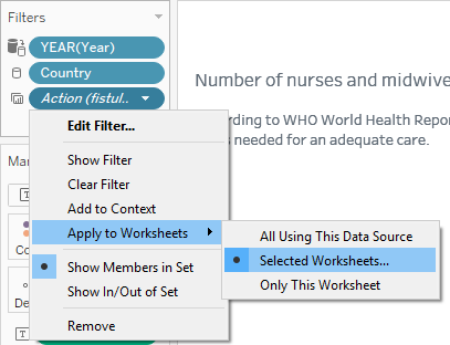
Once you have you dashboard actions all prepared, go to the sheet that has you customised tooltip. On the filters shelf, you should have at least one that’s automatically generated (in italics) called Action (something). Right-click on that pill (or click on the caret) ->Apply to Worksheets -> Selected Worksheets…

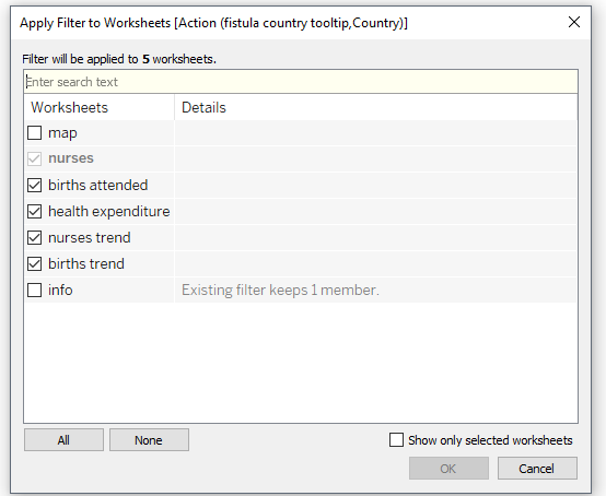
A pop-up window will open where you can select which sheet the action should apply to:

If you want the action to affect your tooltip (I hope you do, that’s the reason you would keep reading this far), select the sheet with your tooltip view – ‘nurses trend’ in my case.
That’s it! Now you should have a functional view in tooltip that also works with your dashboard actions:

Byeee!
