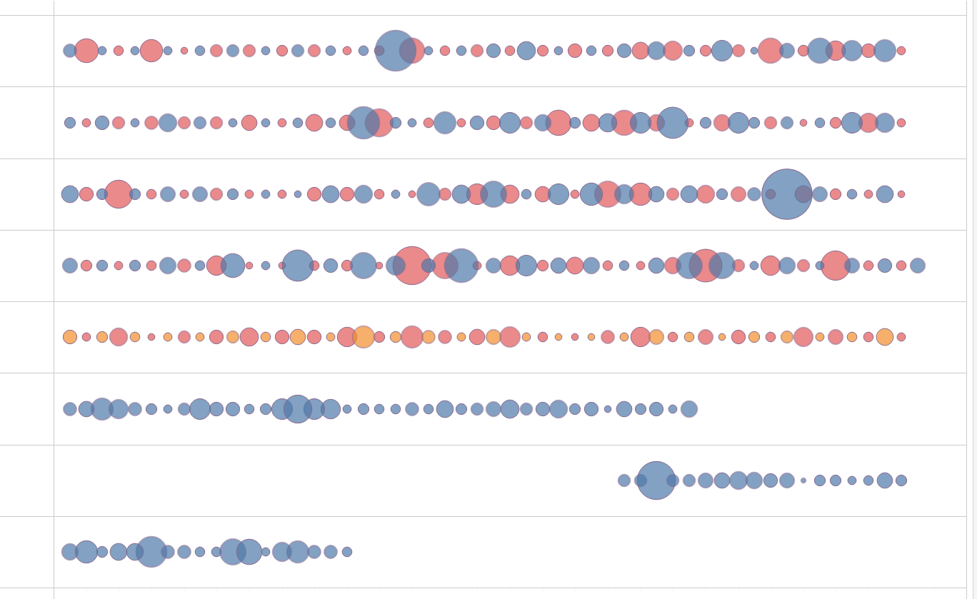
Circle timeline charts are useful for showing discrete values of varying size across a time period.
This blog will go through the process of creating a circle timeline chart with a worked through example. In this example, I will be visualizing the Makeover Monday metadata of every dataset, from every week of the challenge in the form of a circle timeline chart.
1) Drag a date measure into the columns shelf, in this case the week number will be used to represent the weeks across the year.

2) Now you can add a categorical value to the rows shelf to further split the data. In this case, the Year will be placed in the rows shelf.

3) Drag the numerical value you'd like the sizes of the circles of the chart to be into the size marks. Number of columns will be the numerical value I will be visualizing.

4) We also have the option of further drilling down into the data by using the color marks. This example will use color to seperate between the author of the challenge that week.

5) Now change the mark type to circle

6) Now the skeleton of the circle timeline chart is complete. Further adjustments can be made to improve the formatting. Such as adding an AVG(0) pill to the rows shelf, increasing the size of the circles, and adjusting the color and transparency of the circles.

