I’ve been playing with radial and Coxcomb plots recently, which, like all the best things, are both beautiful and complicated. This sort of chart was pioneered by Florence Nightingale to show military deaths during the Crimean War, and over 150 years later, they’re still quite difficult to produce.
[tl;dr version: maths is great, download the Alteryx workflow here, and the Tableau (10.1) workbooks here (proportional radius version) and here (proportional area version)]
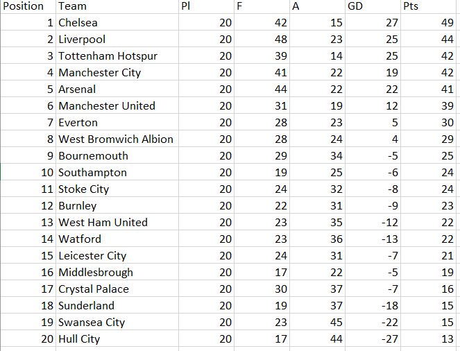
For example, let’s have a look at the current Premiership table as it stands on a grey, frosty Friday morning on the 6th January (insert joke about having an epiphany here):
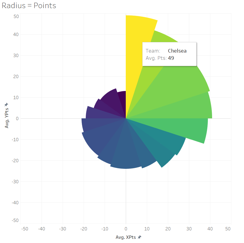
The position goes from 1 to 20, starting at the upright 12 o’clock position and working round clockwise. The tooltip shows that Chelsea are in first place with 49 points. In last place, in dark blue, are Hull City on 13 points.
People disagree on whether the thing you’re measuring should be represented by the length of the segment or the area of the segment; on the one hand, reading it where the length of the segment directly corresponds to Premiership points is more intuitive, but on the other hand, it creates a distorted sense of proportion because the area of the segment goes up exponentially. So, let’s have a look at the same data where the area of the segments corresponds to the teams’ league points:
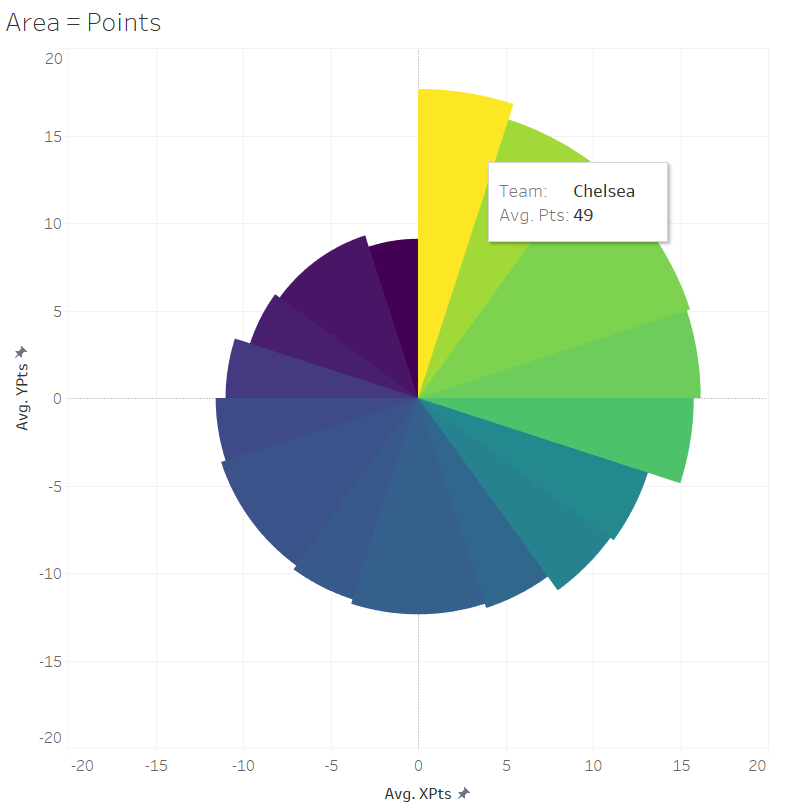
In this blog, I’ll show you how to make both!
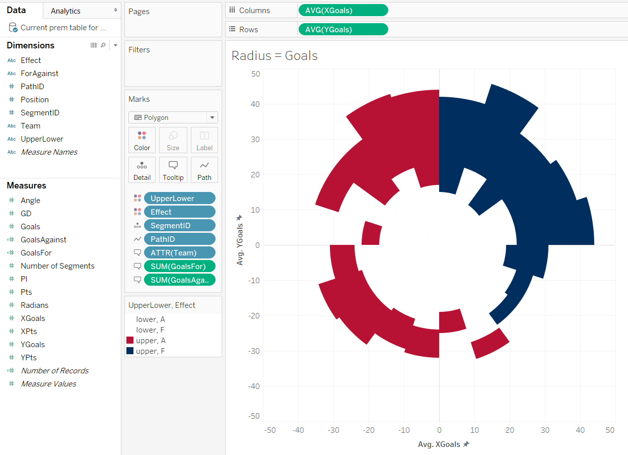
You can take this further and show the difference between values rather than just single values. This viz shows the Premiership teams’ current goal difference:

Again, each segment represents the league position and goes round clockwise. The segment is coloured blue if the team in that position had a positive goal difference (i.e. scored more than they conceded), and red for a negative goal difference. The axis of how many goals a team has scored starts in the centre of the circle, at zero for/against, and goes out in all directions to the edge of the circle. Chelsea in first place have scored 42 and conceded 15, which is represented on the y-axis going up. That axis is consistent all the way round the circle:
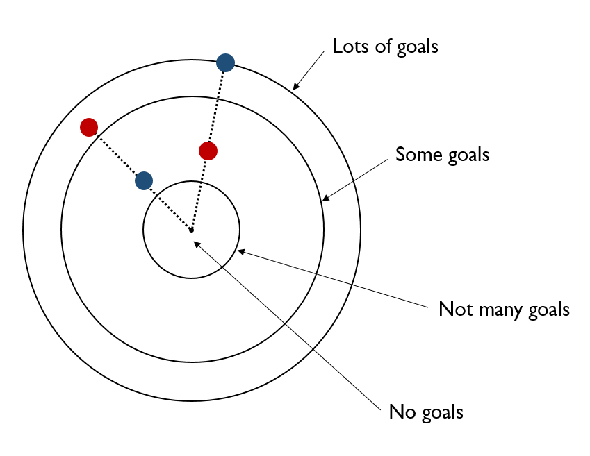
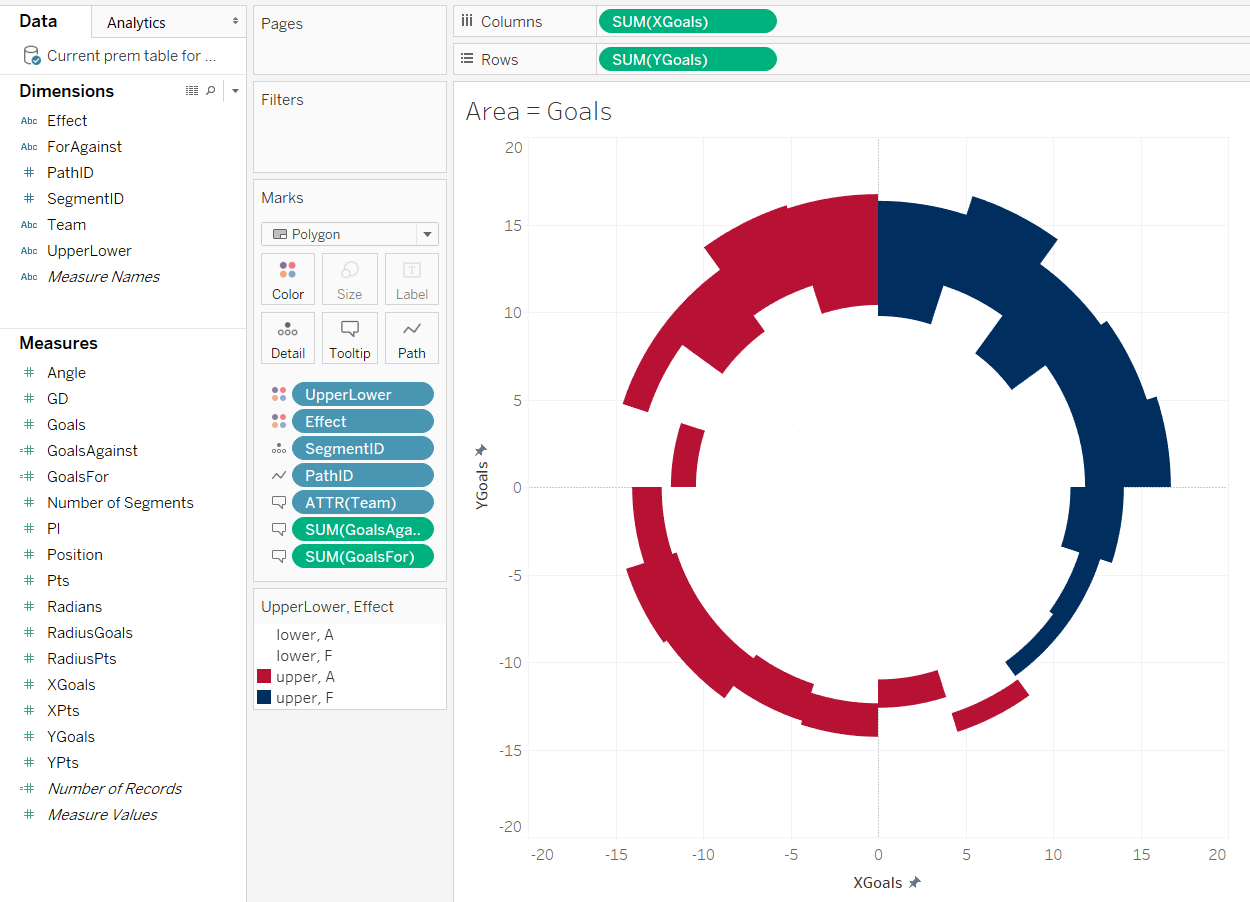
Again, there’s the problem where having the segment length correspond to the number of points means that the area of the shape is out of proportion. So here’s the same viz, but where the area is proportional to the teams’ goal difference:
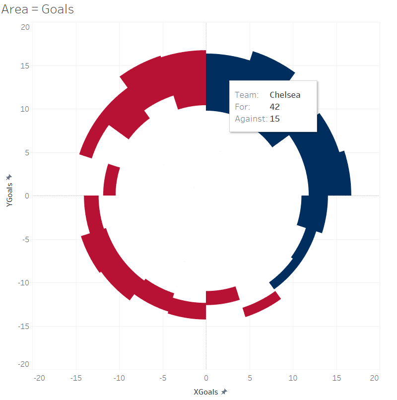
This is proportionate for the segment’s area, but it also means that the length of the segment isn’t readable because it’s essentially a scaling factor.
So. How do we create these different vizzes, then?
It’s possible to do absolutely everything in Tableau. Bora Beran has a blog with a sample workbook which does all the calculations in Tableau, but the downside is that the number and complexity of the calculated fields make it hard to work out what’s going on and where. In his example, there are three different calculated fields – Count, Edges, and Index – which are all simply calculated as index().
I spent a long time pulling this viz apart and trying to put it back together, and in the end found Ben Moss’ way of precalcuating the angles in Alteryx much more straightforward (which he describes here and here). Ben’s example is really good for using as a general measure and adapting; I find blogs more useful when there’s a specific use case to contextualise things, so I’ve adapted his workflow and I’ll go through visualising the Premiership table here.
Let’s start with a simple spreadsheet of the table as it stands right now:
Read the table into Alteryx, and add a formula tool to create a field for whether the goal difference is for or against overall
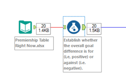
The calculation is:
IF [GD] > 0 THEN "F"
ELSEIF [GD] < 0 THEN "A"
ELSE "Neither"
ENDIF
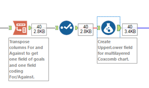
Next, add a transpose tool so that there’s one field for goals and another field for whether those goals are for or against:
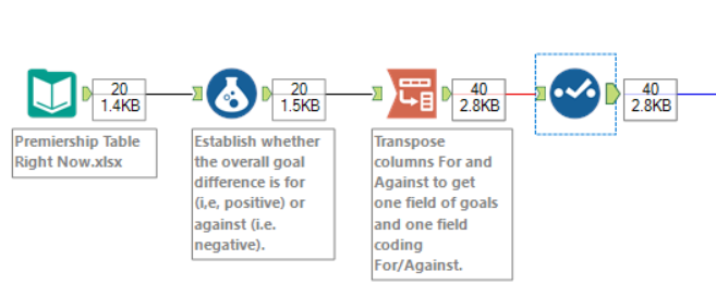
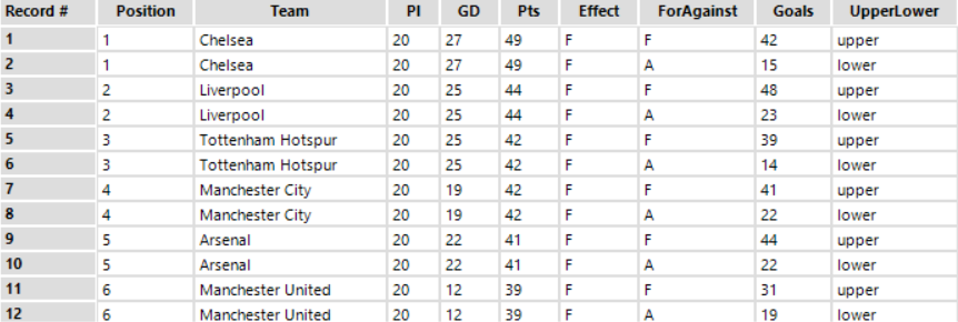
This will give you a table like this:
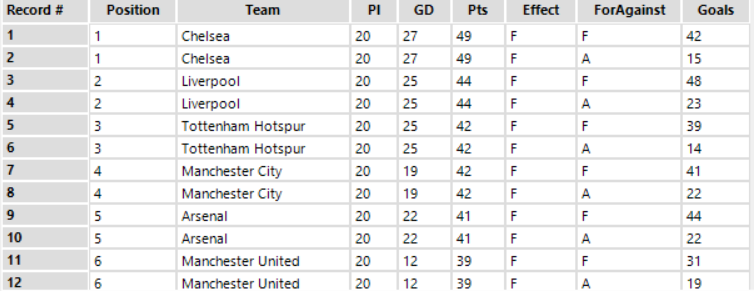
The next thing to do is to create a field which says which one of them is highest. I’ve called this field UpperLower so I know which figure corresponds to the upper and lower edges of a segment in the radial plot in Tableau:
The calculation is:
IF [Effect] = "F" AND [ForAgainst] = "F"
THEN "upper"
ELSEIF [Effect] = "F" AND [ForAgainst] = "A"
THEN "lower"

ELSEIF [Effect] = "A" AND [ForAgainst] = "A"
THEN "upper"
ELSEIF [Effect] = "A" AND [ForAgainst] = "F"
THEN "lower"

ELSEIF [Effect] = "Neither" AND [ForAgainst] = "F"
THEN "upper"
ELSEIF [Effect] = "Neither" AND [ForAgainst] = "A"
THEN "lower"

ELSE Null()
ENDIF
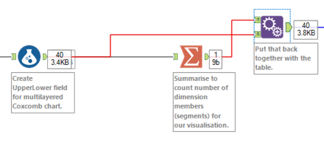
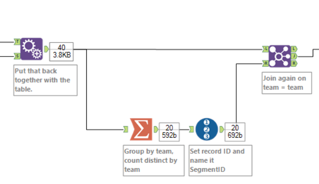
The data itself is now ready, and we need to calculate the properties of the circles. The first thing we need to know is the number of segments to go round the viz. In this case, it’s 20, as there’s 20 teams in the league. We could use another formula tool where the formula is simply “20”, but if we don’t know, we can drop in a summarise tool, do a distinct count of the thing we want the segments to represent, and then append that data back on:
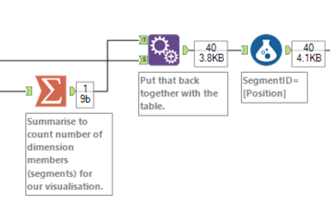
After that, we need to give the segments an ID to know which order to place them in the viz. In this case, it’s positions 1-20, so we can simply set SegmentID to equal Position. If we were doing it alphabetically, beginning with Arsenal and ending with West Ham, we could branch off, take a distinct count of team name, add a Record ID tool in, name that SegmentID, and join back onto the data.
Now we need a PathID. We’ll be making the vizzes as polygons in Tableau, and Tableau processes polygons by drawing lines between X and Y coördinates, creating an enclosed shape. The start of the polygon will be 0,0 at the centre of the circle, so we need at least two PathID points for the polygon to start and end there. That’ll just create a dot. We want a wedge, so we want at least four points to create the two lines along the Goals axes, and the line in between. That’ll create a flat upper edge. We could have any number of extra PathID points to make that edge a curve. The upside is that loads of extra points will create an almost perfect curve; the downside of putting loads of them in is that it takes up more rows:
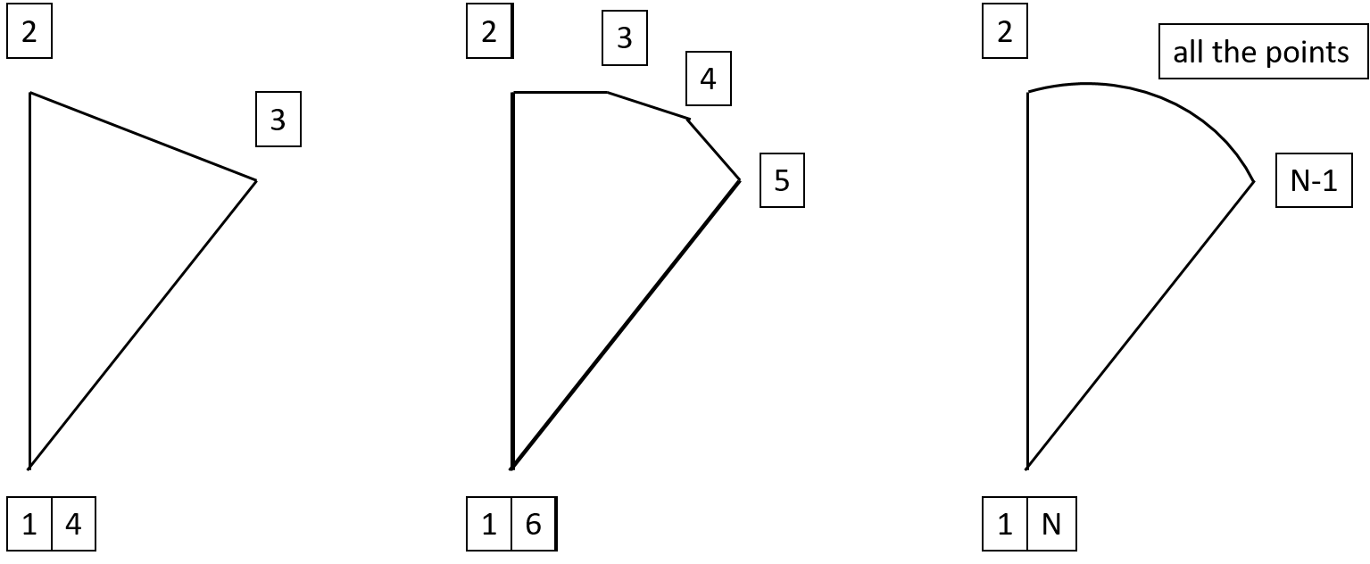
Ben used 13 points in his workflow (i.e. 11 points for the curved edge), which works pretty nicely for this dataset too.
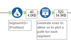
To do this, drop a Generate Rows tool in to create a new field called PathID.
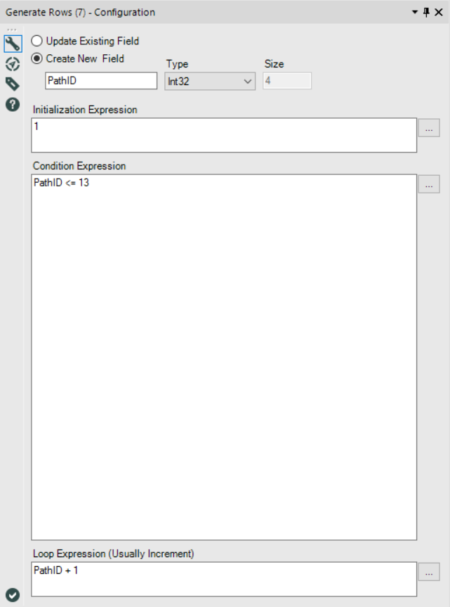
We want PathID to start at 1 and go up to 13, so set the initialisation expression to 1, the condition expression to PathID <= 13, and the loop expression to PathID + 1 :
That’ll give us a massive table like this:
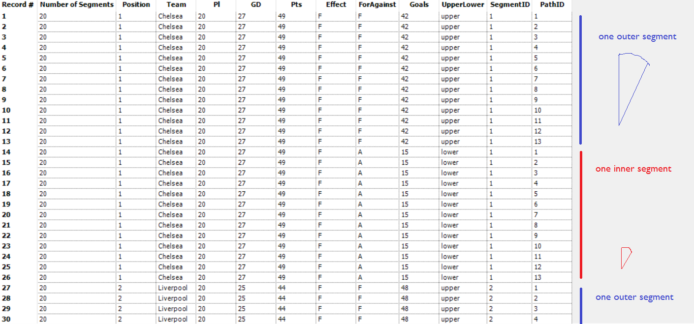
Right. The last thing to do is to calculate the 13 X and Y coördinates for each segment. But that’s not exactly straightforward; we need a load of other calculations first. If you’re not interested in the maths, just drop in a Formula tool like this:
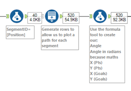
…and pick up when the maths is over.
BEGIN MATHS
This is calculated as follows:
x = radius*cos(angle)
y = radius*sin(angle)
…because maths. The X and Y coördinates on the edge of a circle can be calculated if you know the length of the radius and the size of the angle.
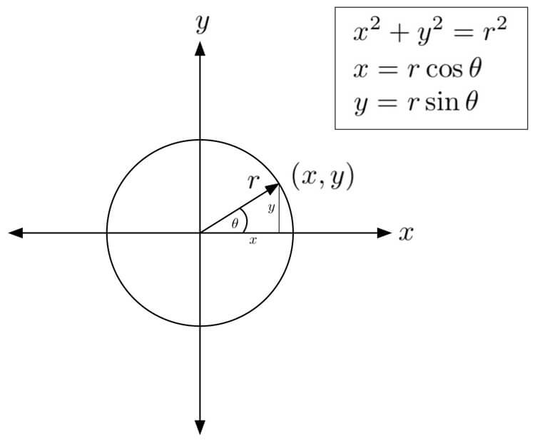
…and since we don’t have the radius or the angle yet, we need to do a few more calculations first.
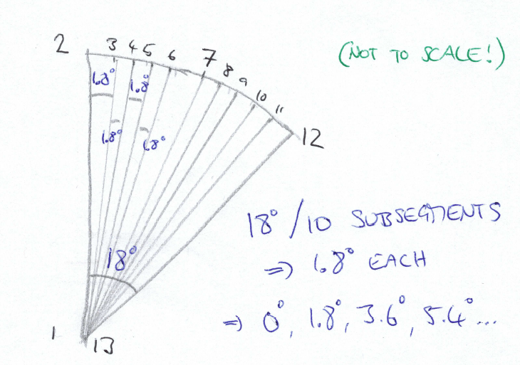
Firstly, the angle. This is going to be different for each segment, and for each point in the segment. Since there’s 20 segments, and 360° in a circle, each segment is 18° wide. The first segment goes from 0° to 18°, the second segment goes from 18° to 36°, and so on. This is the point where I can’t draw things on my laptop, so here’s my own penmanship:
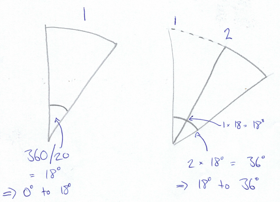
In each segment, there are 13 points. Points 1 and 13 are automatically at (0,0) and therefore have no angle. This leaves 11 points on the outside edge, with 10 subsegments between them. There’s no angle between point 1 and point 2 either, as point 2 is on the same line as point 1. As each segment is 18° wide in total, we can divide that total by the number of subsegments, which is 10. So, the angle between point 2 and point 3 is 1.8°. The angle between point 3 and point 4 is also 1.8°, which means that the angle between point 2 and point 4 is 3.6°… and so on. That means, that each segment looks a bit like this:
END MATHS
Feel free to ignore all that and just stick this in the Formula tool to calculate the angle:
IF [PathID] = 1 or [PathID] = 13 THEN 0
ELSE ((360/[Number of Segments])*([SegmentID]-1)) +
(([PathID]-2)*(360/[Number of Segments])/10)
ENDIF
Now, that’s worked out the angle in degrees. But sadly, this won’t work on its own. To calculate things using angles properly, we need to convert from degrees to radians. That’s pretty much an expression of degrees as a fraction of π (pi), where 360° is 2π, 180° is π, 90° is π/2, and so on.
So, the radians calculation is:
Angle*(PI()/180)
Now we’re getting there. The next thing to decide is whether or not to plot it with the radius as the points measure or the area as the points measure. If you want the proportional radius one, then that’s easy – it’s just the number of points or the number of goals scored/conceded, so you don’t need an extra calculation for working out the X and Y coördinates. However, if you want the proportional area one, then you need to work out the radius length. That calculation is as follows:
SQRT(
([Number of Segments] * [Pts])
/
PI()
)
But why is it that? Again, because maths. The entire area of the circle is π r2., so we want to find that area for each individual segment depending on the points (or goals) a team has. Here’s the maths workthrough:
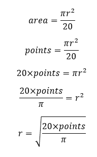
So, if you want to do the proportional area kind of viz, then add this calculation to your Formula tool and call it radius.
Now, finally, we can work out the X and Y coördinates. Remember when I wrote that it was:
x = radius*cos(angle)
y = radius*sin(angle)
…which must feel like ages ago? Well, now we can use that. We already know that the first and last points in the polygon are at (0,0), so we can just set those to 0 automatically. For the other points in the polygon, the calculation is with the trigonometry. So, in your Formula tool, the calculation for the X coördinate is:
IF [PathID] = 1 OR [PathID] = 13 THEN 0 ELSE
COS([Radians])*[Radius]
ENDIF
…and the calculation for the Y coördinate is:
IF [PathID] = 1 OR [PathID] = 13 THEN 0 ELSE
SIN([Radians])*[Radius]
ENDIF
Remember to do these separately for the points measure and the goals measure! My Formula tool looks like this for the proportional radius one:
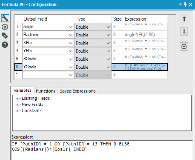
and like this for the proportional area one:
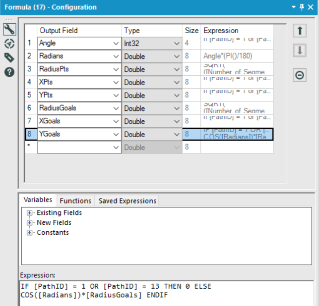
That’s it. Add a browse tool to inspect your creation, save it as a .tde, AND NOW, WE’RE READY TO PLOT IT ALL IN TABLEAU!
(excuse the capslock, I just got really excited that we’re done with the Alteryx calculations)
In Tableau, this is seriously easy.
Let’s look at the points vizzes first. Drag the AVG value of the X coördinates to the columns shelf and the AVG value of the Y coördinates to the rows shelf. Make sure SegmentID and PathID are dimensions, and drag SegmentID to detail and PathID to path. Boom. All you need to do now is colour-code your segments (if you like the Viridis colours I’ve got here, you can find them here):
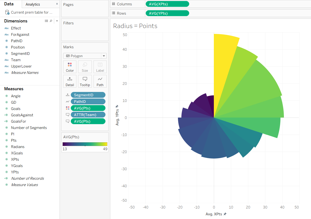
If you’re doing the area viz, the approach is exactly the same:
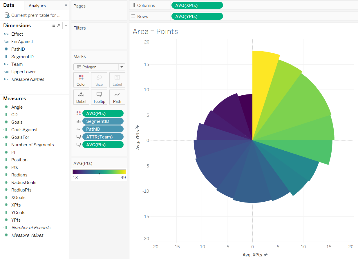
Now let’s move onto the goal difference plots. These are a little more complicated in Tableau.
Once again, drag the AVG value of the X coördinates to the columns shelf and the AVG value of the Y coördinates to the rows shelf. Make sure SegmentID and PathID are dimensions, and drag SegmentID to detail and PathID to path. Then, remember those Effect and UpperLower fields we calculated in Alteryx? This is where those come in handy. Drag the Effect field to colour. Then drag the UpperLower field to detail, and change that to colour by clicking the little detail icon next to the blue pill. Make sure that the UpperLower pill comes before Effect in the order of the colours. At this point, you’ll see four different colours, which is fine. Just edit the colours so that the two fields beginning with “lower” are all in white, and then choose two different colours for the overall F and A effect:
The same thing works for the area viz, but this time, it doesn’t matter whether you use SUM or AVG for the coördinates:
Finally, you see that I’ve got a calculated field for GoalsFor and GoalsAgainst on the tooltip? These are calculated as follows:
GoalsFor:
INT(2 * {FIXED [Team] : AVG(IF [ForAgainst] = "F" THEN [Goals] ELSE 0 END)})
GoalsAgainst:
INT(2 * {FIXED [Team] : AVG(IF [ForAgainst] = "A" THEN [Goals] ELSE 0 END)})
That’s about it! Have fun playing around. Download the Alteryx workflow here and the Tableau (10.1) workbooks here (proportional radius version) and here (proportional area version).
