Introducing control charts
Why use a control chart?
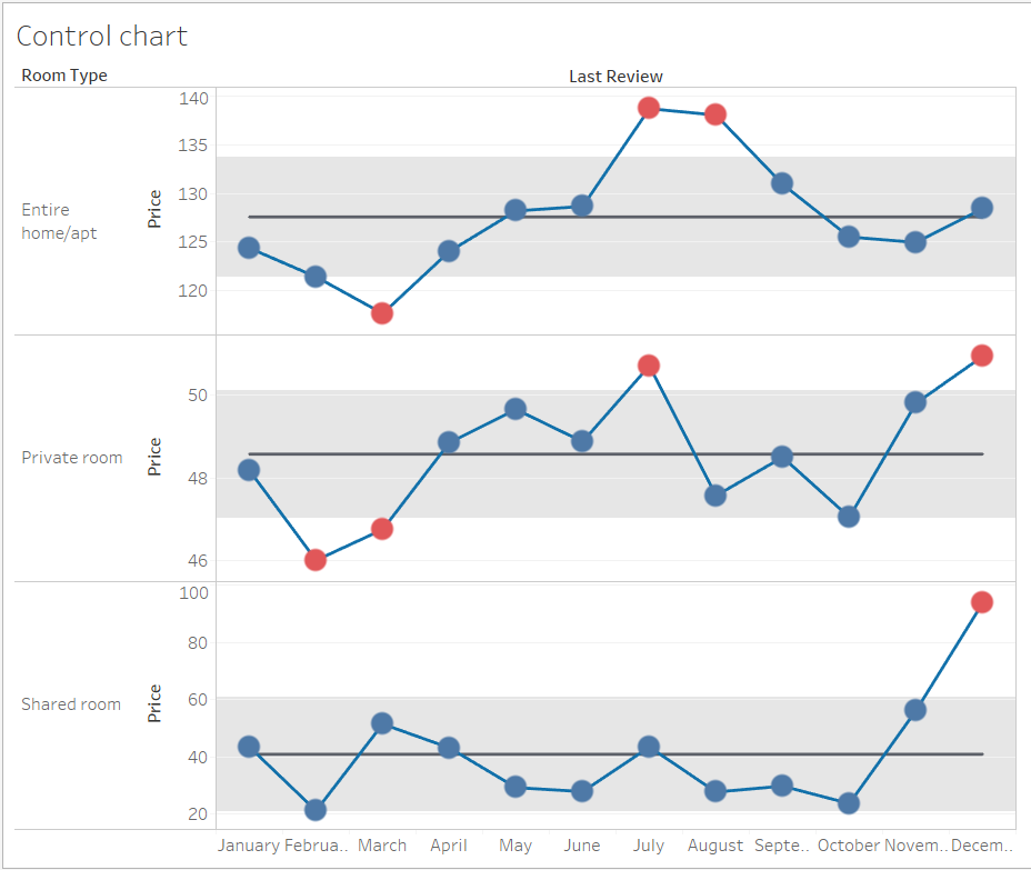
Control charts are a great way to quickly visualise outliers or significant values in an analysis – typically those involving time-series data. For context, its origins lie in the need to control for quality and variations in manufacturing processes.
What are the core components of a control chart?
- Data points that are usually aggregated and connected in a line chart since control charts usually involve time-series data.
- The mean average (line) of the points
- Upper and lower control limits. These lines delimit areas considered in or out of control. Someone looking at the chart can easily spot which points are within or outside of these bands. Typically, the standard deviation of the mean (SD) is used to determine the control limits (this could be an expression of the standard deviation such as 2.SD for e.g.)
Building a control chart
Onto the how-to bit. To illustrate this blog, I have used a dataset from AirBnb that includes prices for listings over several years in London, categorised by type (entire home / private room / shared room). I wanted to examine variations in average prices over the course of a calendar year for all 3 room types.
- Let’s first set up the chart without the additional components of a control chart. Drag and drop the relevant measures onto the shelf. Let’s highlight individual points with circles by turning this into a dual axis chart. Drag the avg price measure onto the right-hand side of the chart until you can see a single green ruler. This indicates that you are about to create a dual axis. Then modify the mark type of the second axis to circles.
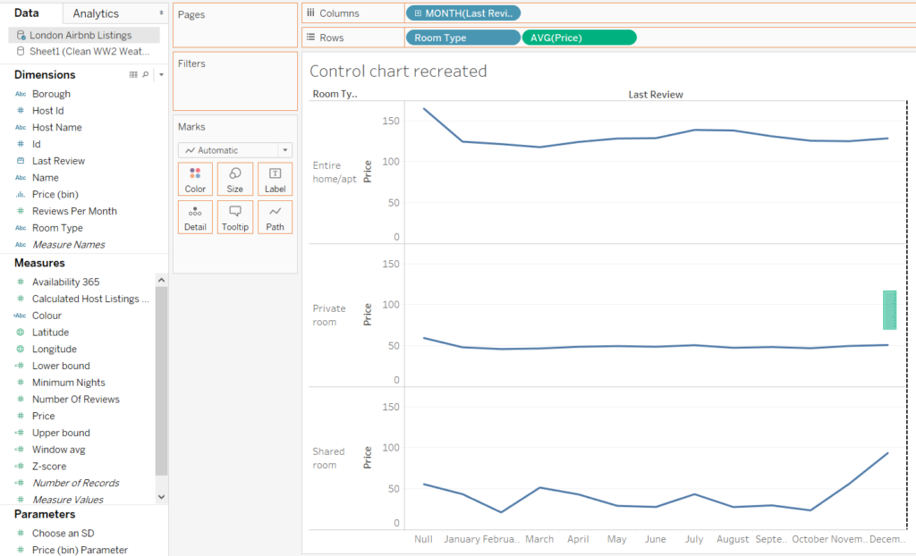
- Now let’s add the average line. You will need to use a window calculation in order to generate an average across the time period (as opposed to being for a particular month). This window calculation will average the values across every month (in a given pane). Drag this newly created measure onto the left side of the chart until you see two rulers – this will create a multiple axis chart (allowing you to plot multiple measures onto a single chart).
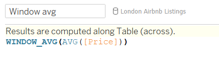
- We now need to add the upper and lower control limits. Again, this will require us to create calculated fields and to use window calcs. Although you can certainly choose to determine your limits differently, it is common practice to use the standard deviation of the mean. The window calc here is estimating the SD across all months (in the same way as the average in step 2 did).

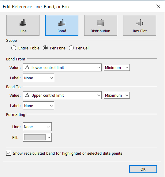
- You can display the limits in a couple of ways. I’m going to add the lines to the chart while also using them to create a banded area in the control area. To do this, drag the two newly created measures onto the chart. You should then have both new lines appearing in each pane. Then go to the Analytics tab and add a reference band. You can then designate the upper and lower lines as delimiters. However, for these options to appear in the dropdown, you will need to ensure that these measures have been added as details in the shelf. (I have suffered much anguish in the past not knowing this!)
- You should now have something resembling the picture below.
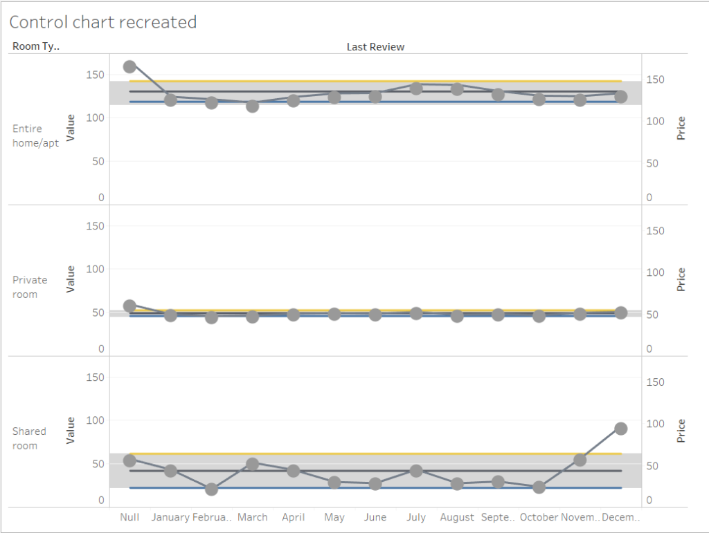 All the components are there, but we still need to make it pretty. Here are a few things you could do:
- Exclude null values from the view – they’re not telling us anything here.
- Modify the axis settings to allow the rows to have different ranges and untick the ‘Include zero’ setting. This move can be problematic at times from a best practice and data ethics perspective, but in the context of this problem it will allow us to view relative peaks and troughs more clearly.
- Ensure the dual axis is synchronised – otherwise you may find you have floating circles.
- Choose more appropriate colours
- Amend circle size
Some optional extras
There’s more we could do to improve the look and functionality of this control chart. Two things come to mind first:
- Allowing the user to determine the control limits
- Highlighting any points that are ‘out of control’
Setting up a parameter to determine control limits
Depending on the situation, it might be appropriate to alter the control limits. For this reason, it’s also helpful to give the user the power to modify the bounds using a parameter. Assuming we are still working from the standard deviation as a base, we can modify the two limit calculated fields to include reference to a parameter.
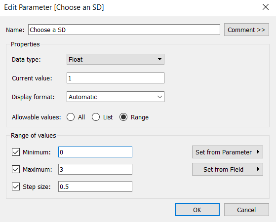
- First, set up a parameter specifying some options for the user. It makes sense to be a little prescriptive in the options to make selection easier. I want to allow the user to choose a SD deviation between 0 (to hide the limits) and 3 with a step of 0.5. They will therefore have 7 options to choose from.
- Next, you will need to modify the calculated fields so that the standard deviation is multiplied be the number selected in the parameter.

Highlighting points that are out of control
I want to colour all the points that are outside of the control limits.
- Create a calculated field with a simple boolean logic that tests whether a point is above or below the limits. You can also use an IF statement if you want to specify names for the outcomes.
- Drag the newly created dimension to the colour shelf for the circles and pick appropriate colours.
