I am ill. Disgustingly ill. I went home early as the rest of DSX wanted me as far from them as possible. So all in all this might not be my best world, but I’m posting it up anyway!
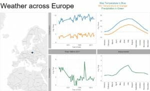
Andy gave us the task of visualising data from the National Weather Service’s Cooperative Observer Program. There’s a lot of data available on their website but it varies wildly on quality and time span from monitoring station to monitoring station. I cut down the complications by focusing on capital cities in Europe (after 1955), I got a fair few but some capitals, such as Helsinki, lacked monitoring stations. I visualised the annual trends and the trend over the years of max/min temperature and precipitation (however some stations lacked temperature readings).
also no alteryx today 🙁