


One of the big mistakes people may make when they build dashboards is that they are not accessible for everyone.
One of the key things we can do is make visualisations be well read on a screen reader.
To make things more accessible, we should add a KPI to the title and add a caption to what the chart is showing. This is because a screen reader cannot read what is being visualised. The narrator will say 'Data Visualisation' and move on without saying anything else.
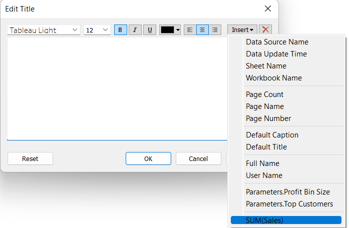
To start with, let's open Superstore Dataset. In a new sheet, we can add sum of sales onto detail. Then, we need to click on the title and edit it. In a top right corner, there's a button to insert a field - here we need to select Sum of Sales. It should look like this:
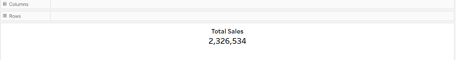
Once we have selected that, it will show the sum of sales throughout the whole dataset.
To make it tidy, we just need to add the title to the KPI which in this case we can call Total Sales. The view should look like this:
Now we are guaranteed that the screen reader will read the title and will be able to say what is in it.
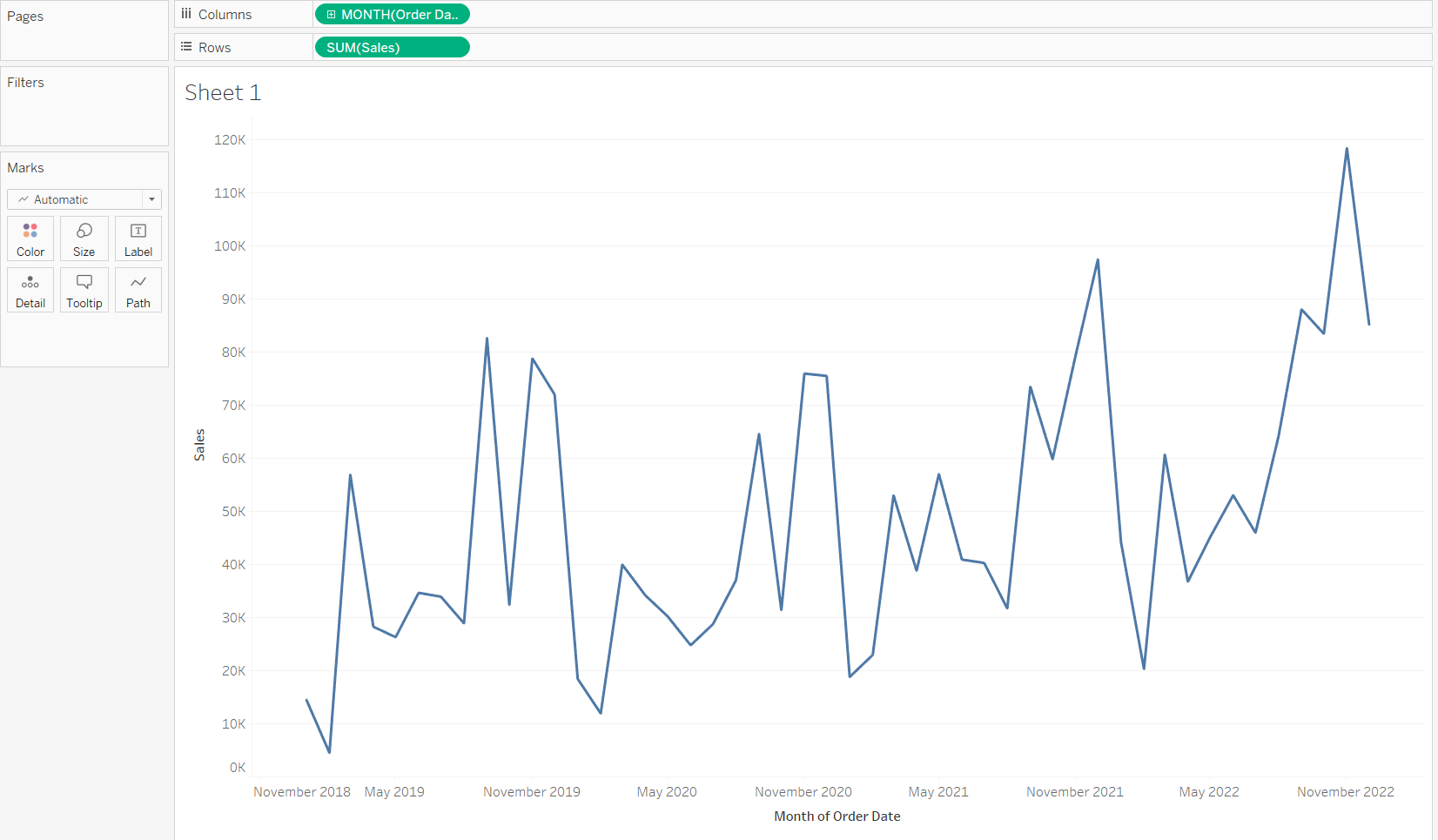
For the caption part, let's create a new sheet. Let's add sum of sales onto rows and continuous month onto columns. Your view should look like this:
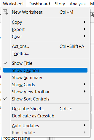
Then, if we go to the top left corner of the screen and select Worksheet, and navigate to Show Caption like this:
This will generate automatic caption that looks like this:
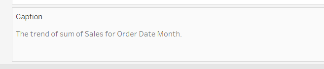
This is not convenient for the screen reader as it will read that and not show much insight so you should write your own caption.
Hope this helps to make dashboards more accessible!