Week 8 Tableau training had us learning about Set and Parameter Actions. One of the charts that we came across was a Show/Hide Marks chart and we will show how to recreate that in a number of steps.
We were using the Sample - Superstore data in Tableau for this chart.
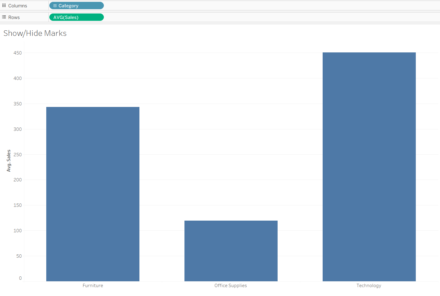
Step 1: Put Category in the Column shelf and Right-Click drag Sales to the Row shelf and select Avg(Sales).
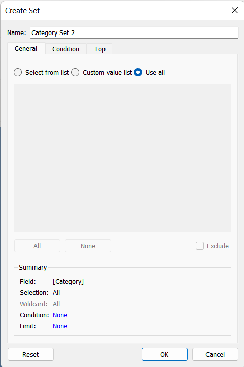
Step 2: Create a set using the dimension that we added to the columns shelf which is Category. You can create a set from right-clicking on the dimension in the dimensions shelf and then clicking create > set. Make sure you name your set in a way that you can remember. Click 'Use All' to use all of the categories.
Step 3: Create a calculated field called Sales (Underlying) that looks like the photo below (we use the set we created in the previous step) and add it to the columns shelf:

After this step, your sheet should look like this:
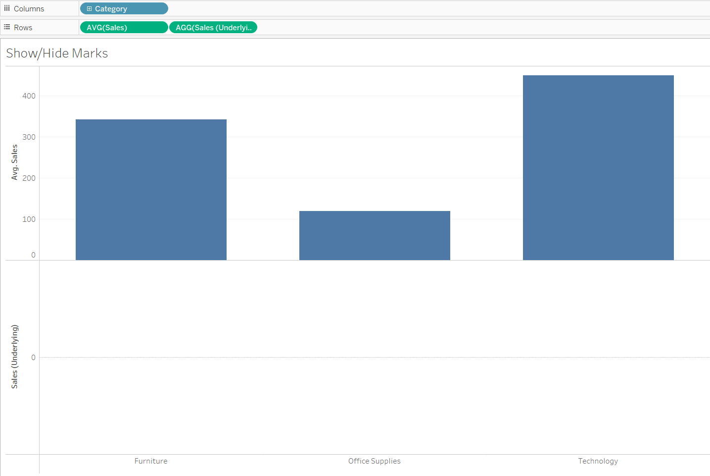
Step 4: Add the level of detail we want to look into. In this case, add Order ID to detail on the AGG(Sales (Underlying)) Marks card.
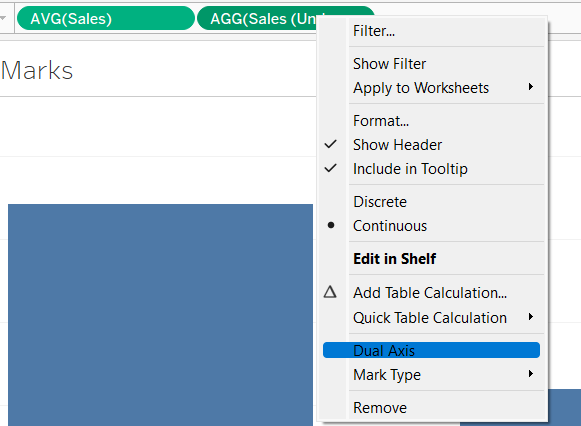
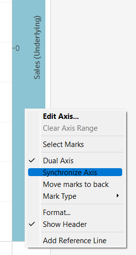
Step 5: Right-click on the Sales(Underlying) in the rows shelf and select Dual Axis and synchronise your axis by right clicking on the axis on the right hand side (with the label named Sales (Underlying)). As a final part to this step, right-click on the Null indicator in the bottom right corner of the chart and select to hide it.
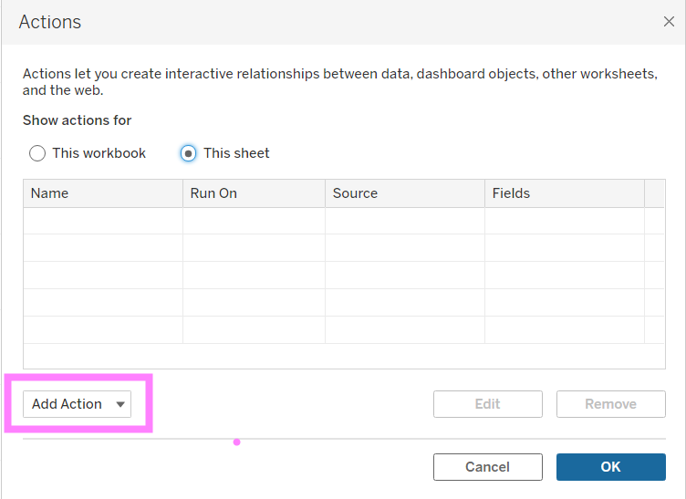
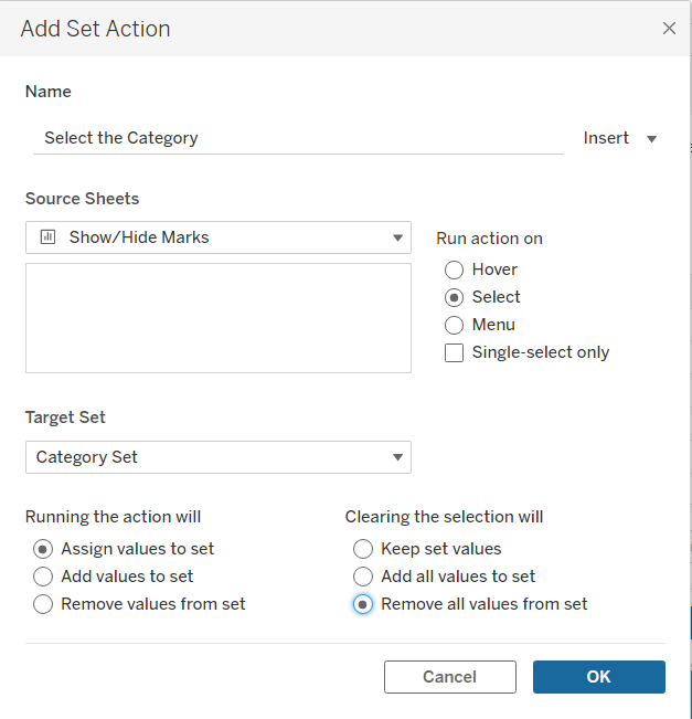
Step 6: Go to the Worksheet > Actions & select This Sheet. Then click on Add Action and configure the action. To configure it, you need to pick a name, a set that you are getting your values from and how the action will be ran. This is how we have configured it in this instance:
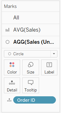
Step 7: Make sure that your AVG(Sales) and your AGG(Sales(Underlying)) marks cards are set to Circle like this:
Step 8: Test it out! See if it works! When you click on a bar, i.e. a category your sheet should look something like this:
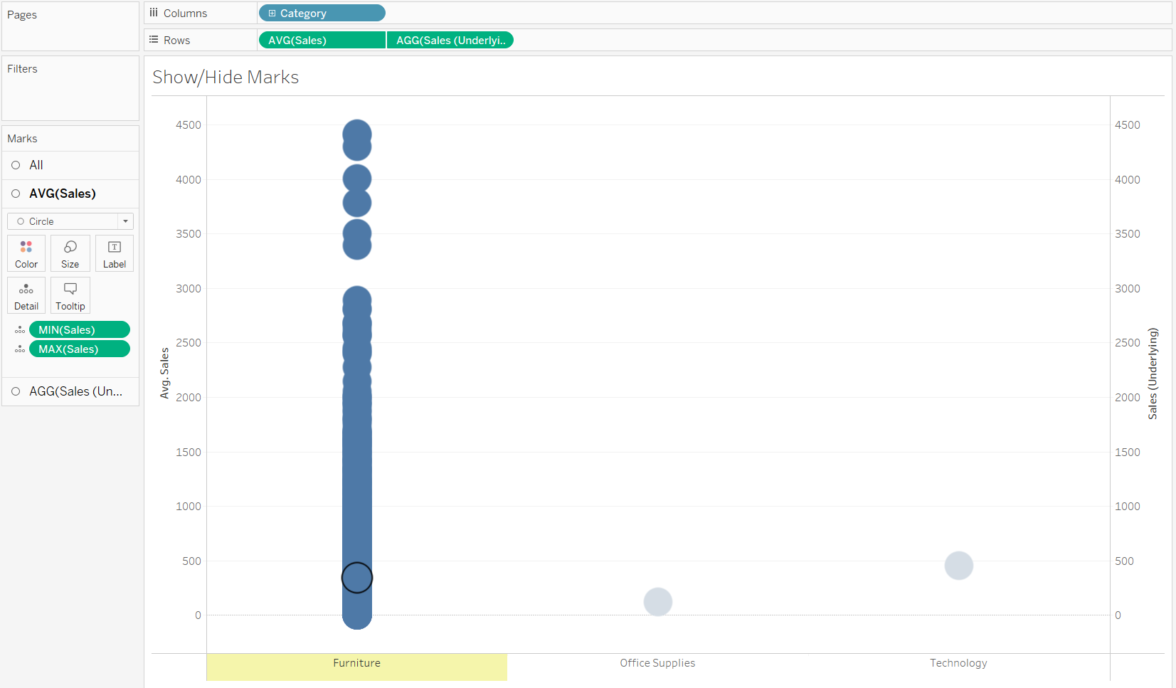
Step 9: Add Min(Sales) and Max(Sales) by right-clicking and dragging to the detail part on the AVG(Sales) marks card. Then, click on the analytics pane and drag a Reference Band to AVG(Sales) and Per Cell view. Then, use the Min(Sales) and Max(Sales) for the minimum and maximum bands and configure the lines however you prefer.
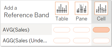
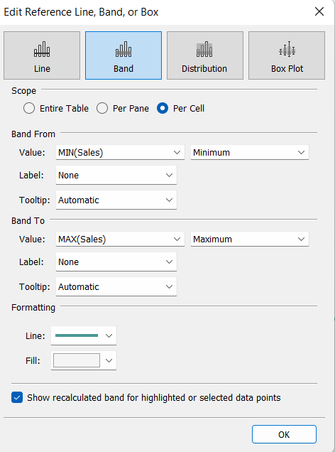
Step 10: To finish, format the chart to add different colours and other things.
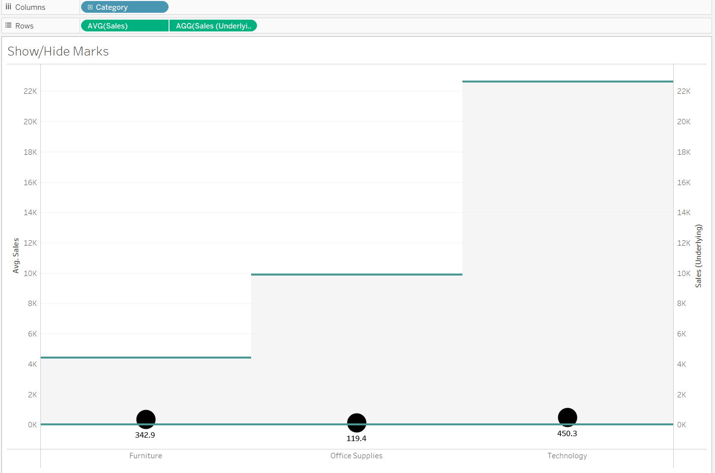
And voila! Here's the final result:
Hope this helps!
