


Week 5 has been quite busy and overwhelming so no blogs have been written but using what we have learned in week 5, we will see how to use containers to create a design of your choice. So let's get into it!
What are containers and how you would use them is two questions you might ask yourself, so let's answer them.
The containers are rectangular object in which you can order your items around the dashboard. This way, you can group different items together and make sure they are sitting together the way you want them to be. There are two types of containers: vertical and horizonal. A vertical container allows you to set up your dashboard items by stacking and horizonal container allows you to set up your dashboard items sideways.
How to use them part we can answer by creating a mock up of just a basic dashboard. At first, the easiest way to see what you want is to create a drawing to visualise what you want to show in your dashboard. Here's an example mock up:
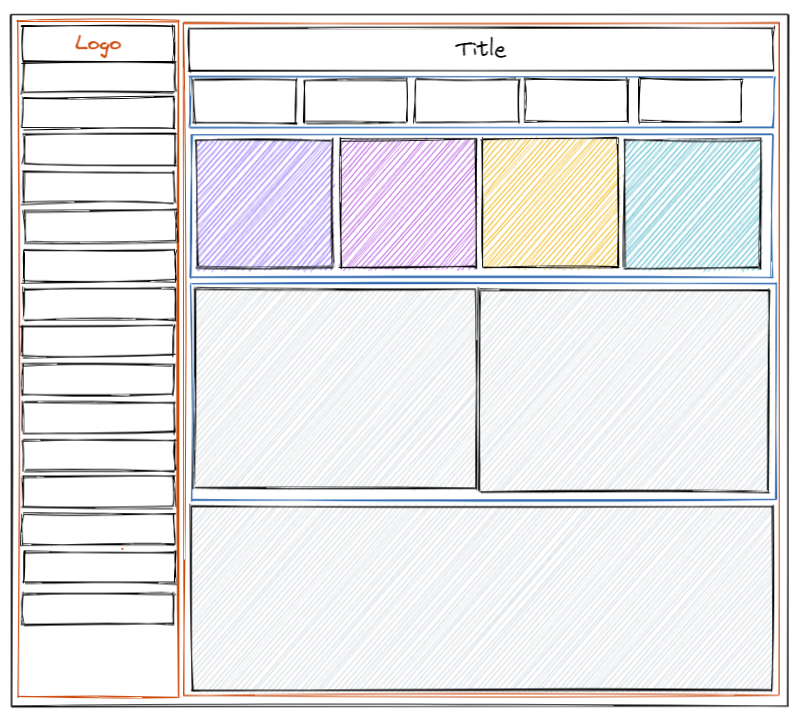
Orange containers are the vertical containers and the blue containers are the horizontal containers.
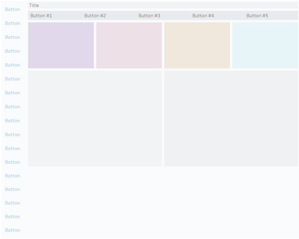
Using this, adding all of the containers tiled (not floating) on Tableau can return this result:
To make sure everything is done the way you want it to, you can check the 'Item Hierarchy' in the Layout tab to check how each container is made.
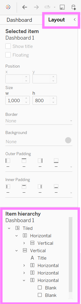
In this tab you can also change the colour of the background of each container, add padding and add a border colour if you want to.
This is how I replicated a dashboard I have selected and it was fun.
If you try to do it yourself, have fun!