


Before I began working on my initial viz for the application process, I had never opened Tableau before. I had never even seen it before. All I knew about it was that it was a name that would pop up every so often as I went through my grueling job search earlier this year. I had some minimal experience with Power BI so I had a vague understanding of what it could do, but sitting down to actually build something myself was a different experience entirely. Intimidating was the right word for it, but so was exciting.
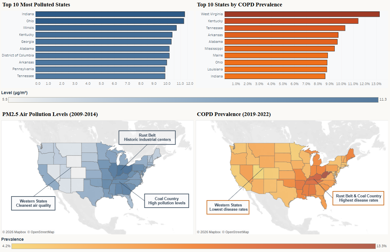
The topic I chose was one I genuinely cared about. I wanted to look at air pollution levels across 48 states and DC and see whether exposure to PM2.5, a fine particulate matter linked to industrial activity, correlated with chronic disease rates a decade later. This meant looking at COPD, heart disease, stroke, and asthma (which was brought in as a negative control variable). The idea was that environmental damage does not show up immediately. It shows up ten years later in a doctor's office.
That was the story I wanted to tell. Figuring out how to tell it in Tableau was another matter.
The first two weeks I spent on the viz were a crash course in everything at once: learning the tool, cleaning the data, deciding which visuals actually served the story and which ones just looked interesting. That last part was harder than I expected. There is a version of this dashboard that has too much going on, and I built it.
The moment things clicked was when I made the map. I was watching tutorials, trying to figure out how to shade states by their pollution levels, and when it finally rendered that was it. It was the moment I knew this was the space for me. Data has always felt important, but seeing it rendered visually, seeing it take on color and shape and geography, made me realize that in this field I could make complex information into something digestible. I had never made anything like it before and it made me realize that data can be beautiful, and that I could be the one to make it.
Then came the feedback email. Eight points of specific, detailed critique. Some people might have found that demoralizing. I found it energizing. They were not telling me it was bad. They were showing me exactly how to make it better, which told me they saw something worth improving. I fixed what I could, went further where I thought it made sense, and submitted a revised version I was genuinely proud of.
Looking at it now, after just two weeks at The Data School, I can already see things I would do differently. And I am certain that if you ask me the same question in four months, I will say the exact same thing again.