Control charts allow us to see when a measure if within or outside a selected range. The upper and lower bands are often a number of standard deviations above or below the mean. This can highlight marks that are abnormally high or low.

This involves multiple techniques including parameters and table calculations.
1) Create an average table calculation: WINDOW_AVG(SUM([Sales]))

This takes the average of the sum of sales based on what is currently in the chart and will not consider any measures or dimensions that are filtered out of the visualization.
2) Create a standard deviation table calculation: WINDOW_STDEV(SUM([Sales]))

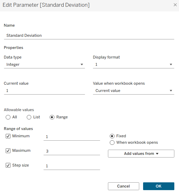
3) Create a parameter so the viewer can interactively select how many standard deviations above or below the mean their upper and lower band are (remember to right click on the parameter and click show parameter).

4) Calculate the upper band and lower band based on the selected number of standard deviations in the parameter.


5) Create a calculation using an IF statement to colour the dots depending on if they are within the upper and lower bands. Right click on the dot colour pill and convert to discrete.

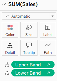
6) Drag a date field to columns, choose continuous date (my example uses month), and drag your measure onto rows twice to create two marks card. Right click on the lower axis to change to a dual axis. Drag lower band and upper band to detail on the 'all' marks card.
First Marks Card: select line

Second Marks Card: drag 'dot colour' calculation to colour and select circle

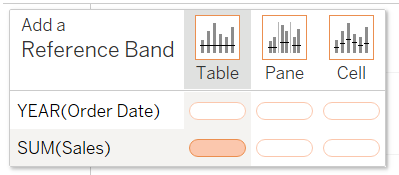
7) In the analytics pane, drag a reference band onto the measure across the table

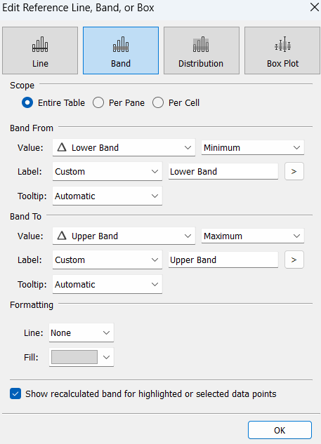
Select the lower and upper band calculations as your minimum and maximum of the reference band.

Drag an average line onto the chart, choosing across the table.
Now you have a control chart where you can dynamically select the upper and lower bands!
