This post will explain how I built a stacked radial chart. Today is day 4 of dashboard week and I saw this chart online and was inspired to try and build it myself. We have been given a dataset about boybands (this blog post will illustrate how to build this chart, however this dataset isn't the most relevant for this type of chart). In this chart each segment represents a boyband, and each ring represents a different boolean (true or false) metric.
This chart type would be most powerful for a dataset that has metrics that represent conditions a category in a dimension field has met, this graph can be used to show how many conditions different members of the dimension have met and therefore either show the best dimension. Alternatively, if you have other data indicating which of the categories in a dimension field has been the most successful this chart can indicate which combination of conditions leads to success.
Preparing the Data
1) Your main dataset needs to have a column where each row is a segment (boyband), a column called metric name which will be the rings (e.g. song in the top 10?) and a column called metric value (this column will need to contain 2 values e.g. 1 and 0, or true/false). If you have a different column for each metric then do a column to rows pivot (this may be easiest in tableau prep if you are working with calculated fields).
2) For the radial chart information, go to this Will Sutton's app that he built using R-shinny and enter the number of rings and segments you need and download the file.
3) In tableau, join the radial chart dataset onto the original dataset. You need to do an inner join and join the ring column from the radial dataset to a join calculation. In the join calculation, you need to write as many if statements as rings that you need. In my case I needed 6 rings, and I wrote this calculation:
if [Metric] = 'Fast Pop Music' then 1
elseif [Metric] = 'Featuring Artist On Hit' then 2
elseif [Metric] = 'In top 10?' then 3
elseif [Metric] = 'More than 4 members ' then 4
ELSEIF [Metric] = 'Plays Instruments' then 5
ELSEIF [Metric] = 'Post 2000' then 6
End
The second join calculation is from the segment column in the radial dataset to a join calculation from the main dataset. In the join calculation, you need to write as many if statements as rings that you need. In my case I needed 8 segments, and I wrote this calculation:
if [Band] = '5 Seconds of Summer' then 1
elseif [Band] = 'Big Time Rush' then 2
elseif [Band] = 'Jonas Brothers' then 3
elseif [Band] = 'NSYNC' THEN 4
elseif [Band] = 'One Direction' then 5
elseif [Band] = 'Take That' then 6
elseif [Band] = 'The Wanted' then 7
elseif [Band] = 'Westlife' then 8
End
Building the Chart
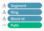
Drag Y to columns, change it to continuous dimension.
Drag X to rows, change it to continuous dimension.

Drag Ring to detail, change it to discrete dimension.
Drag Block Id to detail, change it to discrete dimension.
Drag Segment to detail, change it to discrete dimension.

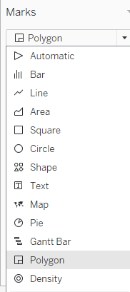
Select Polygon on the Marks Card and drag path to path, change it to continuous dimension.

Formatting the Chart
To colour each ring separately, and within each ring having each segment coloured if it is true (or meets the metric condition) and blank if it is false, I created a calculated field which assigned a string to each unique combination of metric name and metric value (if we had more than a day for this dashboard week I would have investigated a less manual method of colouring):
IF [Metric] = 'Post 2000' AND [Metric Value] = 1 THEN 'Post 2000'
elseif [Metric] = 'Post 2000' AND [Metric Value] = 0 THEN 'Pre 2000'
elseif [Metric] = 'Plays Instruments' AND [Metric Value] = 1 THEN 'Plays Instrument'
elseif [Metric] = 'Plays Instruments' AND [Metric Value] = 0 THEN 'No Instrument'
elseif [Metric] = 'Fast Pop Music' AND [Metric Value] = 1 THEN 'Pop'
elseif [Metric] = 'Fast Pop Music' AND [Metric Value] = 0 THEN 'Slow'
elseif [Metric] = 'Featuring Artist On Hit' AND [Metric Value] = 1 THEN 'Feature'
elseif [Metric] = 'Featuring Artist On Hit' AND [Metric Value] = 0 THEN 'No Feature'
elseif [Metric] = 'In top 10?' AND [Metric Value] = 1 THEN 'Top 10'
elseif [Metric] = 'In top 10?' AND [Metric Value] = 0 THEN 'Not Top 10'
elseif [Metric] = 'More than 4 members ' AND [Metric Value] = 1 THEN '5+ Members'
elseif [Metric] = 'More than 4 members ' AND [Metric Value] = 0 THEN '4 or Less'
end
Drag this calculated field to colour and select the colours you would like.
Legend Formatting:
If you would like to add a legend to the middle of chart as i have, then float the legend over the top of the chart. Furthermore, exclude the false values and then these will disappear from the chart and the legend.
