


The final day of dashboard week and that means the final day of training too!
Today's dashboard was on the world happiness report where every country is measured amongst several metrics to see how 'happy' they are as a whole.
As we only have 3~ hours to complete this there is no data prep just a bit of smart scoping and planning and all should go well.
After doing some research on what continent is considered the happiest and saddest I decided to dive deeper into that and use that as the focus of my dashboard. Europe is allegedly the happiest and Africa the saddest.
Here is my plan:
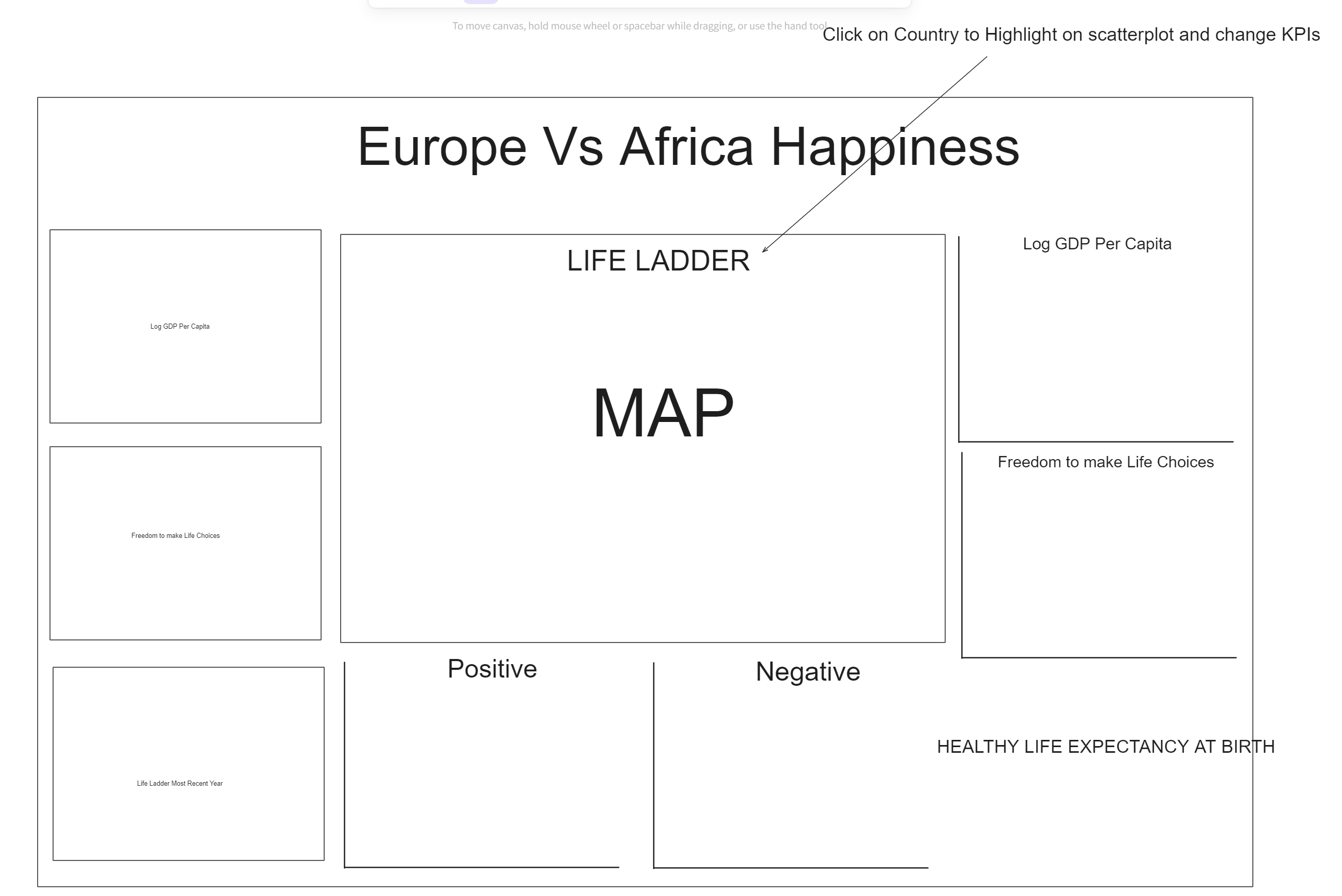
A good starting point but you will see from the final product that I changed and moved stuff around.
Here is my final product:
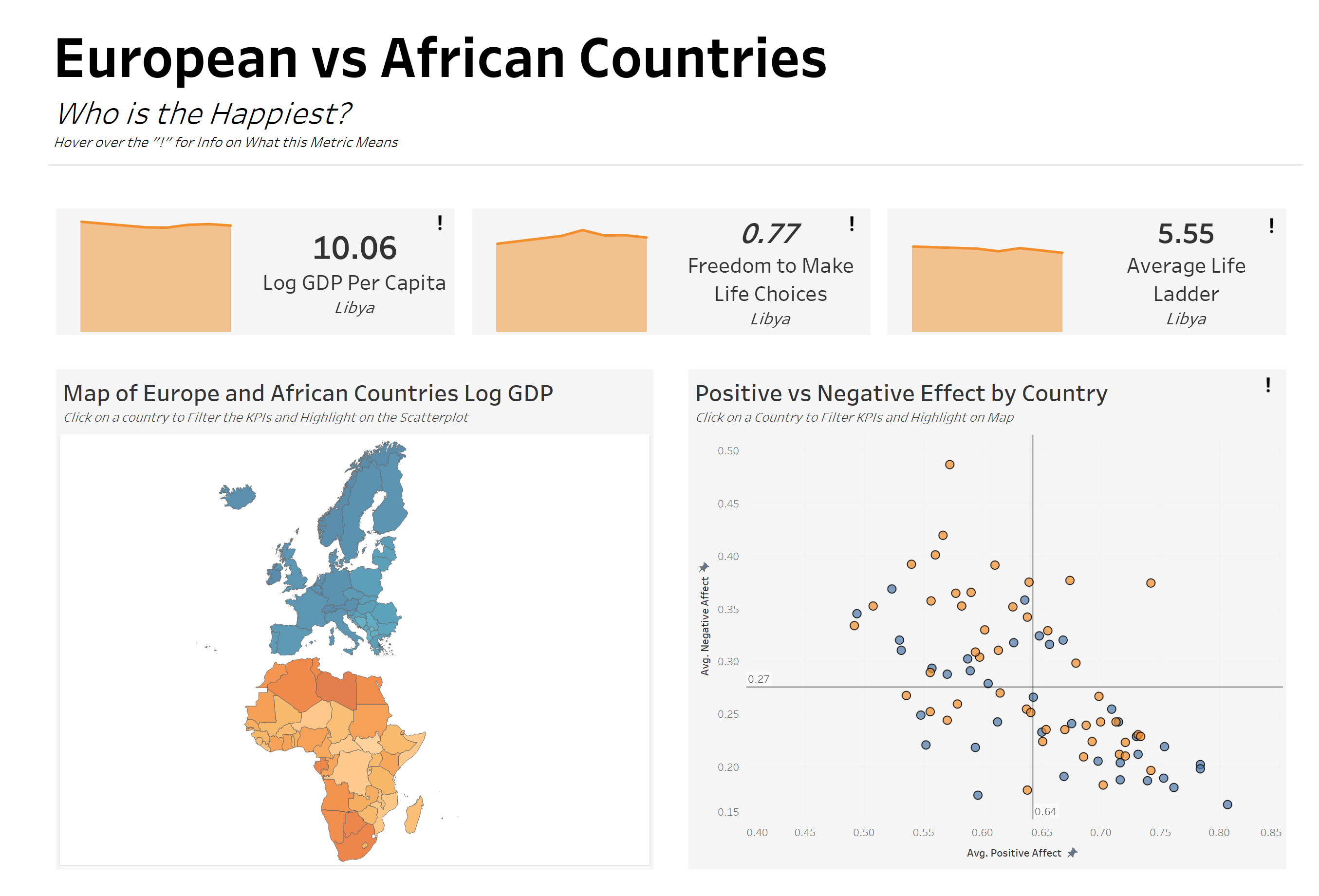
Very happy with what I have produced and a good mix of explanatory and exploratory.
Functionality:
- Hover over a "!" and get info on what that metric means
- Click on a country on the map and the KPIs will filter to that country and also be highlighted on the right hand-side scatterplot
- Similarly, click on a country on the scatterplot and it will be highlighted on the map and KPIs will be filtered.
As a quick summary for this week, it has not been as bad as I thought it would be and was very very enjoyable. Lots of fun datasets, planning, changes of scope etc. This weeks biggest test is how much do you think you can do in this limited timeframe and trying to balance optimism and realism.