


Today's dashboarding task was using Power BI as our tool rather than our more comfortable Tableau. As I knew my limitations with Power BI already this put me in a good position to be smart with my scoping.
The dataset we were given was on Eurovision results. As I wanted a narrow scope I went straight online to see what I could find out about the previous competitions for some inspiration. First thing that came to mind was what country had won the most? When I discovered Ireland had won seven times I went straight to creating my wireframe alongside the fields provided. We had data on more subjective metrics such as 'danceability' and 'happiness'.
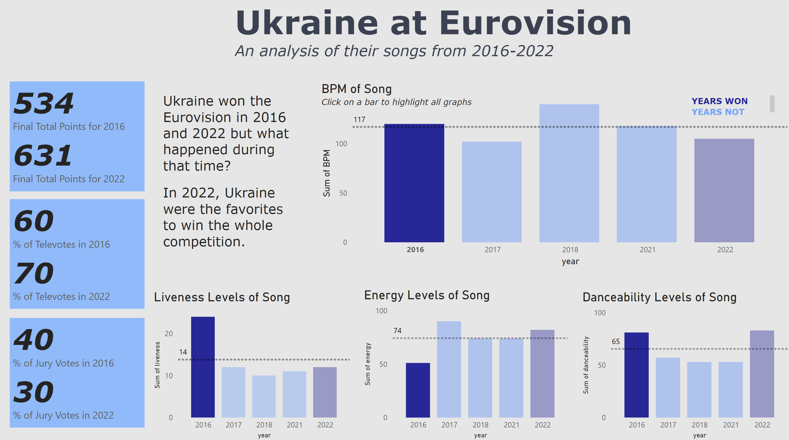
The first problem. I went into the dataset to find all the competitions that Ireland had won and I did not have the data for it across all datasets. It was time for a rescope. Seeing that the results datasets go back to 2016 I went to check what countries won in that timeframe, lucky for me Ukraine had won in 2016 and 2022. Perfect, I can analyse their two successful years and what happened in between to see if their songs had any attributes that aided their success.
Now that I knew what I wanted to do it on, it was time to be humble and realistic as I cannot expect myself to achieve the same level of work in this timeframe with a tool I am not as familiar with. I went the basic route, had my KPIs, a main bar chart and 3 supporting bar charts that covered some metrics over the years I am analysing. Here is the final product.
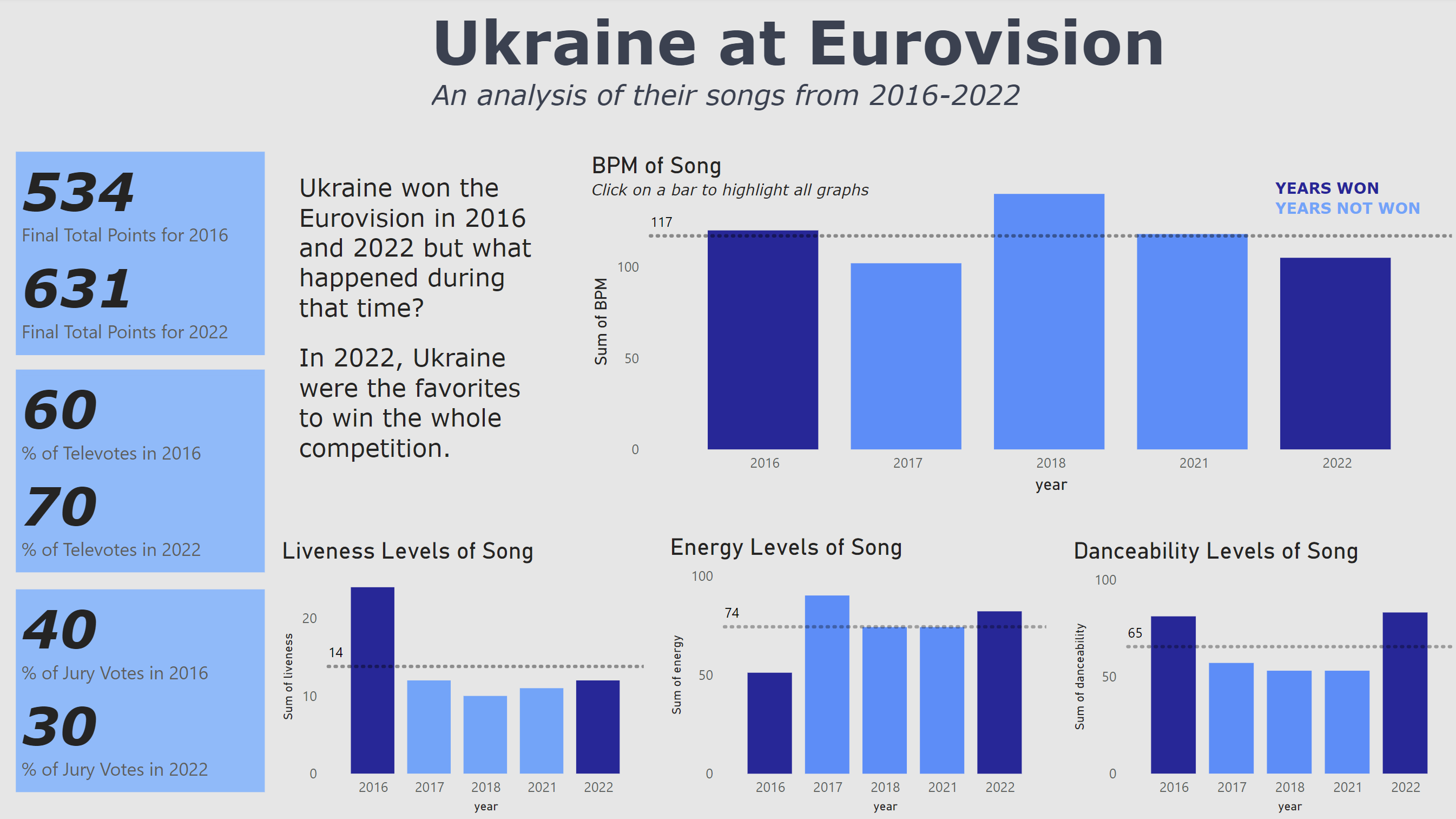
It is not as much as I would liked to have done but I am happy with my scoping for today's project alongside some minor interactivity. If you click on a bar it will highlight the corresponding bars in the other charts. Simple yet effective. (see below for showcase)
Thank you reading! One more day to go!