


Today's Dashboard Week Project was an interesting one....
We were given a link to an API that has NBA data going back decades. As my previous experience with APIs gives me mixed emotions I approached this carefully. Thankfully, the API documentation was fairly self explanatory, the only issue came from you only being allowed to call 60 rows a minute. This caused me to change my scope from analysing an entire teams performance to a single player in a season. I am not too familiar with NBA which led me to Google to find out what some of the best seasons were. The first result - Golden State Warriors' legendary run in the 2015 season. Perfect, I will do with that.
Back to the APIs, because a season in the NBA has 82 games in regular season I only needed to make 2 calls which caused no issues when calling APIs through Alteryx and using the beautiful tool that is JSON Parse (a real life and time saver).
Once I had my data it was straight to excalidraw where I planned out my dashboard to a decent level, not as detailed as I usually do but I wanted to get stuck into building charts.
My Wireframe/Plan:
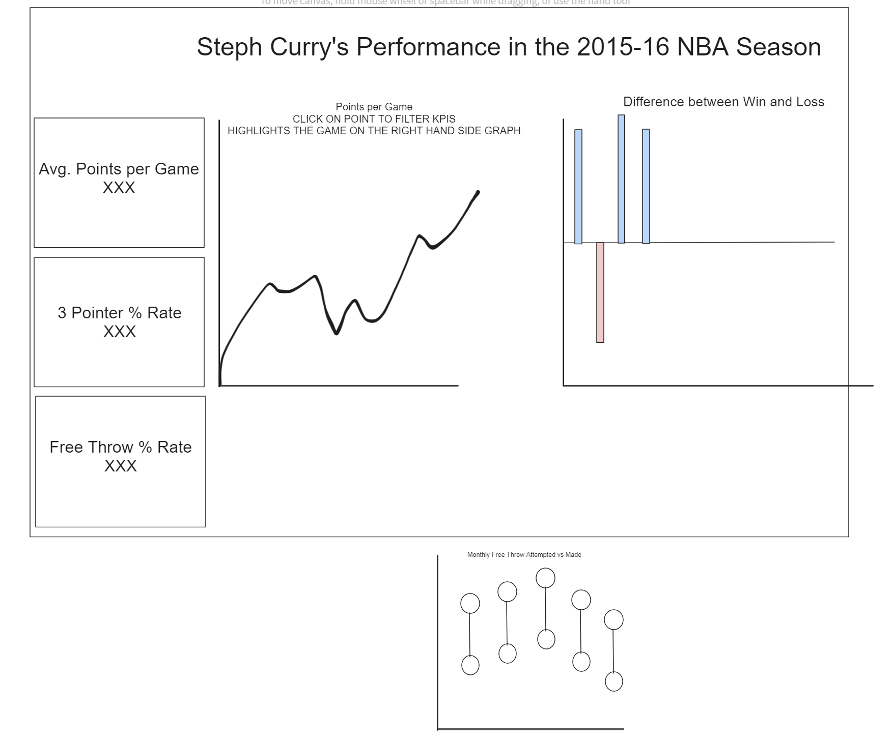
As you can see, I had a DECENTLY good idea of what I wanted to show and had to ask a few colleagues on what stats are important when analysing a basketball player's performance.
ON TO THE FINAL PRODUCT!
Final Product:
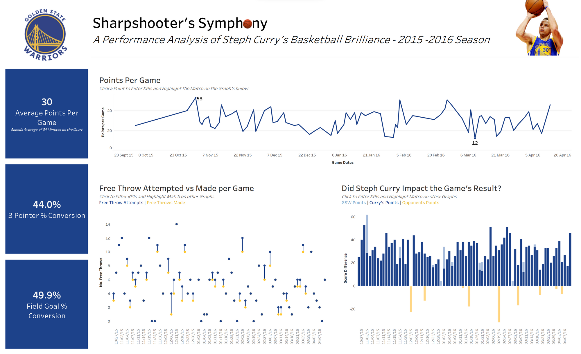
This is the my final dashboard! Very happy with what I produced today and solid planning/scope change when I realised the issue calling the API this morning.
Let me run you through the interactivity:
- Click on a line on the "Points per Game" chart to filter the KPIs to that specific game and highlight the game on the "Free Throw" and "Steph Curry Impact" Graph.
- Click on a circle/line on the "Free Throw" chart to filter the KPIs to that specific game and highlight the game on the "Points per Game" and "Steph Curry Impact" Graph.
- Click on a bar on the "Steph Curry Impact" chart to filter the KPIs to that specific game and highlight the game on the "Points per Game" and "Free Throw" Graph.
Thank you for reading! Here is a link to my Tableau Public to see my dashboard.