


Scaffolding data is a technique used to fill in missing pieces of data from a dataset. Much like real life scaffolding in construction sites, it provides the framework for someone to repair an incomplete structure. When completed, a scaffolded dataset can be analyzed without having to worry about inaccurate or empty areas.
I'm going to give an example of a dataset that could benefit from data scaffolding, and walk through the steps taken in Tableau Prep to fully complete it.
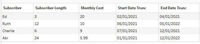
To start, we have a dataset with only 4 rows of data, each representing a subscriber, how much they pay per month, when they started subscribing, and when they finished. Right now, making a visualization showing profit over time would be impossible. To map out a graph over time, we need to have each month represented as a row in the dataset. This is where scaffolding comes to the rescue!
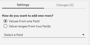
In Tableau Prep, there is helpful tool called "New Rows". Clicking it brings up this screen:
We would like to use this tool to add, for each subscriber, a row for each month they are subscribed. For example, Since Ed is subscribed for 3 months (Feb 2021 to April 2021), we want to have 3 Ed rows in our dataset. We need to have one for February, one for March, and one for April. This will allow us to visualize the whole time period he was subscribed for.
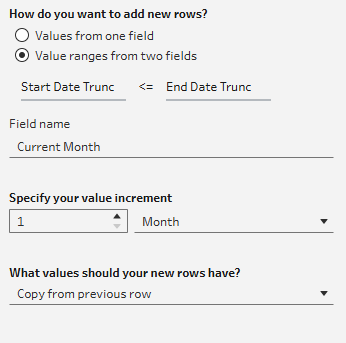
To do this, we want to add a new row for each month that the start date is less or equal to the end date. This tool leaves our data with many new rows. The first 6 now look like:
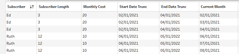
Ed is now correctly represented in 3 different rows, with the "Current Month" column having a date for each month subscribed. Now that we have successfully scaffolded our data, we can bring it into Tableau and visualize it!
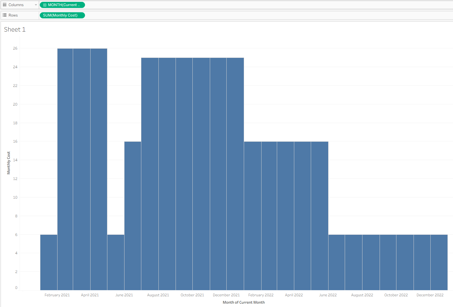
We can use the newly created "Current Month" column as time, and use the "Monthly Cost" to see how much money was being brought in for each of the months.
Mapping out the data over time in this way would have been impossible without the helpful tool of data scaffolding!