Photo by Markus Winkler / Unsplash
Moving over to a new country is always stressful as it comes with a host of challenges one usually isn't accustomed to, which can be both exciting an daunting at different times.
Luckily for me - the job hunting process, which is usually an exceptionally stressful and uncomfortable part of moving, was made noticeably more interesting and interactive by The Information Labs application process. I'm sure most of you reading this are familiar with scrolling endlessly through LinkedIn Jobs and getting fairly discouraged by the amount of applications you throw out, each of which take a substantial amount of time, versus the amount of responses you receive from companies.
Therefore, The Information lab was a breath of fresh air. Right from the start you are able to get stuck in to new software (or fairly familiar in my case) and build a dashboard of your choice. This immediately enables individuals to showcase their level of skill as well as level of interest in the role, as the more time and effort you invest in the dashboard, the greater your chances of a successful application will be.
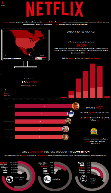
As I was locked down in Norwich for my first few months in the UK, I spent a considerable amount of time on Netflix, but an even larger portion of time trying to decide what to watch (and arguing with my girlfriend and her mother with regards to our selection). Due to this time investment, I decided to find some data on Netflix and get creating..

Above is the dashboard I was able to throw together after many hours of hacking away on Tableau and reading/watching tutorials on how to build certain charts. Looking back, my first mistake was trying to build a certain Viz without actually having the data for it, rather than finding a data set and building a Viz that is suitable. Going forward I'll be looking at the data I have before preemptively creating a dashboard in my head and then trying to find/create the data that I needed.
Throughout the process I was, however, provided really great feedback with regards to my dashboard which was incredibly helpful as well as being a great tool for learning. I was also given really useful sources to use to upskill in Tableau. This just goes to show the level of effort that The Information Lab puts into their applicants.
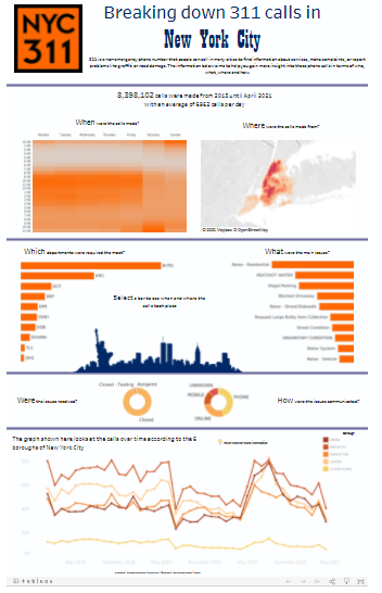
After the initial chat with Andy we were tasked with building a dashboard based on a dataset provided to us. In our case this dataset was concerned with 311 Calls made in New York City. 311 is essentially 911 but for non-emergency things.
This was another great opportunity to practice Tableau and below is my final submission. Is it incredibly complex? No. Does it provide insightful information? kind of. Is it easy on the eyes and pleasant to use? Probably not. The bottom line is it doesn't have to be exceptional, but it should show that you do actually have an interest in data visualization and the applications thereof. Therefore, the way you present your dashboard is really important! Try find interesting things within your data and show it to your audience.

I am now one week in and it's been awesome so far. If you're currently thinking about starting the process of applying, I can can certainly recommend it. Even if you're unsuccessful, you'll still learn a ton along the way.

