Second day of the dashboard week is Alteryx day!
Today we are asked to create a dashboard in Alteryx, and forget about Tableau - we can still use it to investigate the data if we want to, but the dashboard and all the style must be done with Alteryx Reporting Tools.
The data comes from the National Oceanic and Atmospheric Administration - NOAA and contains information about hail storms recorded in the USA from 1955 to 2015. The data is very details and includes dates and time, geographical information, number of injured and fatalities and information about property and crop loss. For the sake of the report, I considered Hail ID to be a unique identifier, while in reality it is possible that the same Hail Storm has been recorded by different stations/observer in different environment/context. This because many records showed hails with different IDs happening at the same date, at the same time in different places, or just a few minutes apart in locations that are close to each other.
START/END COORDINATES
Some hails show a finishing latitude and longitude but most of the records just show a 0 value. Keeping it as a value would put my end coordinates to be somewhere in the South Atlantic Ocean, so I assumed these to be wrong and considered the end coordinates were not included. Hence I used the start coordinates to update this field.
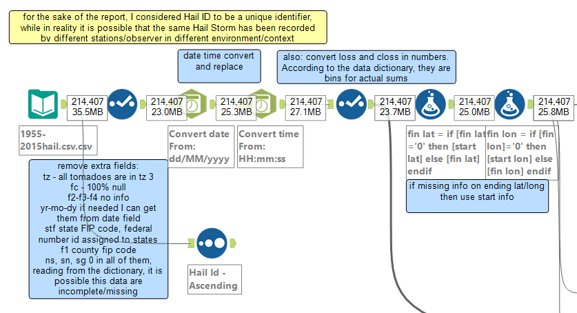
After these first steps, I am ready to move on creating some visual analysis to include in my report. All the reporting tools can be found in the top panel in Alteryx interface, and each of them will have an example workflow. Other instructions on how to use them can be found in the documentation web page.


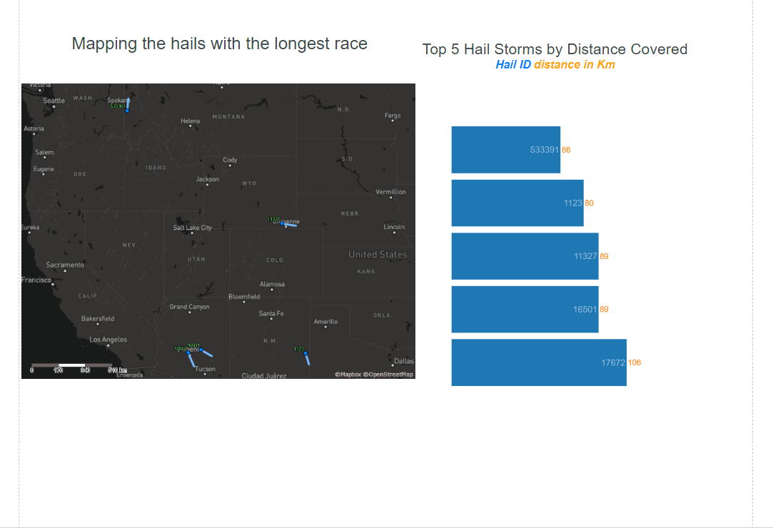
I decided to look at the 5 hail storms with the longest race and created a bar chart and a map view to plot them. I created also a couple of paragraphs with the Report Text Tool. I then used the geographical information to plot their path

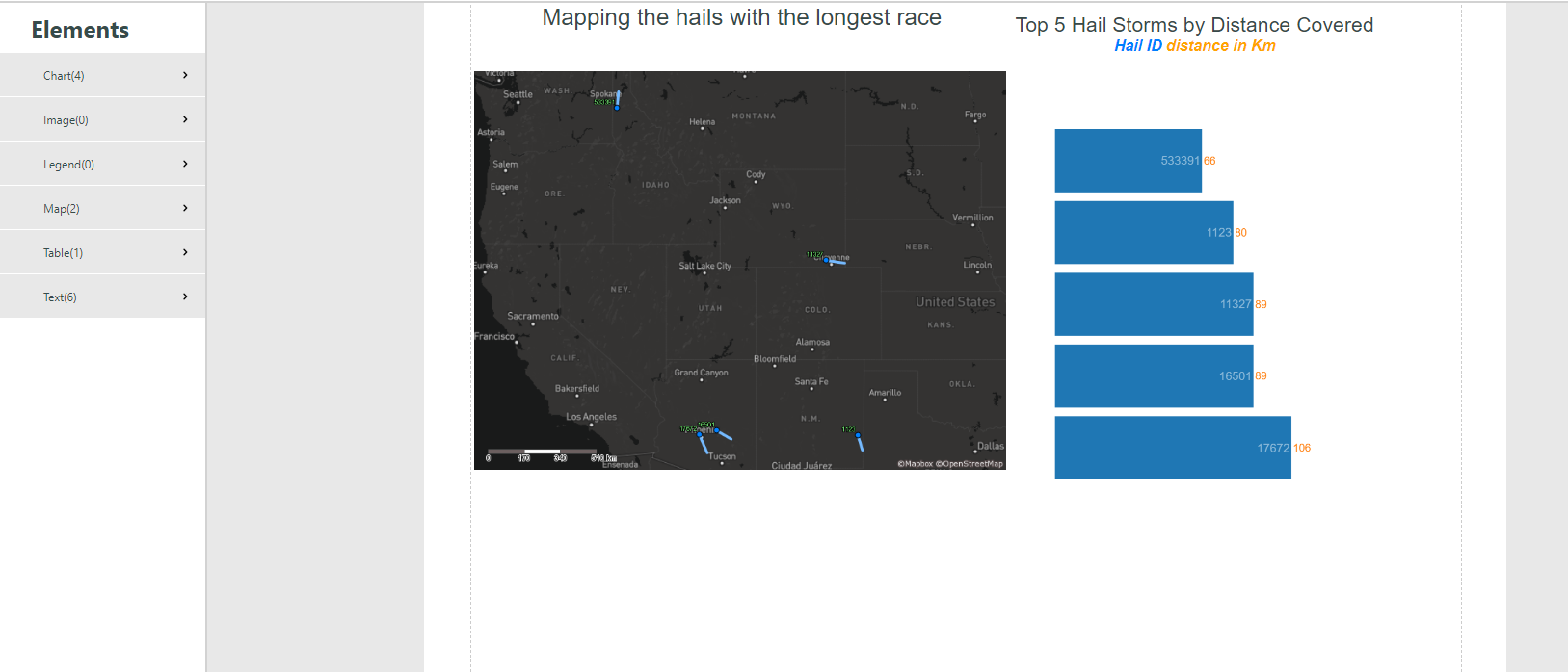
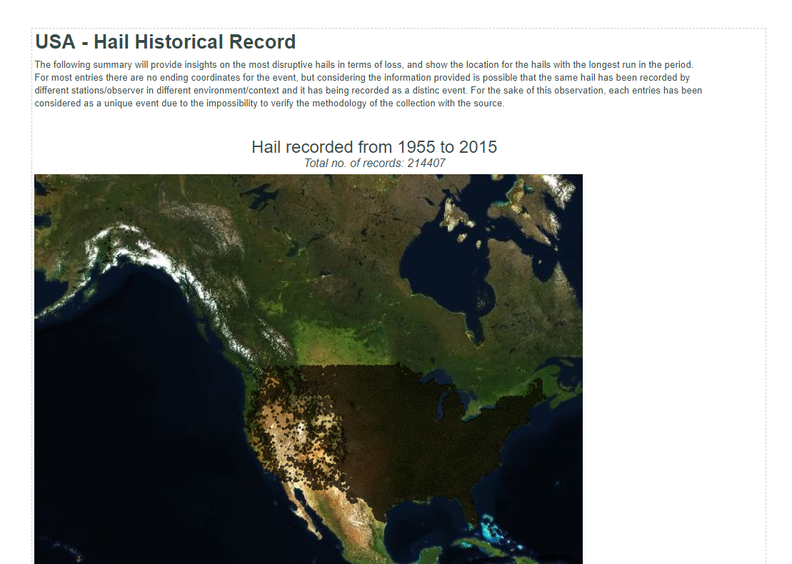
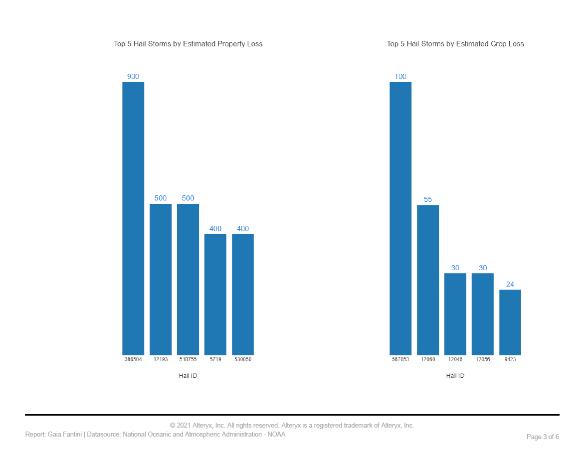
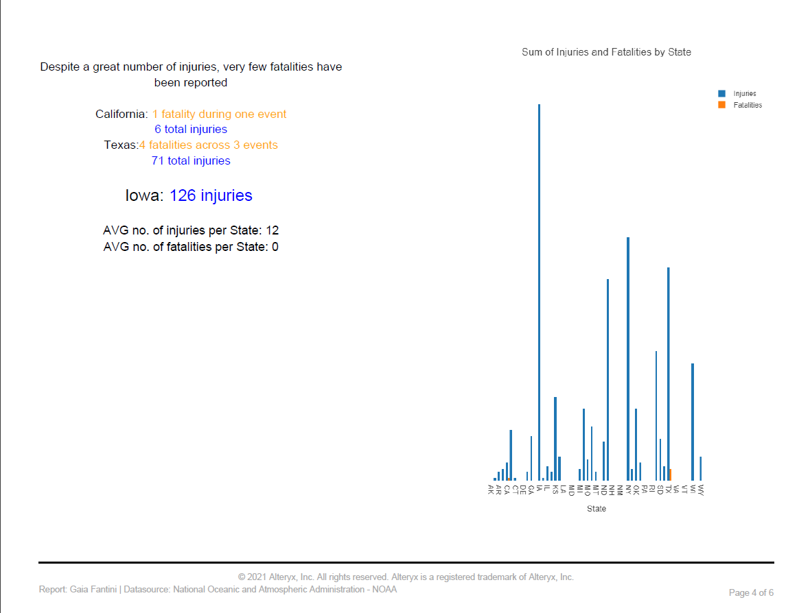
I experimented a little more with the tools and decide to create a map showing the starting points for every storms during the period. Then I created two other bar charts showing the top 5 storms per estimated Crop Loss and Property Loss, and a paired bar chart comparing the total number of fatalities and injuries across each state. It is a bit tricky to get the information I want to be displayed on the final charts, and I ended up using two layers on simple charts just to add a level of details (this is how I included the number of Kms in the bar charts above for instance, or how I created the paired bar since I couldn't plot two measure and the State details at the same time on a single bar chart).
Here a snip of the interactive chart tools configuration panel:
After many tries and many streams my final worflow is very crowded, also due to the paragraphs and annotations I took along the way.
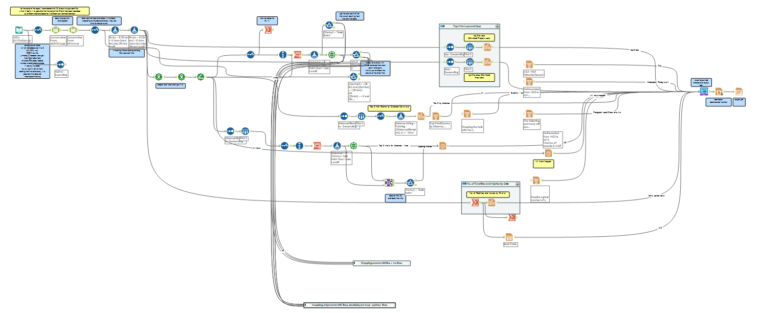
I guess with a simpler flow it might not be so bad to create a visual report using Alteryx, but in my case it was very time consuming, especially because there are things that needs to be run over and over every time a change is implemented, and it might take a while. The final report has been saved as a local pdf file and it looks pretty much like this:
