Proportional brushing is a set action technique that allows you to interact with your data by viewing the proportion of your selection against other items without needing to filter from a selection.
In order to better understand this technique, I will build a proportional brushing dashboard and walk you through each step.
For this demonstration I will use the Car Sales Mock Data, which you can find it here.
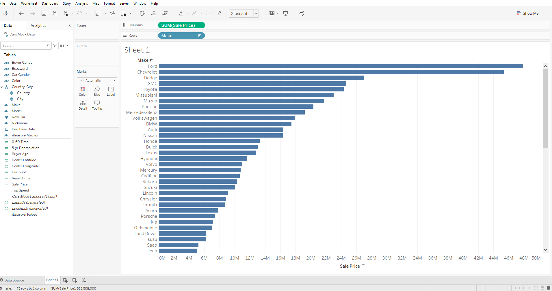
I upload the data set into Tableau and create a new sheet. For this example we will look at the Car Make (Make) and Sales Price. For a start, drag "Make" into Rows and "Sale Price" into Columns.
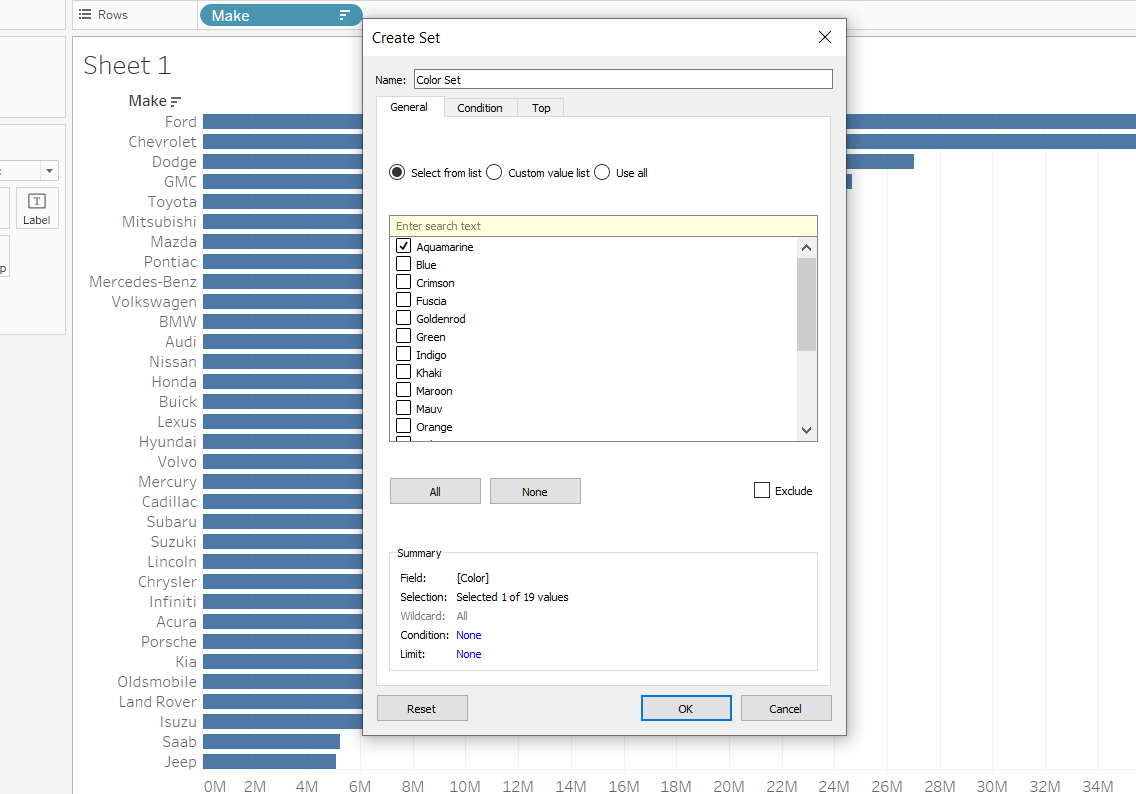
Next, we want to see how many cars are a particular color. This is where the proportional brushing technique comes in handy; We create a Color Set from the Color Dimension and choose any item from the list:
We drag the Color Set that we've just created into the Color mark and it should return a similar result as the one below.
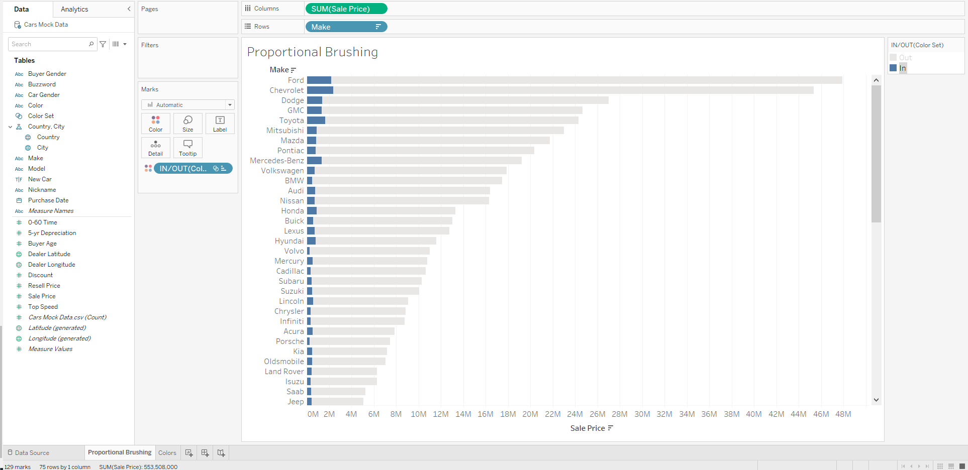
However, the viz chart will show you the proportion of (in this example) Aquamarine cars in the selection. In order to change between colors, we will add a new sheet that will only look at the Colors dimension.
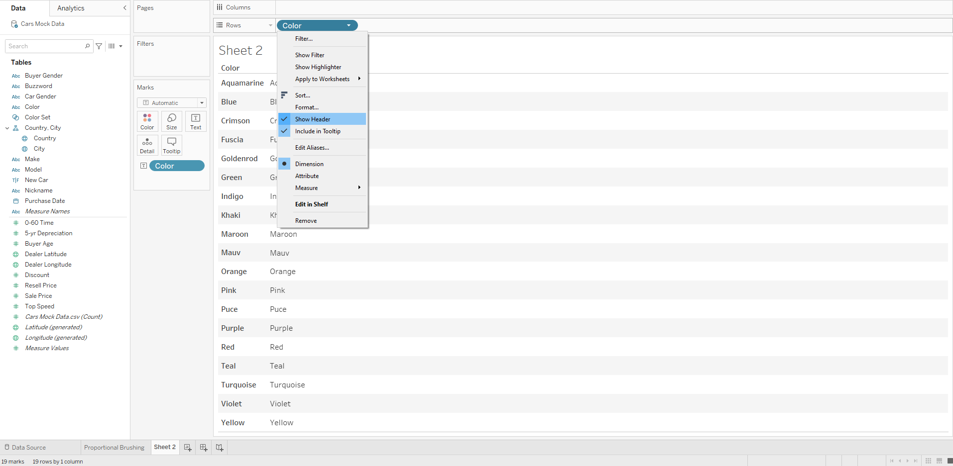
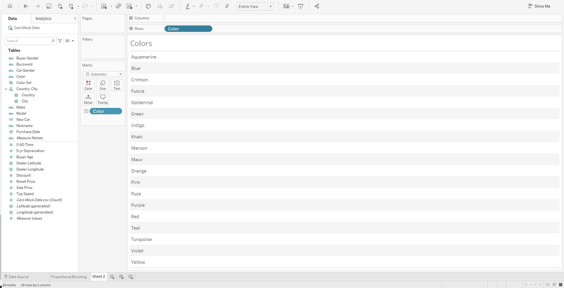
We add the Color into Rows and Text Label and untick the "Show Header" option. We're left with the view below that will serve as a dynamic filter for our previous chart.
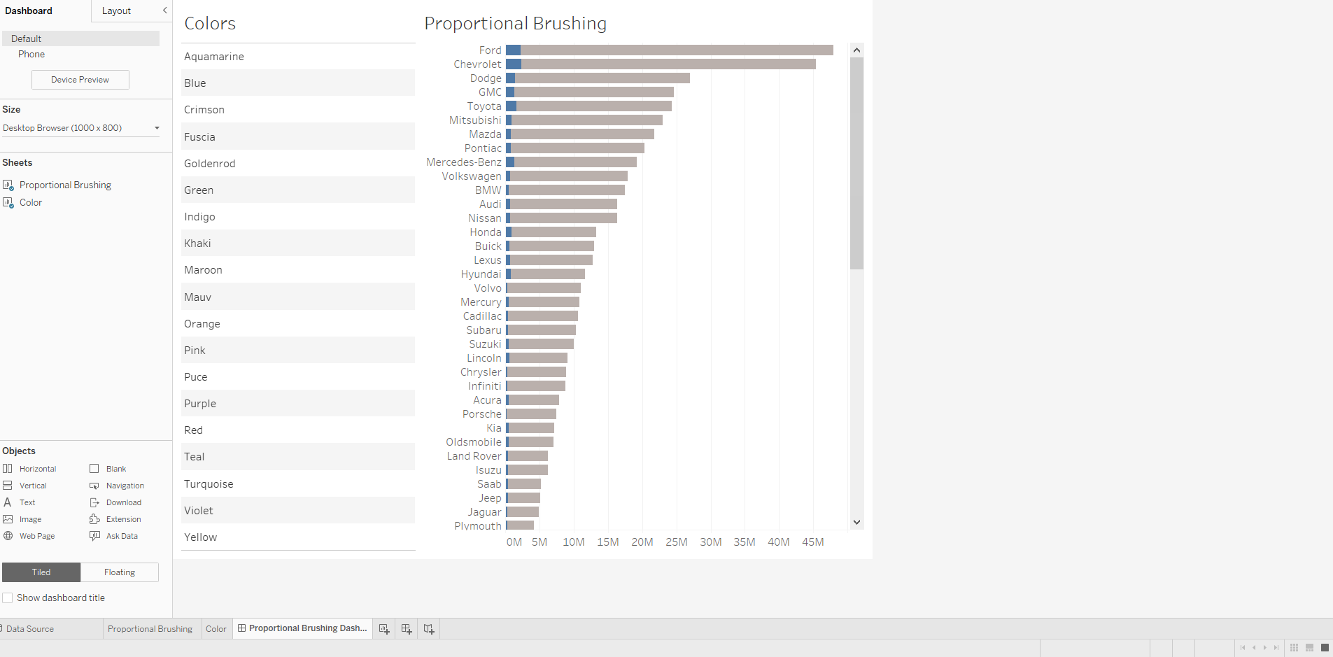
Next, we add the two sheets we created to a dashboard:
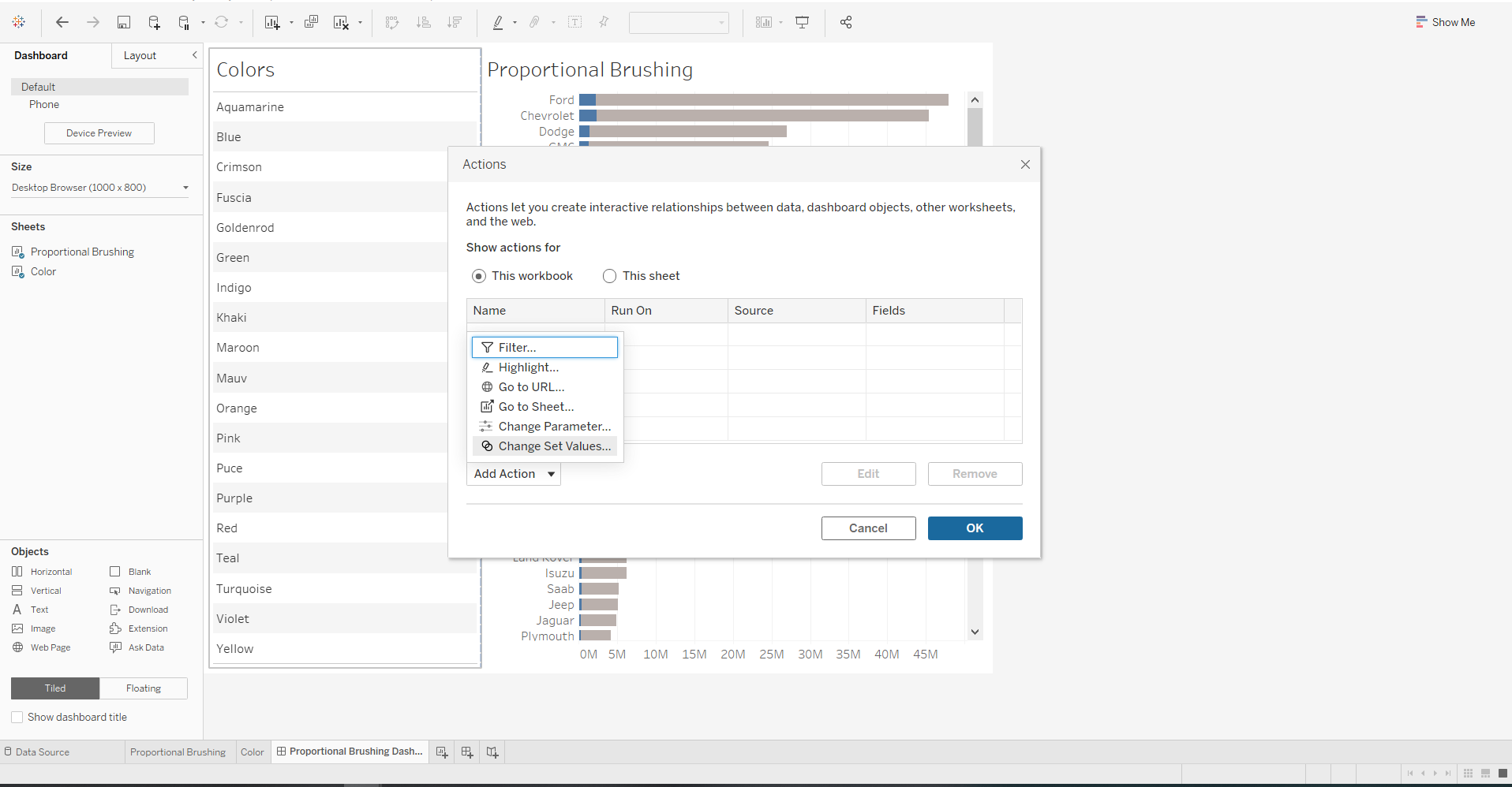
In order to filter the chart on the right using the colors on the left, we will have to add a dashboard action that would change the set values:
We create Change Color Set action using the "Color" Source Sheet with the "Color Set" Target Set.
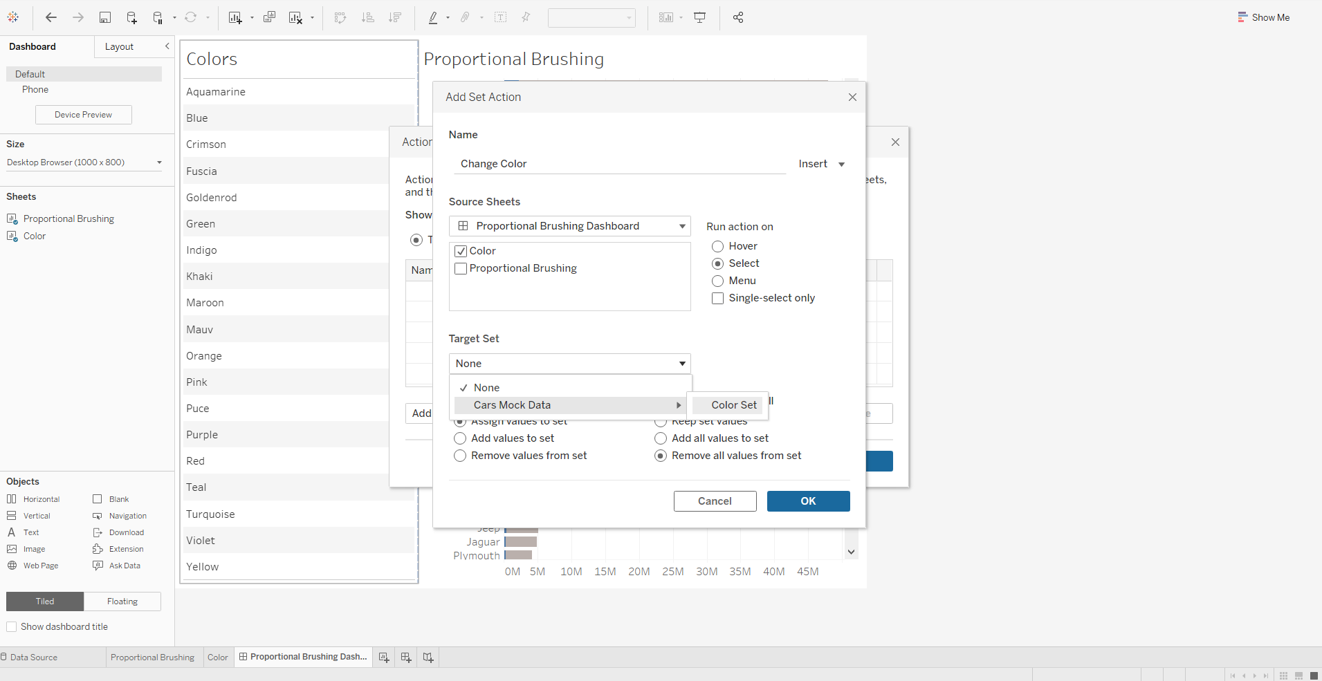
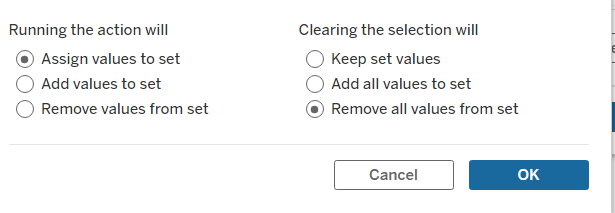
Finally we update the functionality of the action by assigning the values to set and removing all values from set once the selection is cleared.
As a result, by changing the color field on the left, the chart on the right will update accordingly.
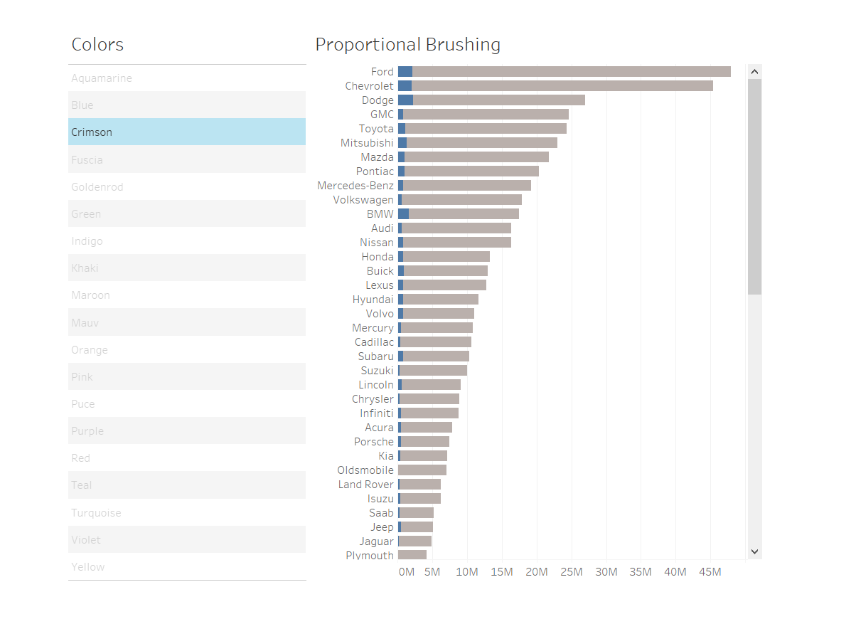
This is how you build a proportional brushing dashboard. Hope you find this helpful!
