So far I have covered how to build a Donut Chart and a Sunburst Donut Chart. The last part will be covering the Expanding Donut Chart. This chart is, just like the Sunburst Chart also showing a second dimension, but it’s a bit more interactive. This blog post was inspired by Alyssa Huff at Playfair Data.
Expanding Donut Chart
Idea of the Expanding Donut Chart
The idea is similar to the one of the Sunburst Chart, but with including a little bit more interactivity as the subcategories only show up once the user hovers over it.
Building an Expanding Donut Chart
You can start with two sheets we have already built before. 1st A Donut Chart, 2nd the slightly bigger Donut Chart that has less opacity and has white subcategory borders. Make sure the sorting is the same on both worksheets.


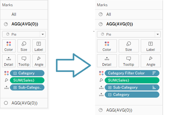
The chart including the subcategories needs to be modified. We need to modify the marks card, as shown in Fig. 2.

Therefore we need to create a parameter and a calculated field:
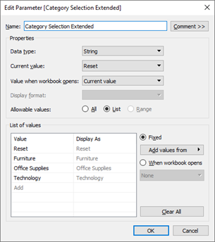
1. Parameter: Category Selection Extended
With a list of the dimension and additionally a reset option (Fig. 3)

2. Calculated Field: Category Filter Color:
STR([Category Selection Extended]=[Category])+[Category]
This field adds “t” or “f” to the category name, depending on whether that field is equal to that parameter, or not. This way we get the option to set up the color individually. Every “Category Filter Color” that starts with “f” gets the background color, while every “Category Filter Color” that starts with “t” gets the category color. E.g. fTechnology is white, while tTechnology is red.
Once we got that set up, we can again, change sizes and opacity. Then we can go to the dashboard, and again place the underlying, more detailed Donut Chart on the board and then add the other chart floating. Again, just like with the Sunburst Donut Chart, place these two above each other and change the worksheet color, again, to be “None”. As the bigger chart won’t be visible right now, the placement is difficult, you can adjust that at the end.
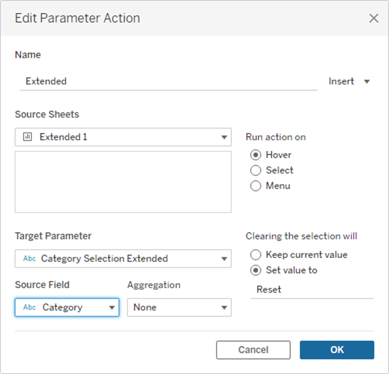
Then you can go and set up the dashboard actions. The configuration is shown in Fig. 4. The source sheet has to be the smaller donut.

Add Text to the Donut
The chart is done, but some text that shows the sales, categories, and subcategories is very valuable here – The same can be done for the other Charts. Create two calculated fields:
1. Sub-Category Text
IF [Category Filter Color]="tOffice Supplies" OR [Category Filter Color]="tFurniture" OR [Category Filter Color]="tTechnology" THEN [Sub-Category - Extended] ELSE NULL END
2. Sub-Category Sales
SUM(IF [Category Filter Color]="tOffice Supplies" OR [Category Filter Color]="tFurniture" OR [Category Filter Color]="tTechnology" THEN [Sales] ELSE NULL END)
Note that for the Donut and Sunburst Donut you would only need [Category]=[Parameter.Category] as the if statement for both calculated fields.
These two calculated fields are dragged onto the “Label”.
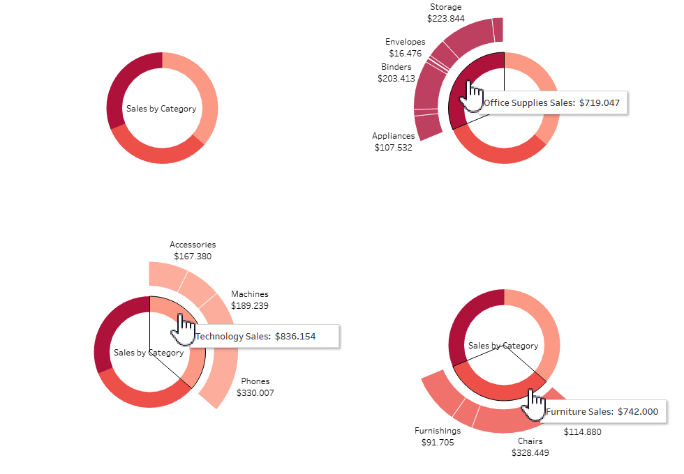
Once you have completed all these steps, your chart will look like mine in Fig. 5.

An exemplary Workbook of all these three charts can be found on my Tableau Public, feel free to download and explore it.
