


It's finally DASHBOARD WEEK! The words every Data School Consultant fears. 😅 But here we are, and are we prepared for finishing a dashboard every day this week? Yes, of course!
The week starts with a Tableau Dashboard and another dataset on Real World Fake Data #RWFD. The first time I made a dashboard on Financial Consumer Complaints (Click the link to view it!). Today I chose the Hospitality data.
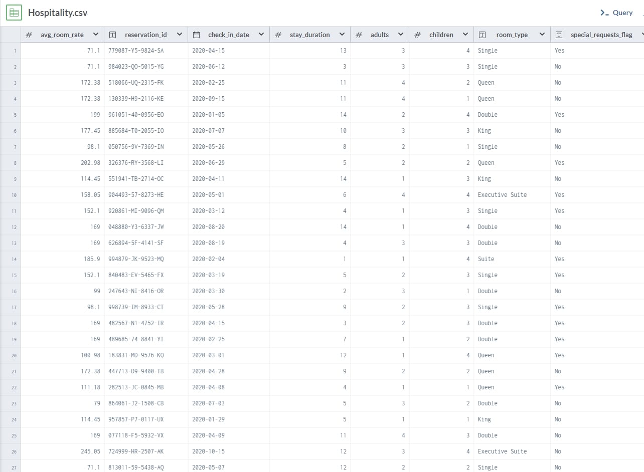
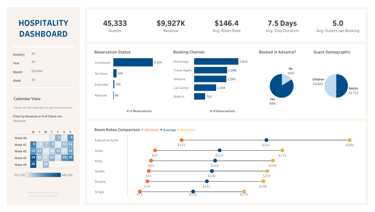
It's a dataset all about hotel room data, check-in times and guest information. I wanted to build a dashboard that would be helpful for a manager in the hotels, or of the full hotel chain, to get an overview of revenue, price rate changes of hotel rooms, as well as general information on guests staying at the hotels.
I wanted to make a heatmap calendar that can show which days will have a lot of guests checking-in, so that the hotel can be staffed accordingly. I also really liked the idea of using a paramter to change the calendar heatmap to high-revenue days.
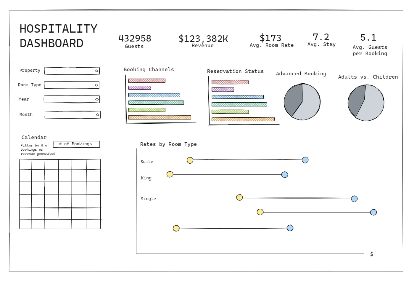
As this was a mock dataset, it didn't include a lot of data prepping, so I had time to work on the visualization as soon as I was finished with my dashboard sketch.
With more time I'd definitely would have loved to add KPI's with month-over-month changes, or more drill downs or parameters on the individual charts.
You can look at (and play around with) the dashboard on my Tableau Public!