


It's the second day of dashboard week and today we are crafting a dashboard about the World Happiness Report, this time using Power BI!

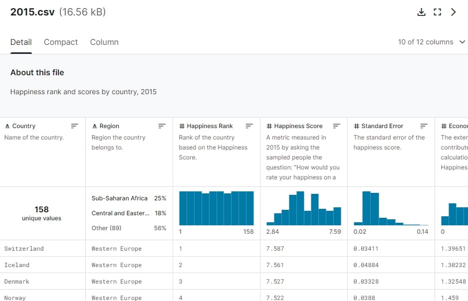
The data looked quite simple on first glance, but it turned out it involved quite a bit of data prepping. We usually use Alteryx for that, but were explicitly asked to do everything in Power BI this time, so that took a bit more work than expected. For example we needed to make some changes to the data model to be able to append the tables.
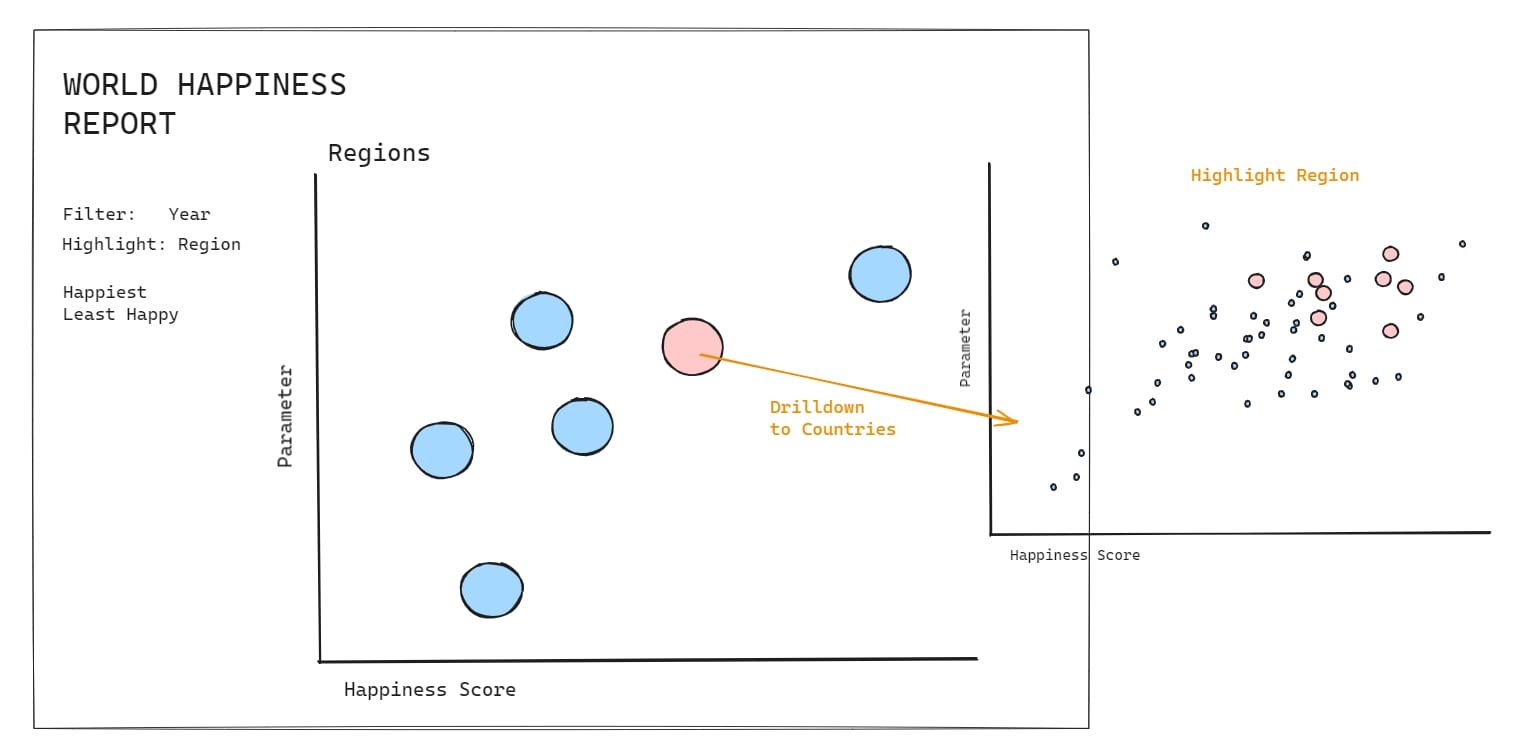
Our task was to build the report / dashboard with navigation buttons. My idea was to build an overview dashboard first. It is supposed to show a comparison between all regions and and countries as a scatterplot. I wanted it to be able to drill down and filter by different metrics.
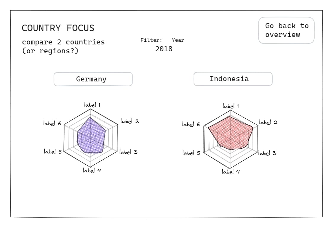
The second page was supposed to show radar charts, comparing two countries in the various happiness factors like economy, social support, government trust, freedom and generosity.
As we had our last real client project with Power BI in December, I felt a bit rusty getting everything done in a day and had to make slight adjustments to several charts. I'm happy about the result though, today definitely felt harder than yesterday, but our presentations felt better in comparison.
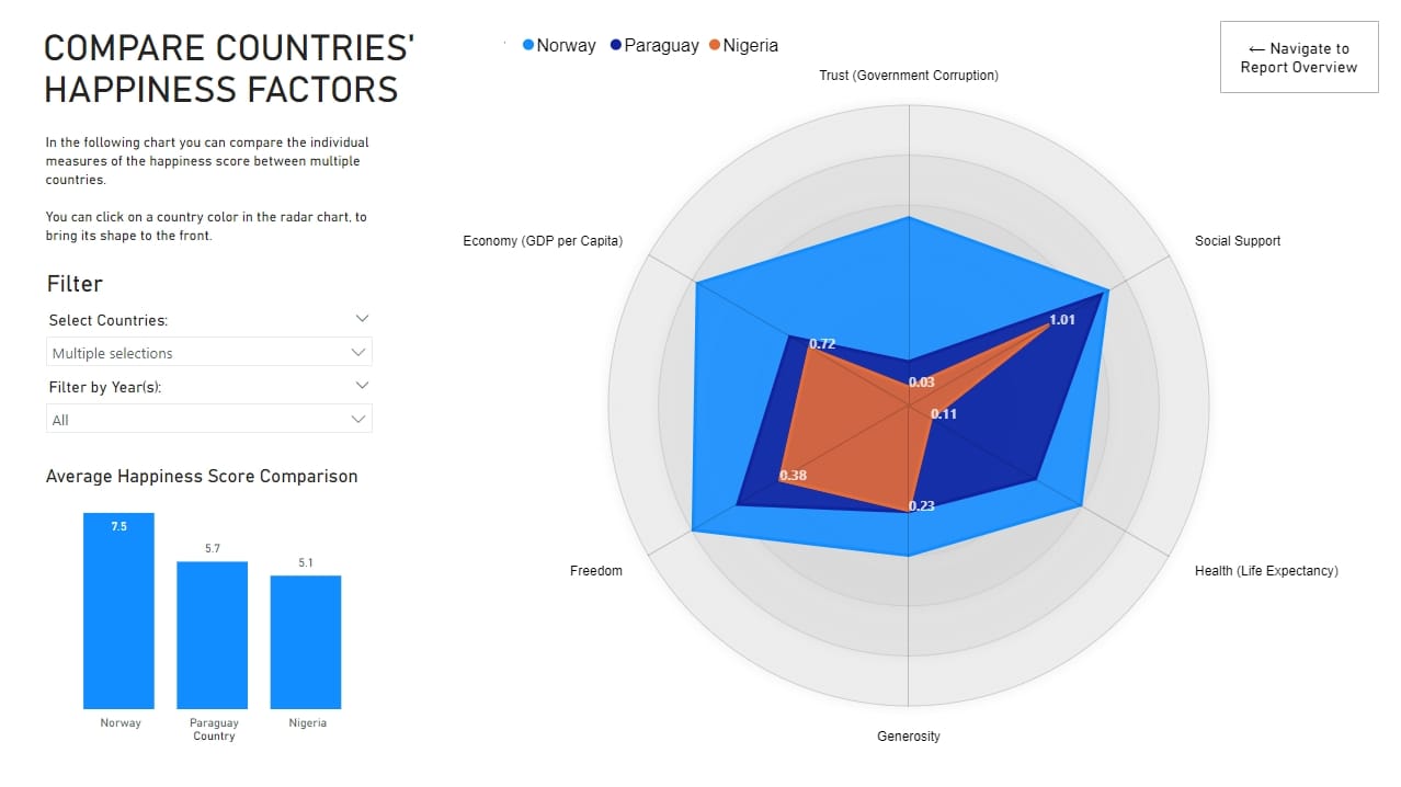
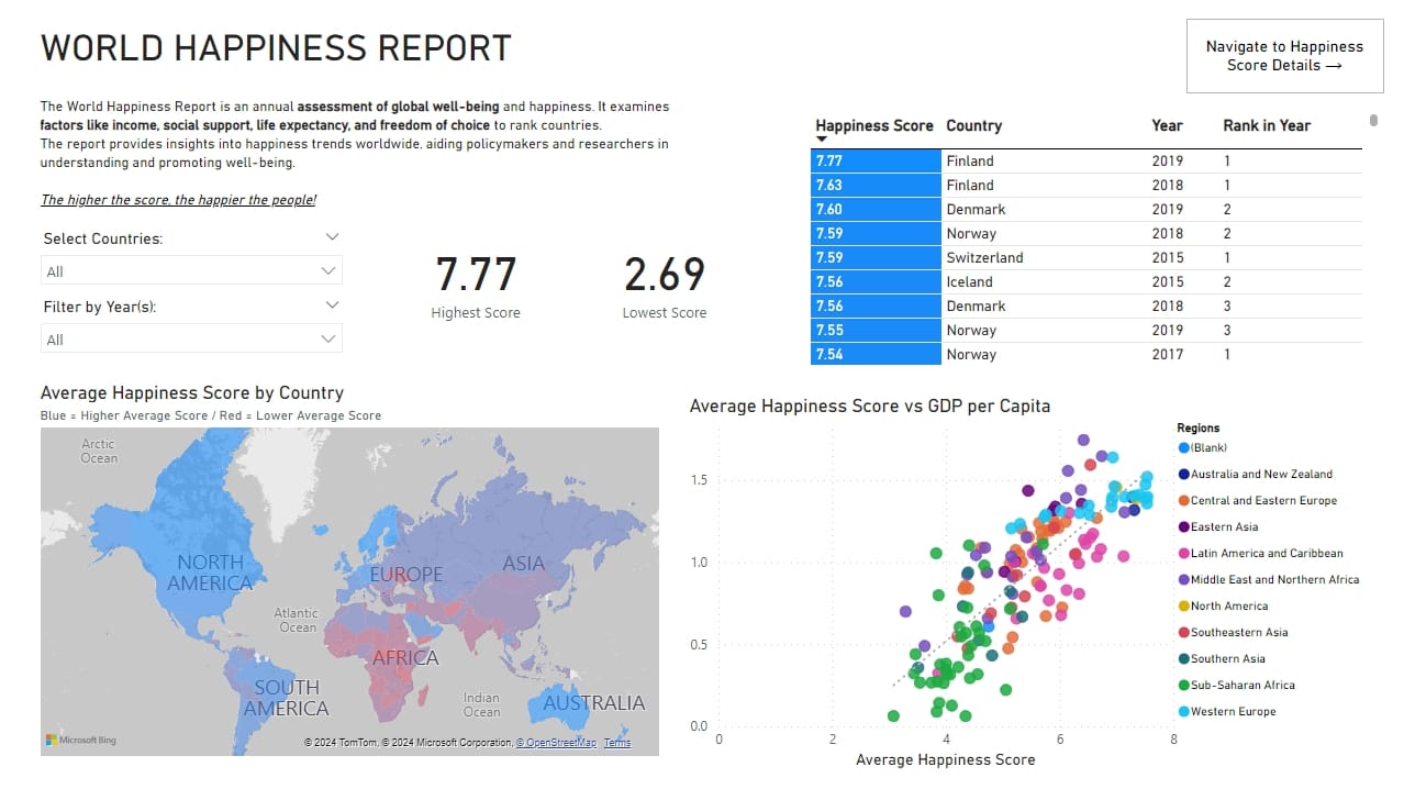
You can look at the finished dashboard HERE.