The Pie Problem
Everyone loves a good old-fashioned pie chart right? Well, turns out they're not always the best choice in terms of representing data. This is often a shocking revelation since they are (mis)used so frequently in analysis every single day.
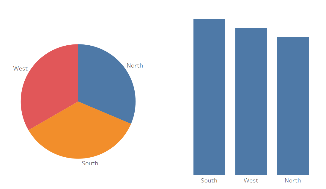
Look at the example below of sales by region. Would you be able to tell from the pie chart how well each region performed from best to worst? It's hard to tell right... sure we can add on some labels to aid the visual but this doesn't actually need to be done at all for the bar chart. From a quick glance, the bar chart is far quicker and easier to understand which is so important when making business decisions. The problem grows even larger as we add more categories into the mix, imagine if we had 20 to compare, the bar chart would still be easily digestible, the pie chart on the other hand; a mess.

So why is this?
Our brains are very good at interpreting and comparing length, this is because we have a simple axis to work with. In the radial world it's not so straight forward, in a pie chart, we need to compare segments, but how do we do this? Technically the perimeter of the circle gives us this axis in which we can compare the different arcs of the segments but comparing curved lines is way more complicated than comparing straight lines. This is why any kind of curved lines that are used to represent size in data viz should be used with caution.
It's not all bad...
There are still circumstances whereby pie charts are useful, the first trick is to keep the segments down to a minimum, once you start going above 4 or 5 categories, it gets too clustered. Pie charts can be particularly useful for comparing overall proportions. Looking back at our example above, we can easily see that the segments are comparable in size therefore we know from this that there isn't an overall dominating region in terms of sales. If we are interested in exact values however, then it's best to stick the data on a straight axis so we can quickly compare between categories.
So overall, don't be scared to use pie charts to visualise data, but make sure that the purpose and message of the viz is clear, the best data visualisations will be able to efficiently translate the data to the reader, making them do as little work as possible to understand it.
