


Sometimes, the most simple techniques make a huge difference in your visualization. Filter Actions are a simple feature in Tableau that facilitate interactivity and dynamic data exploration within worksheets and dashboards.
Check a dashboard that I used to practice design during trainning. This dashboard has lots of filter actions: https://public.tableau.com/views/PracticingDesign/Dashboard2?:language=en-US&:display_count=n&:origin=viz_share_link
How to use Filter Actions? First let's build 2 simple bar charts by using the SuperStore dataset (you can find it on tableau desktop or public connections pane at the bottom)
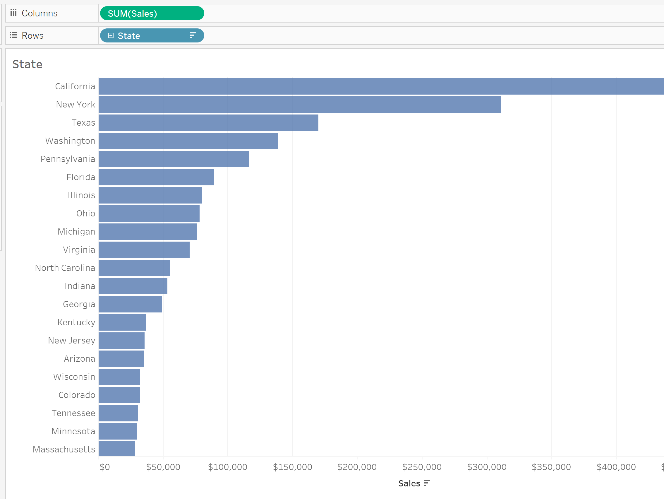
What we want? we want to see the products' sales for each individual state
1st bar chart (State Chart) - Drag a dimension to rows (in this case State); Drag a measure to columns (in this case Sales)
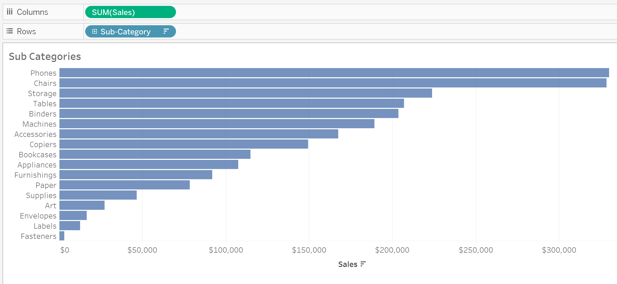
2nd bar chart - Drag dimension to rows ( Sub category); Drag measure to columns (Sales Again). At the moment, this chart only gives us the total sales of each product for all states.
What we want to do now is to bring these two bar charts together into a dashboard. Why? we want to be able to click on a bar of the state bar chart to filter the sub categories bar chart. Outcome: only show the sales of each product for that particular state
Then, go to Dashboard at the top -> Actions...
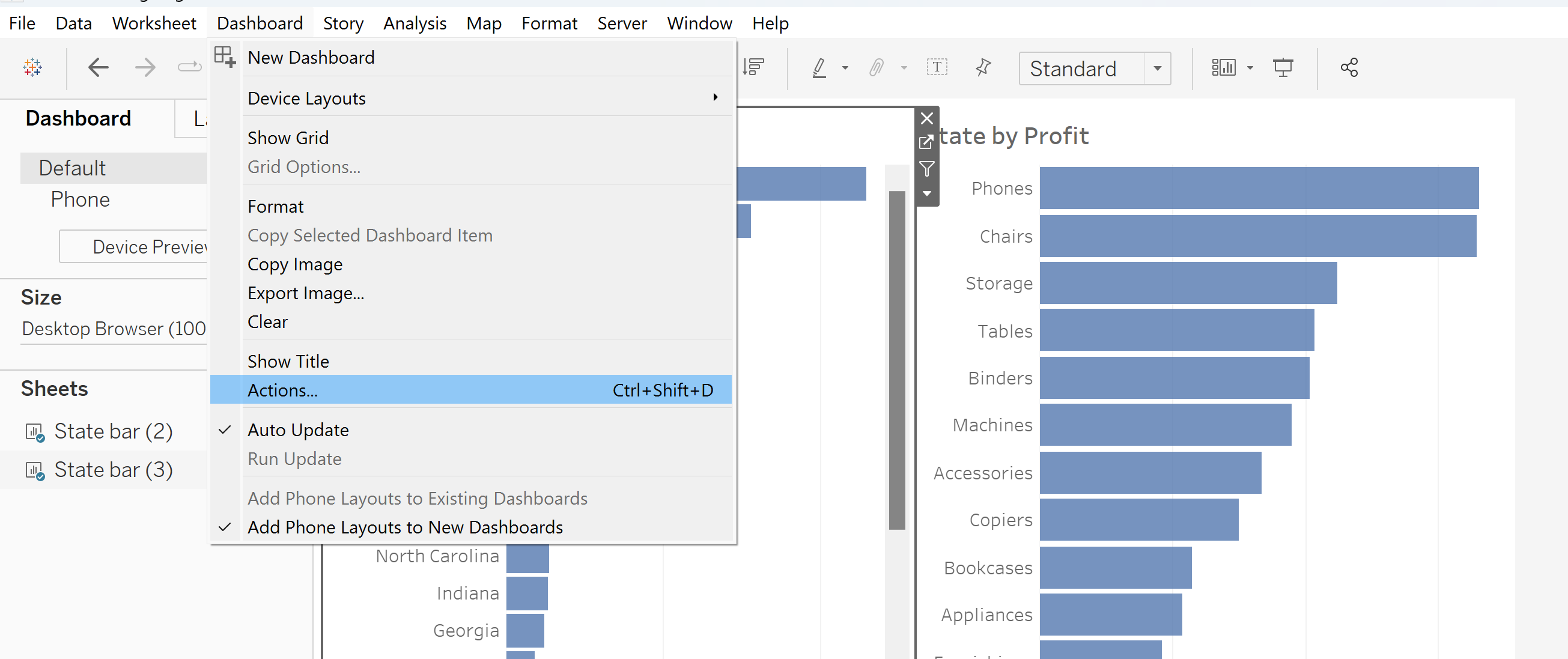
The below pop up menu will come up: Select Add Action -> Filter...
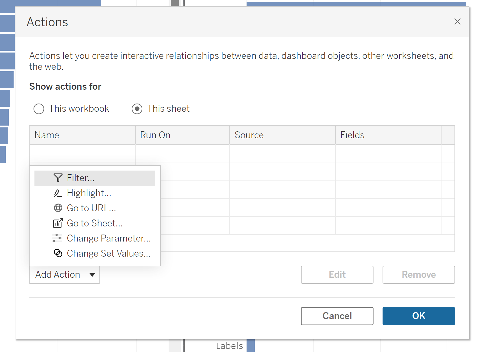
After clicking Filter, the below pop up menu will come up.
The Source Sheets will be the sheets/visualizations that you want to use as the 'selector' (In this case, it will be the state bar chart). The Run Action on the right allows you to choose how you want the interactivity to be (in this case I want to simply select a bar in a bar chart)
The Target Sheets will be sheets/visualizations that you want to filter when you select the 'Source Sheet'. Clearing the selection will (on the right), allows you to choose what you want the target sheet to look like when you finish your selection (in this case, after I deselect the state, I want the values to reset to the total sales per sub category, so I choose Show all values)
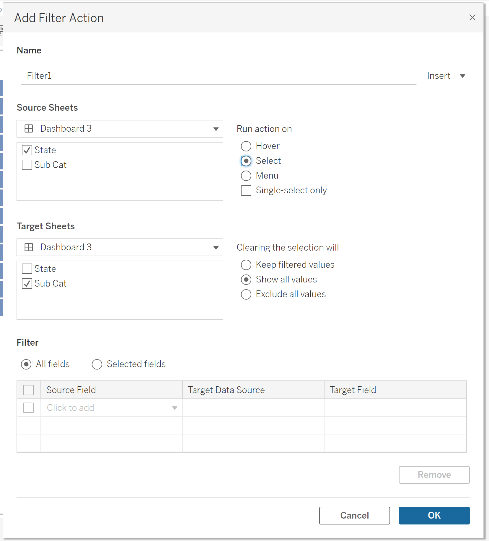
Note: You can select multiple source sheets and target sheets. Just be careful to not filter charts that you do not want to be filtered.