


How to make a switch measure in PBI?
Switching measures is useful when you have limited space in view or just want to show a measure at a time. This way you do not need to create multiple reports.
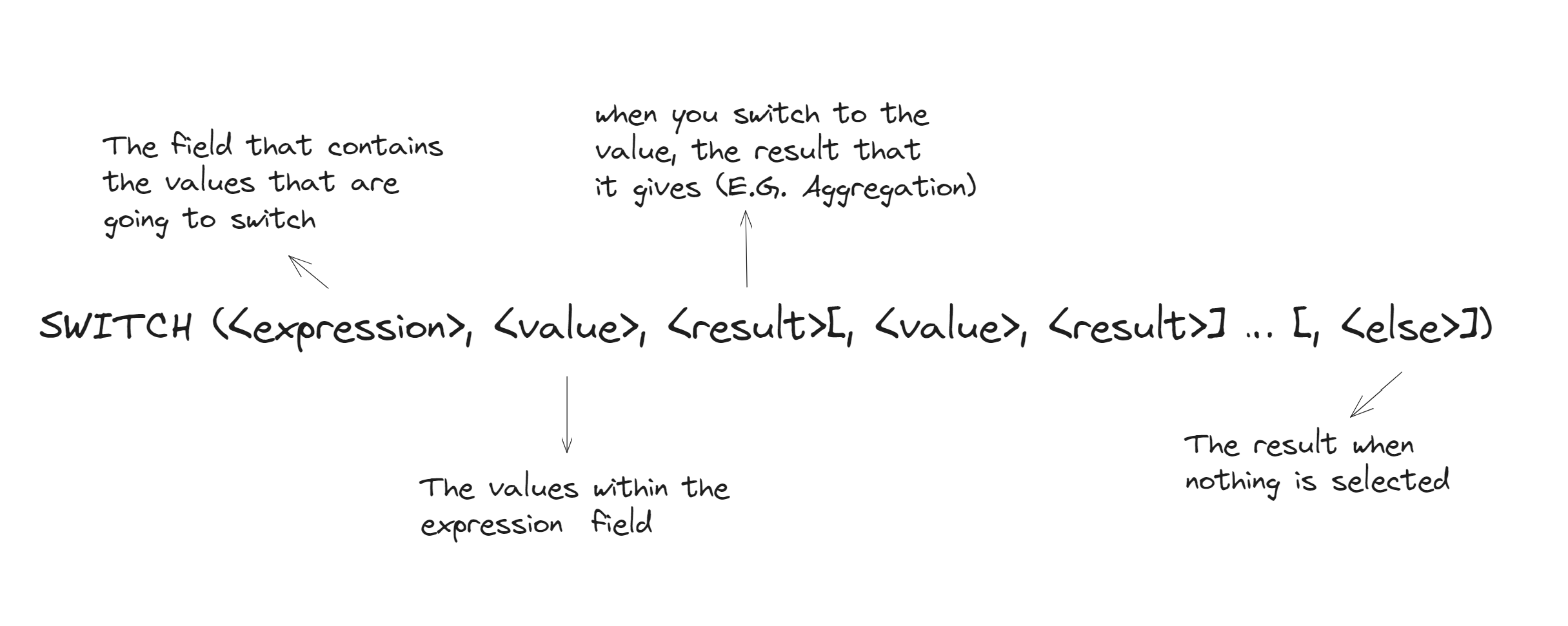
SWITCH FUNTION - Evaluates an expression against a list of values and returns one of multiple possible result expressions.
Syntax:
The example for today will be creating a switch measure to switch between revenue, expenses and profit
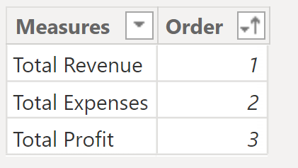
NOW! The easiest way to create our <expression> is by creating a table (think of this like creating a parameter in tableau, but instead you create a table with values)
- Go to Ribbon -> Home -> Enter Data (Date panel) -> Create the following table -> Name it Measures Table (I created an order column so I then can order my values as I wish when creating the buttons)
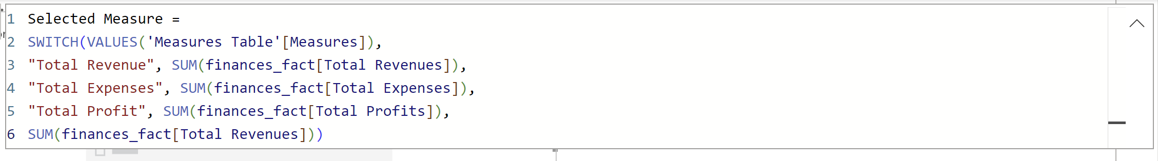
2. Then create your measure switch with DAX, using the Switch Function (I called my new measure Selected Measure )
In written form, what the expression is saying:
"Switch the Values thar are in the column Measures from the 'Measures Table' (line 2). One of the values is Total Revenue and when i select this value, I want to compute the SUM of total revenues that is in the 'finances_fact' table (line 3). (Same repeats for all values - line 4/5). Lastly, (line 6) If none of the values that i just told you are selected or match, just give me Total revenues "
(NOTE: Make sure when you write the value, it matches exactly the value in the table you created. In this case, it would be the Measures Table)
Build your view:
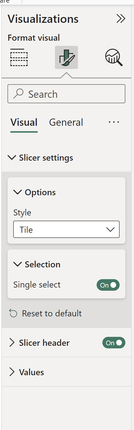
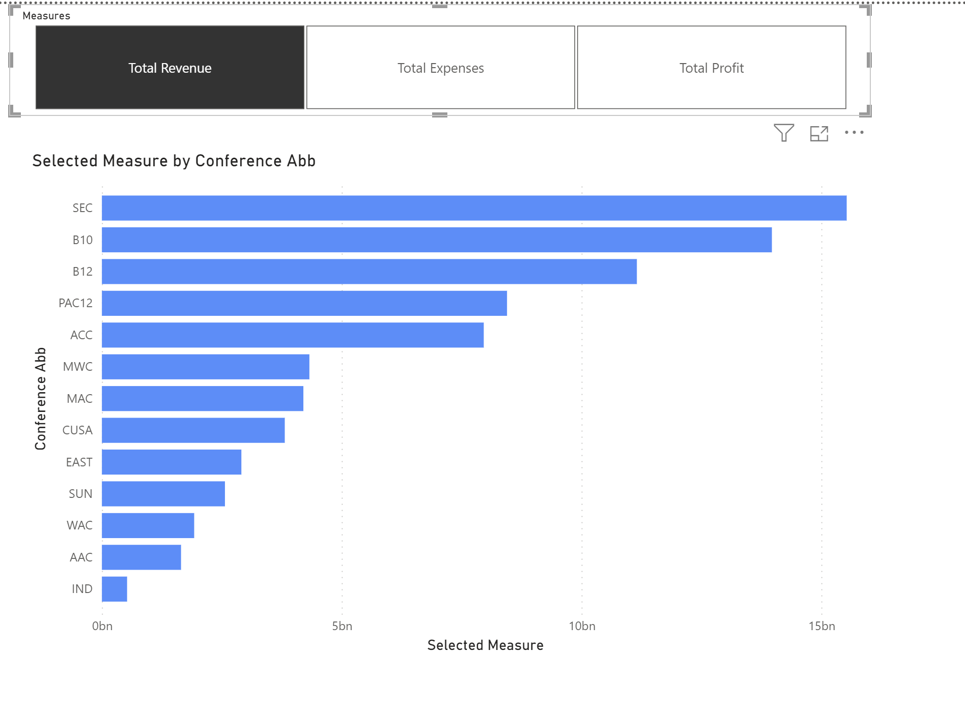
Create a bar chart where Selected Measures will be in your x axis and a categorical field in your y-axis. AND DONE!Create a Slicer with the Measures field -> Go to Format Visuals -> Slicer Settings -> Style - Tile -> Selection - Single Select
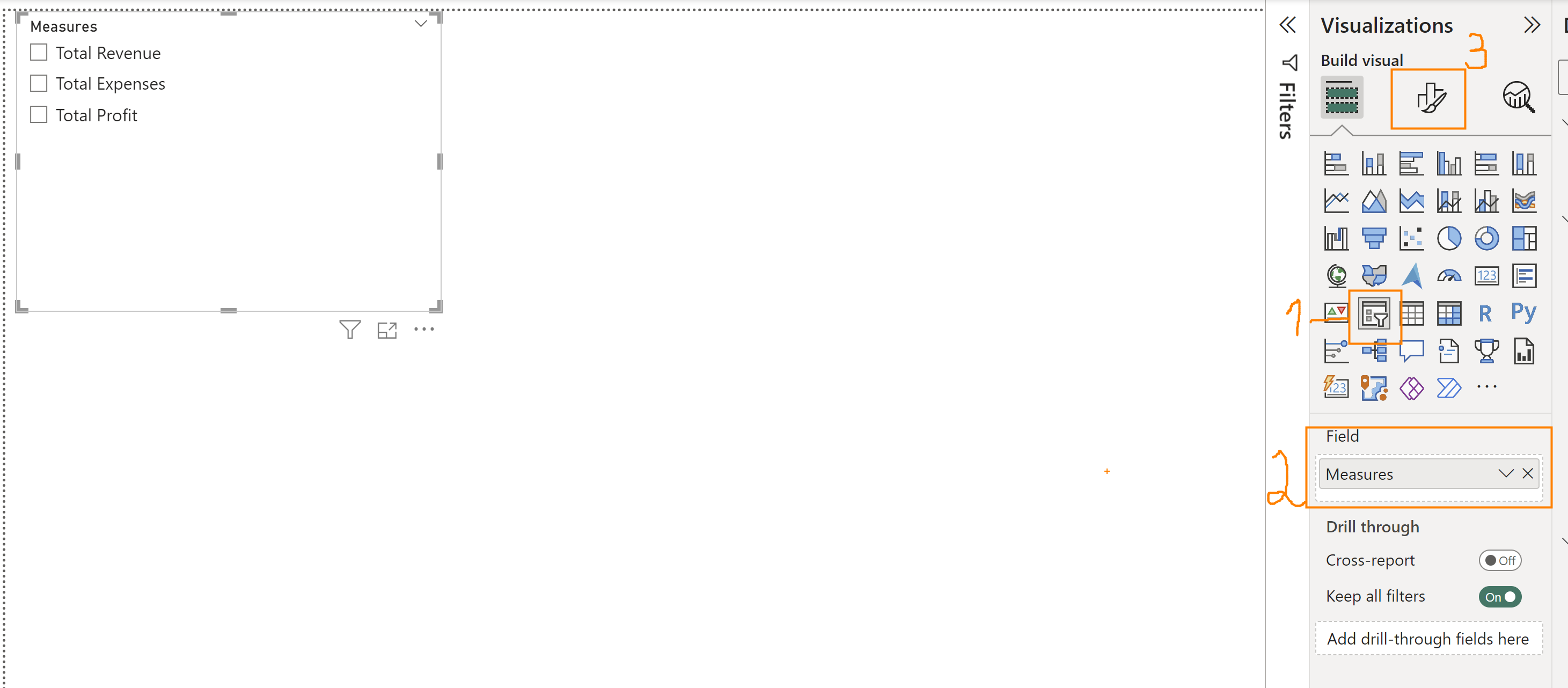
To sort the order of the buttons: Select Measure (from Measures Table in the Data Pane) -> Ribbon -> Sort by Columns -> Order
Extra tip: Change the color of the bar chart when you select each metric.
Select Bar Chart ->Format Visual -> Visual -> Bars -> Color -> Conditional Formatting (icon fx)