


What is an Infographic?
An infographic as a visual representation of information or data that combines imagery, data visualizations and minimal text to provide a clear and easy-to-understand overview of a topic. It emphasizes that engaging visuals in infographics should not only capture attention but also enhance comprehension.
Why Use Infographics?
Infographics simplify complex information, providing quick overviews, present research findings, summarizing lengthy content, and raising awareness about various topics. It suggests that infographics have applications across different industries.
What We Did For Dashboard Week Day 2?
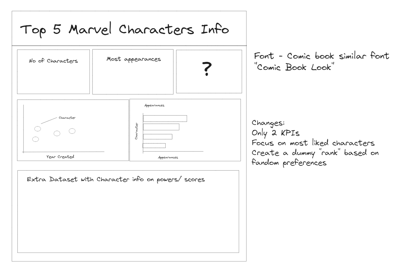
For day 2 of dashboard week we were required to create an infographic dashboard based on a marvel comic book dataset.
My thought process:
- Look at what infographics are;
- Get some inspiration;
- Look at the data;
- Build a sketch ;
- Get extra data to compliment my dashboard;
- Rethinking my sketches;
- Start building dashboard ;
My sketch:
Final Output: https://public.tableau.com/shared/565ZXFJF3?:display_count=n&:origin=viz_share_link
NOT FINALISED. A few things still need to be changed, such as some formatting.