Accessibility is the practice of making information, activities, and/or environments sensible, meaningful, and usable for as many people as possible.
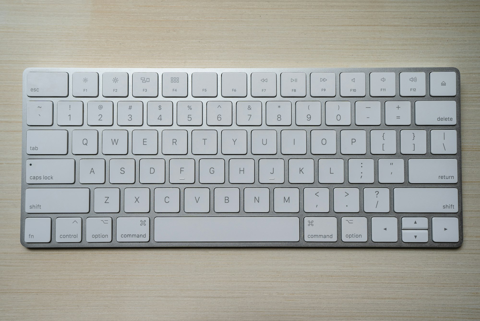
When presenting or navigating a dashboard, you should keep in mind your audience. Today I worked in pairs and we were tasked with revising and redesigning a dashboard that is accessible for someone that uses keyboard only (no mouse or trackpad). Additionally, how to navigate this dashboard on tableau server
We divided this into 2 segments:
Dashboard / charts designs
Navigation
Dashboard / Chart Design
When thinking about design and chart choices for someone that uses keyboard only, you should take into consideration:
- Number of charts in a dashboard - Is there too many charts and would it be difficult for this person navigating the dashboard? If so, you might want to breakdown the dashboard into 2 dashboards or so
- Labels - for someone that will only use their keyboard to navigate a dashboard, they won't be able to hover and see the tooltips. Add labels to display the most important data
- KPIs - Might be useful to have the most important data displayed as KPIs
- Tables - When a chart has a lot of information that is necessary to explore and you cannot hover the chart, a table might be a good option to add in. Although not the best visual, it will give the necessary information for someone with this type of accessibility
Navigation
- Practice - Put yourself in someone with keyboard only accessibility needs, understand and take notes on how to navigate. In this exercise we used Tableau Server. Tableau Server has its own shortcuts for keyboard only.
- Create a guide - If this individual will be be using the website frequently, may be worthy to write a document with how to navigate the dashboard / website
