


During training at the Data School, we complete client projects where we get the opportunity to experience what it's like to be a consultant with external stakeholders, but with the safety of still being within the Data School bubble whilst we learn. During one of my cohort's client projects, the area that I was focused on was visualising customer satisfaction within a dashboard. Among other charts, I wanted to use a heat map to demonstrate how customer satisfaction varied by time of day and day of week to determine if there were any patterns that might be hidden by using averages. When I showed this to our head coach, Carl, to get some feedback for improvement, he suggested upgrading my heat map using miniature bar charts for each timeslot so that the distribution of responses could be seen.
Why show an average when you can demonstrate distribution? The benefit of showing the distribution is that it leaves less opportunity for details to hide. For example, you might have received 8 reviews, 4 each for 2 separate timeslots. For one timeslot, all of the reviews are 3 stars and therefore have an average rating of 3 stars. For the other timeslot, you receive two 5-star reviews and two 1-star reviews which also give an average rating of 3 stars. On the outside, if you'd just used averages the timeslots would look the same but by using distribution, you can see there is a vast difference between the responses in the second timeslot and the inconsistency there might be something you'd want to investigate. Of course, this is quite an extreme hypothetical but an easier way of demonstrating the point!
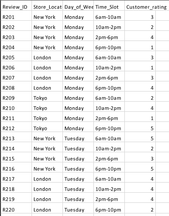
So, how do you actually create this chart? That's what we'll be learning today. I mocked up a dataset with some help from Gemini (not loads, I haven't figured out how to use Gemini to create mock datasets quite yet so had to do some of the stuff myself manually in Excel!) on customer satisfaction in gyms. You can see a snapshot of the data below but essentially each row represented a customer response, identified by a review ID. This was specific to a gym location (I didn't end up breaking down by this to maximise number of reviews in the example), and included the review's day of week, time of day and customer rating. Feel free to use whatever dataset you have though that would work well with this sort of chart.
Now, let's get to it!
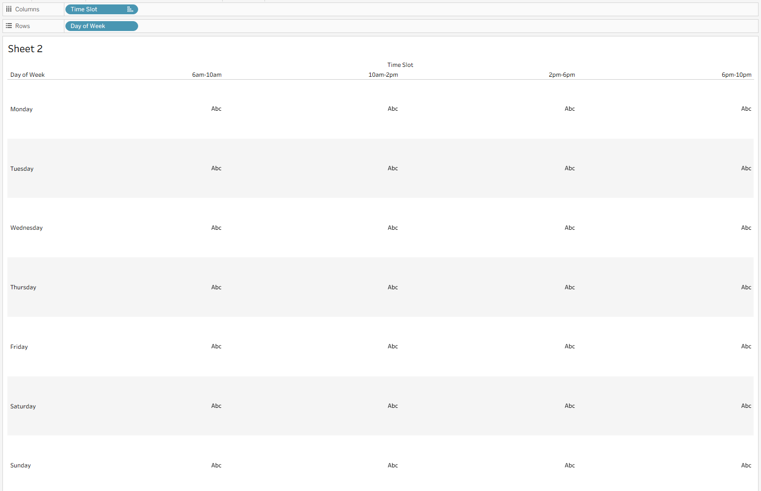
Step 1: Set up a table.
To begin, drag your day of week to rows and timeslot to columns. Depending on how your dataset is set up, you might need to group your timeslots so that you get blocks of time. You might also need to reorder your timeslots so that they make logical sense by dragging the columns to where they should sit in the chart.
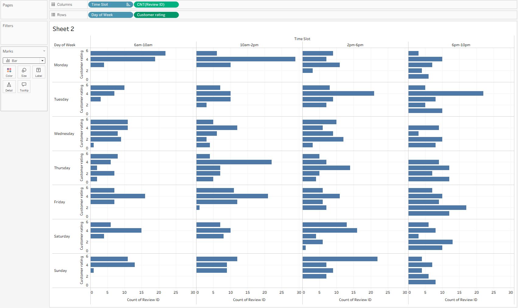
Step 2: Drag in your measures.
To make your mini charts, you need to drag your customer rating to rows (to the right of your day of week field). You'll need to convert this to a dimension to remove the aggregation - we just want the rating values. Then drag your review ID to columns (to the right of timeslot). Make this a count to show how many reviews scored each rating on that day during that timeslot. Convert your marks to bar and you have your basic chart.
Step 3: Format.
I think this chart is one of the hardest to format because you need the lines to separate the boxes but it can make it look a little uglier as a result. I removed various gridlines and axes and also chose to add a colour gradient to highlight where the timeslot averages are higher/lower. I think it's important to note here that my averages were quite distinct between 2.4 and 4.4 stars which is why using colour to distinguish these averages was more appropriate. If the averages were separated by less than 1 star, you might want to reconsider using colour because it could cause the audience to draw false conclusions based on what they think they're seeing. For example, an average of 4.8 stars vs 4 stars isn't something you particularly need to draw attention to but if these were highlighted in a dark blue and light blue, the audience could see the 4 stars as bad when in the grand scheme of things, it's not that significantly different.
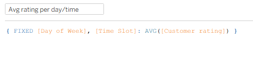
Here's my simple fixed LOD for the day of week and timeslot average if you wanted to add it to colour:
I also added labels to the bar in each pane to show the maximum number of reviews for that pane. This was just to provide a little more immediate context. If the user wanted more information, they could also hover over the bar tooltips.
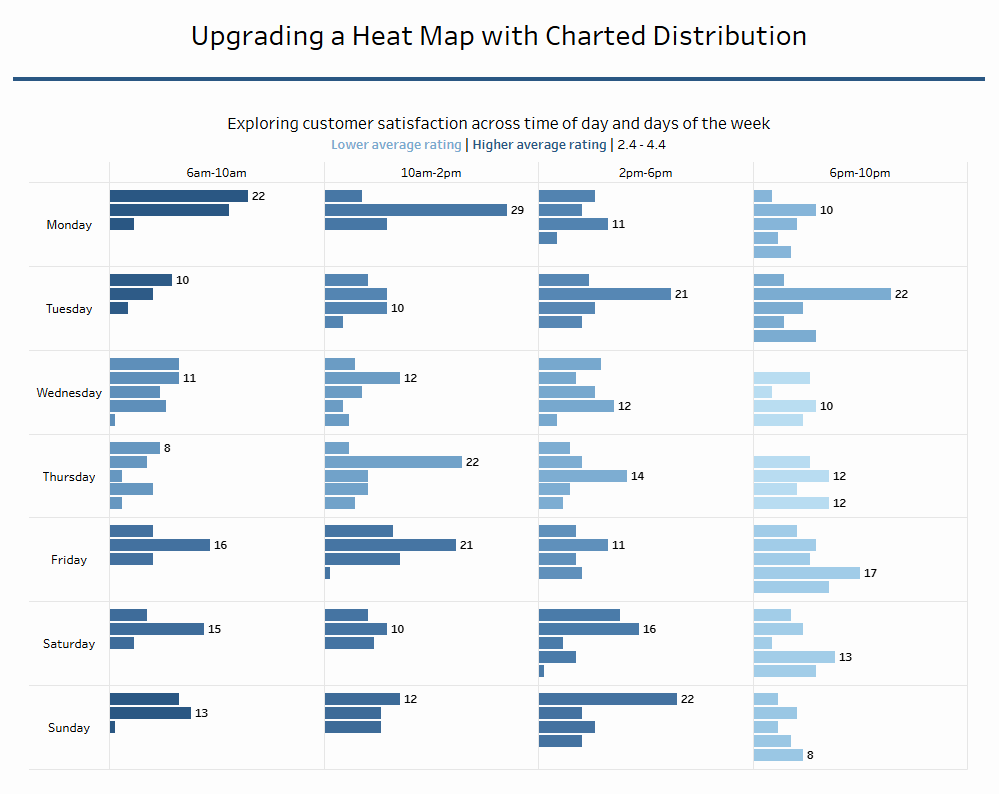
And there you have your final result. If you want to check out the interactivity, head over to my Tableau Public because I can't figure out how to embed the code to make it all fit the page! Anyway, this chart offers all the fun of a heat map with the benefits of bar charts. I don't think you could ask for much more. That's all from me today so until next time, happy charting!