


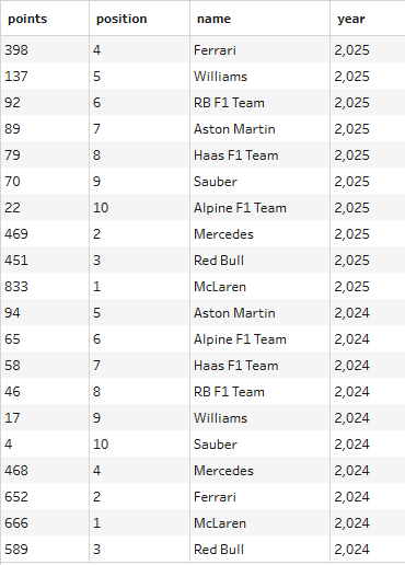
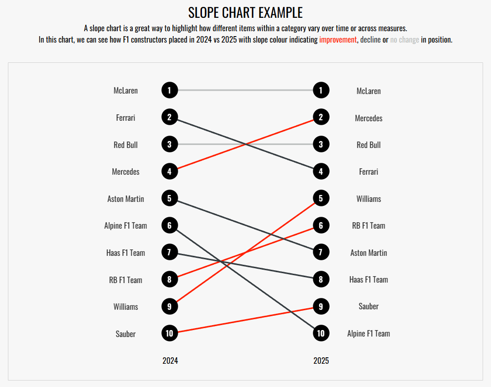
A slope chart is an excellent chart type for highlighting change, either over two points in time or across two different measures. In the case of the feature image, I explored how Formula 1 teams placed in the Constructors' Championship in 2024 vs 2025. As you can probably tell and might be the reason that brought you to this blog post to begin with, the comparative value that this chart offers is fantastic and the additional features that you can include, such as slope colour, can take this chart to the next level for your next dashboard project. However, whilst the chart appears deceptively simple to create and although it isn't highly technical, there are some small hurdles that can make it more difficult to create than it might at first appear. We'll be covering all of those in this blog so follow along with me to learn how to create a slope chart from scratch in Tableau.
Step 1: Interpreting the data
There are two ways that your data could be formatted with one way which will make your life easy and more flexible for future alternatives, and the other being a little more fixed. We'll go through how to do both though.
Option 1 is your best option where you have one column for the category (e.g. team), one column for what you're comparing across (I don't really know what to call it but in this case it's year) and a separate column for the measure value (e.g. position).
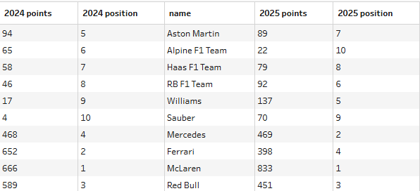
In Option 2, you still need the column for your category (e.g. team) but in this case your other two columns have been merged so the measure value and what you're comparing across are combined. You now have one column which contains the initial value (e.g. 2024 position or whatever your value will be on the left of your slope chart) and one column which contains the secondary value (e.g. 2025 position).
Take a look at your data and see how it's formatted. If you have it in the option 2 format, you can pivot it to make it easier for yourself in the long run (which I'd recommend) but if you're not sure of how to do that or have another reason why you need the data in your wide format then don't worry, we're going to cover both options anyway.
Step 2: Making the slopes
To make the slopes with the dots, you will need a dual axis but let's start with a single axis chart to begin with.
Option 1
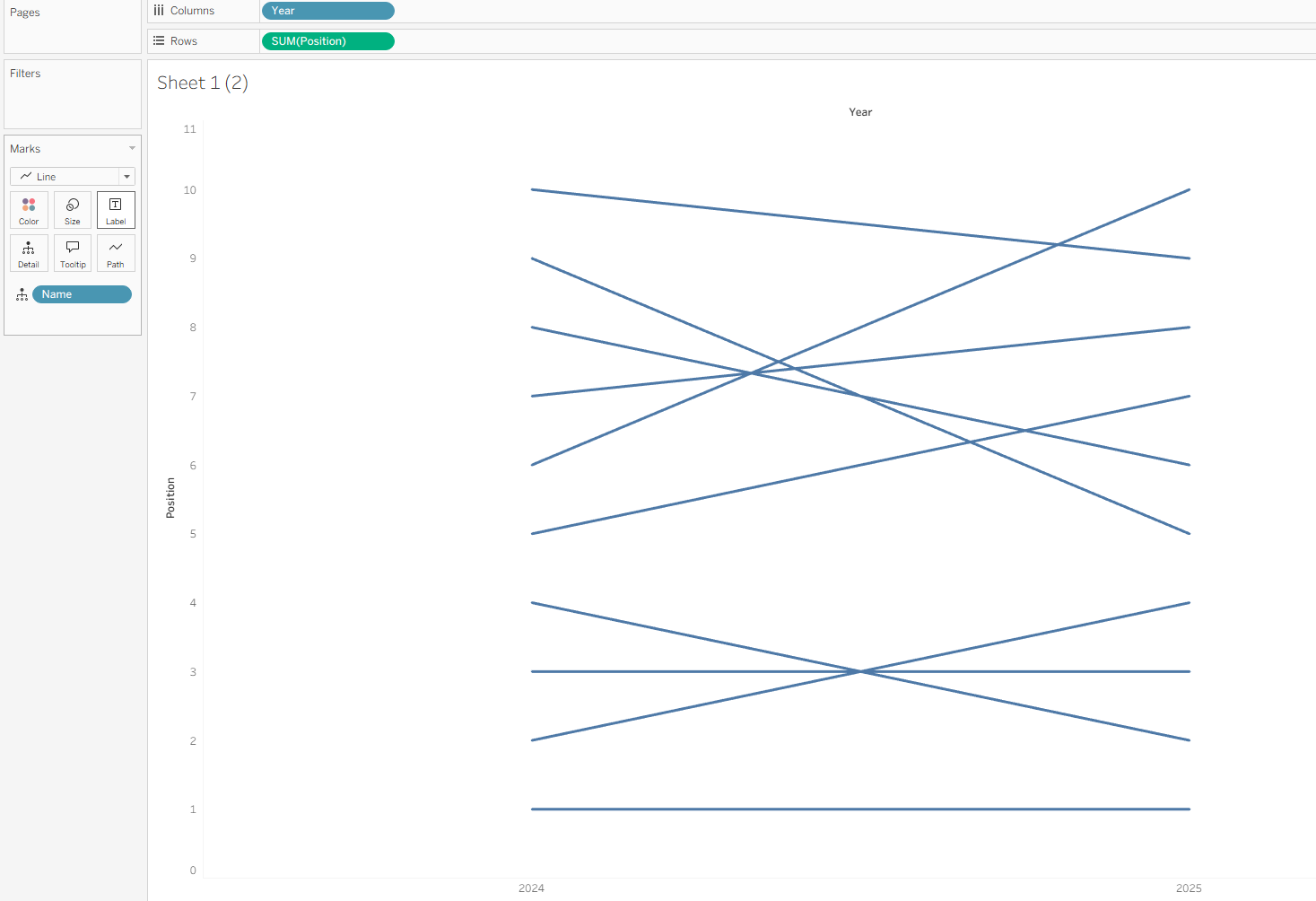
- Drag your comparison column (year) to columns. Ensure that is set to a discrete dimension (blue pill) if you do have a numerical value, so that it forms headers rather than an axis.
- Drag your value column (position) to rows.
- Add your category (team) onto detail.
- Ensure your mark type is set to line.
Option 2
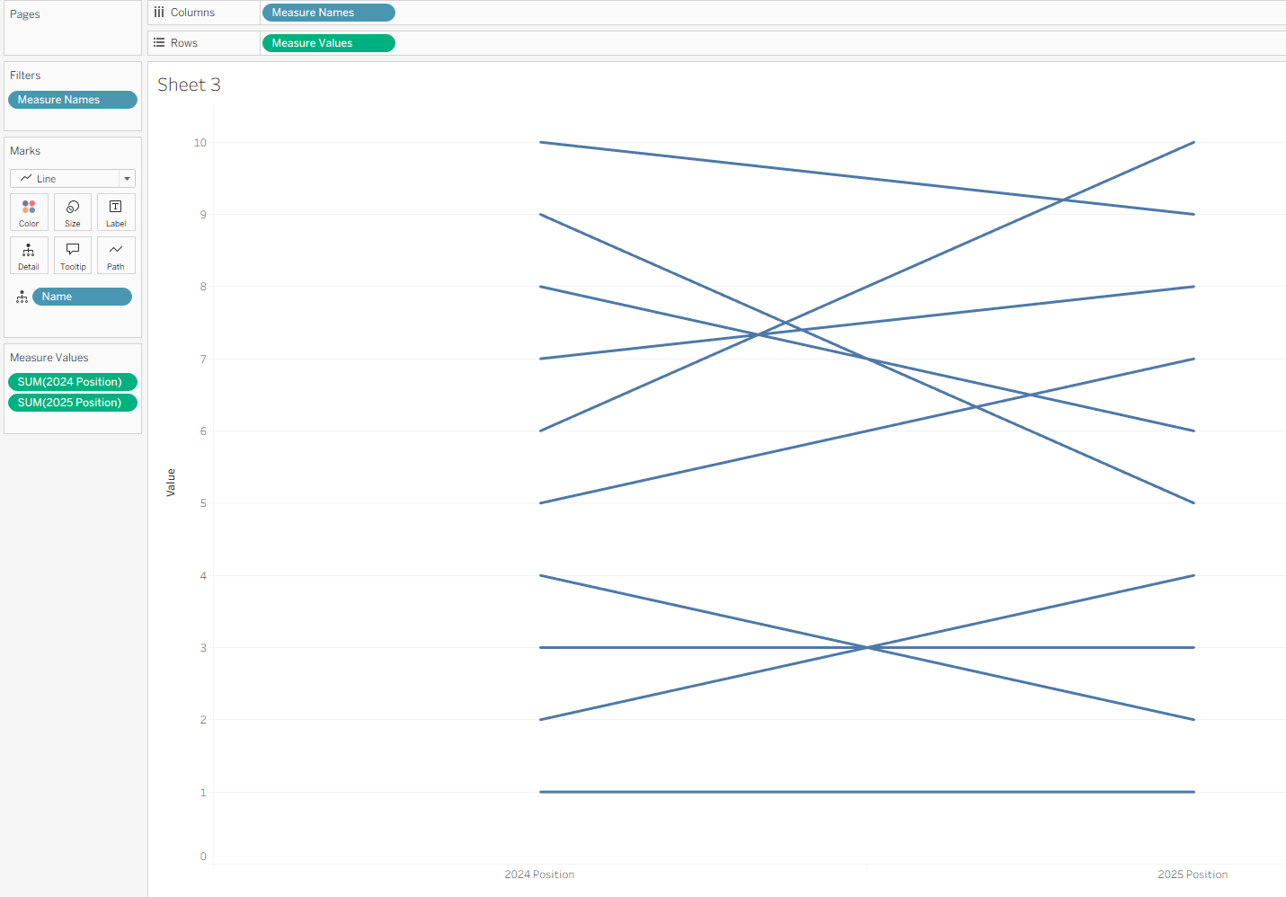
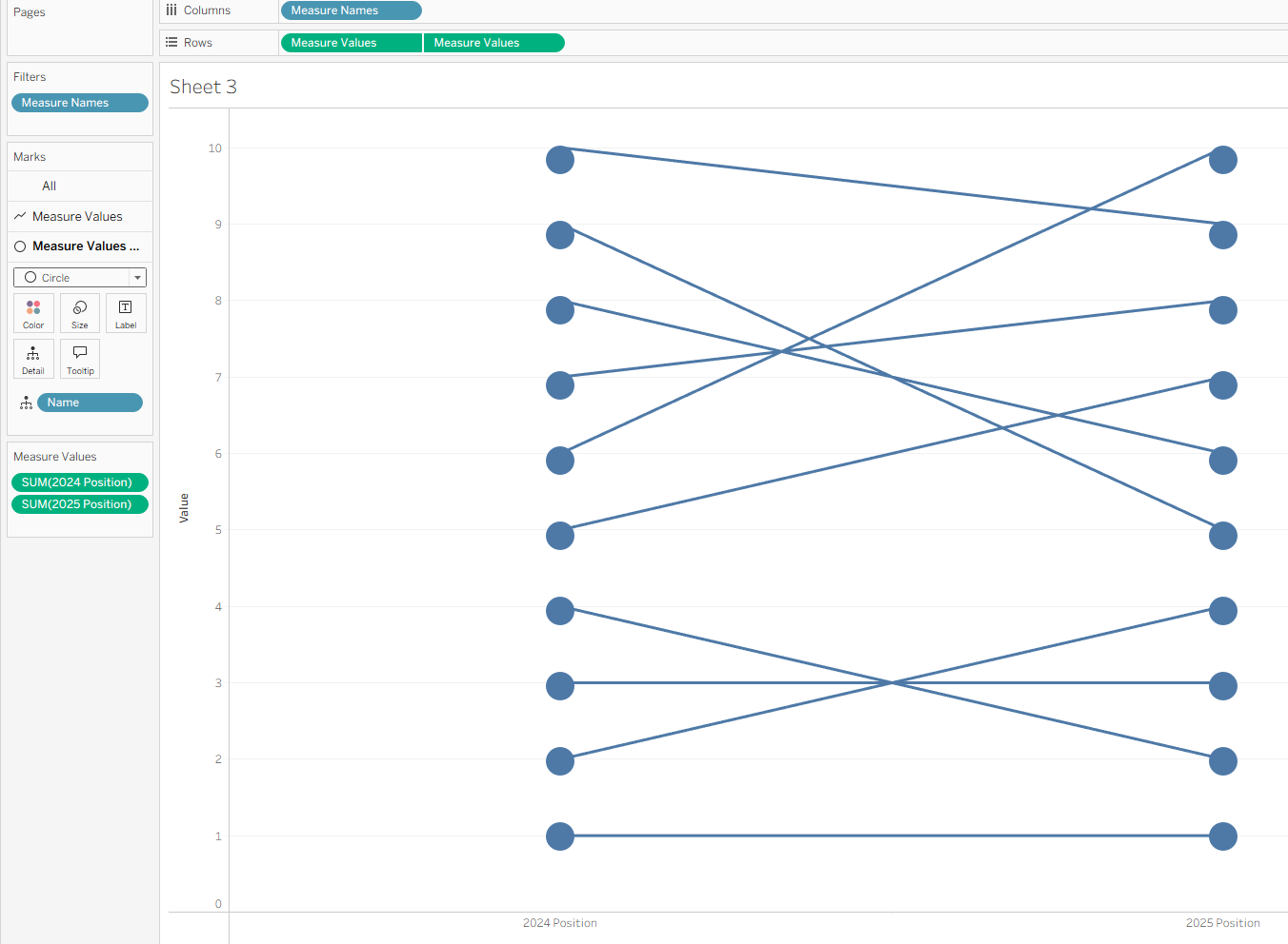
- Drag measure names onto columns.
- Drag measure values onto rows. Remove the measure values that you aren't comparing so that you're just left with two (2024 position, 2025 position).
- Add your category (team) onto detail.
- Ensure your mark type is set to line.
Step 3: Making the dots
I'm a big fan of the dots which mark the start and end of the lines. I think this acts as a great way to show the values and neatens everything up too, but you probably could leave it if you're unbothered.
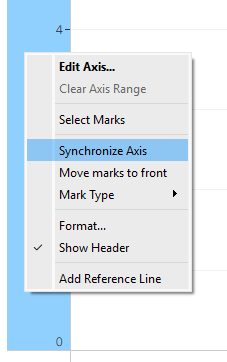
If you do decide to create the dots which I'd recommend, you need to create a dual axis. This the same method for both options where you need to duplicate your values (the green pill on rows) using the CTRL + drag method. Right click on your bottom y (value) axis and select dual axis, ensure that they are then synchronised when the dual axis is in place. Also ensure that your new mark type is set to circles.
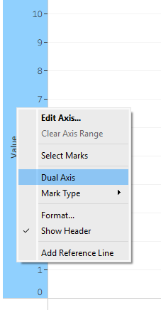
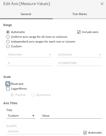
Final note: If your good value is smaller (e.g. position 1 is better than position 10 for me) then reverse your axis so that it's more intuitive to the user. Right click the axis, select edit axis and then reverse the scale.
Step 4: Colouring the slopes
This is not a necessary step again, but I think it really adds something to the chart making it even easier for the user to quickly see areas of improvement and decline. As you need to create a calculated field for this, we have to separate them into the different options.
Option 1
To get individual slope colours for improvement and decline, you have to fix the values at the team level to allow for the comparison at the row level (as they're currently on different rows which cannot be compared across). We could create this all in one calculated field but I think it's easier to understand when it's split up so let's do it that way.
Beginning with the initial value field, we have to fix the level of detail to the team level. We then need to specify that we want to return the value if our comparison (blue pill) column is equal to our initial metric (in this case, 2024). As we're using a FIXED LOD, we need to wrap our IF statement in an aggregation.
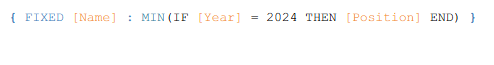
We do the same for 2025.
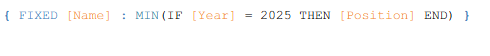
Then we compare these values. In this case, a lower position is better for me which is why my calculated field shows a lower value in 2025 compared with 2024 as an improvement, but make sure that you note what is appropriate for your chart.
Once complete, drag your final coloured slopes calculated field onto the marks card.
Option 2
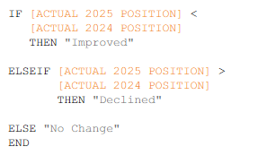
Creating the individual slope colours is relatively simple with the option 2 data format. All you need to do is compare one value to the other as they're at the same row level, unlike in option 1.
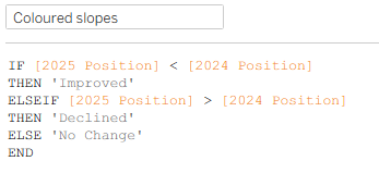
Drag your coloured slope calculated field onto your 'line' marks card. Easy peasy!
Step 5: Make it pretty
There are a variety of ways that you can make this chart pretty. Here are a few examples of things that I did to improve the chart from the basic creation to the polished version you can see in the image below:
- I removed unnecessary headers.
- I changed the colours of the slopes to be a little less garish.
- I changed the colour/size of the dots.
- I added a customised tooltip.
- I changed the font.
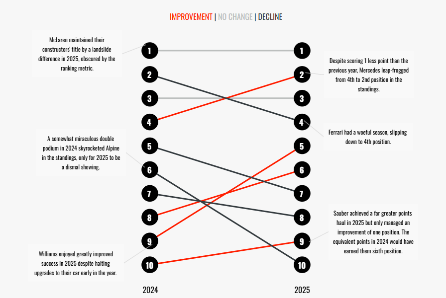
And there you have it - your slope chart. In my dashboard that wasn't explicitly being used as the slope chart example dashboard, I also added annotations to the chart to add some context but that's up to you.
I hope you've learnt something new today and now feel confident creating a slope chart regardless of the format of your data. Until next time, happy charting!