


I wasn't sure how to describe this filter to be perfectly candid with you. After learning the technique during training from one of our coaches, the wonderful Lorna Brown, I thought it was a really cool filter to use in dashboards - so much so that I used it in my big personal development project from my time in training (a project that took me far longer to complete than I ever envisioned but also the one that I think is my best dashboard on Tableau). However, when I tried to find a blog on our website about it, I couldn't find one and I wanted to share this knowledge with the world so you could create a fun filter action too. It's very possible that I just wasn't the best at googling as I wasn't sure what to call the action itself (a big thank you to Erica Hughes for answering my random introductory message to help find a better descriptive term for this trick than the 'click and drag' thing that I originally described it as - the Workout Wednesday warriors have really played a prominent role in bringing this blog to life!), but hopefully if you've made it here, then something has gone right!
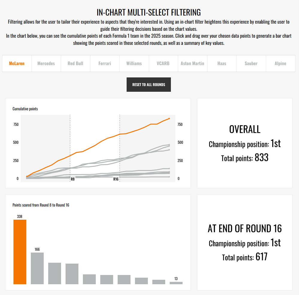
Let's start by at least attempting to explain what's going on though. I call this manoeuvre the 'click and drag' because that's what the user does to select the timeframe that they want to filter to. This filter creates a range which can then be applied to other charts, as I do in the demonstration below. Of note, the 'timeframe' does not just have to be the traditional dates timeline. The filter action is only applicable to line charts but as long as you have a time-like element that's appropriate for the sequential nature of a line chart, you can use whatever measure you'd like. In my example, I'm using the rounds in Formula 1 and if you are thinking about moving away from the classic date format, sports provide an excellent backdrop as they usually have their own timeline like matchdays or tournament stages. But a classic is a classic for a reason so don't shy away from using this action with a line chart using dates either - it will really elevate the user experience to change your regular dashboard into something special!
So now that we're hopefully on the same page about what we're getting up to in this blog, let's get started on how to create this filter action. It is a slightly complicated process, I'll be honest with you but once you understand what you're doing and why, you'll get to grips with it in no time.
Step 1: Create your charts.
As ever, we start with creating the charts that we will be using in the filter action. You'll definitely need a line chart (as this is the chart we'll be using as the filter) and one other chart as well (the chart that is being filtered). For me, I of course had my line chart and then a bar chart that was being filtered. I also had my KPI which was unaffected by the filtering as well as a filter-specific KPI. We'll just focus on the 2 key charts for today though.
If you're wondering how to do the highlight action, I've just written a blog which takes that step to the next level so I won't repeat myself here. You can check it out though and come back or sort it later if you'd like.
Step 2: Create your parameters.
To form the click and drag action, you'll need two parameters to define the boundaries of the filter. These parameters are based on your x axis measure so head to where that is in your data pane and start by creating your first parameter.
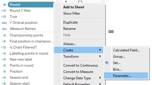
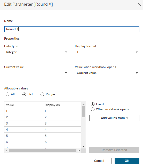
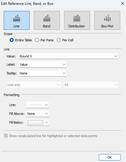
Your parameter should cover the entirety of the field's expanse and you can name it as you please. You might want to call it 'lower boundary' or something similar but I originally named them with x and y (perhaps a somewhat confusing option given those are also the names of the different axes but I know what I mean!) so that's why I've gone with that. Set the current value to your minimum value and then hit ok.
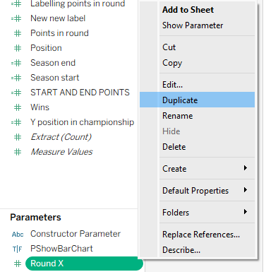
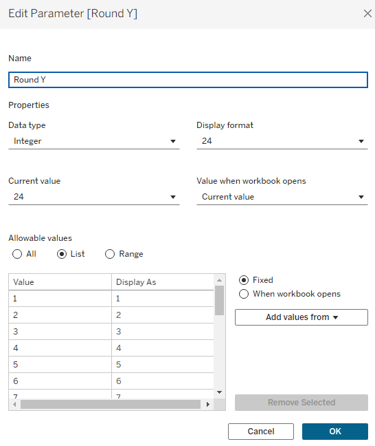
Next up, you need to duplicate this parameter to create your upper boundary, setting the current value to your maximum value within the parameter, renaming as appropriate and then hitting ok.
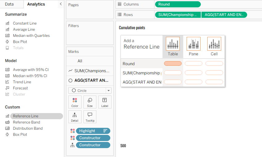
Step 3: Add your parameters as reference lines.
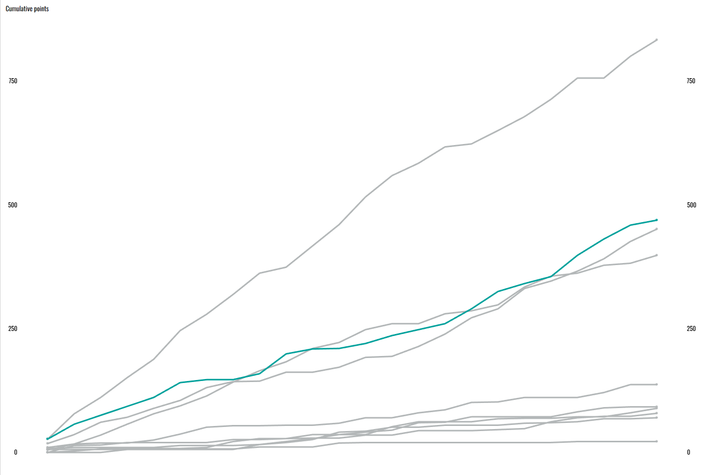
To add your reference lines, go to the analytics pane and drag a reference line onto the canvas. You want it to be on your x axis measure that's setting the timeline (for me, that's round) and on the table section.
A pop-up window will appear. You can really set this up as you please but these are my preferences. The only specific thing that must be the same is using your parameter as the value.
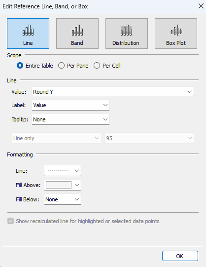
Once complete, set up your other reference line too. Make note that if you're using fills to more clearly represent which rounds have been selected like me, this time you'll be filling above rather than below.
Step 4: Create your chart filter.
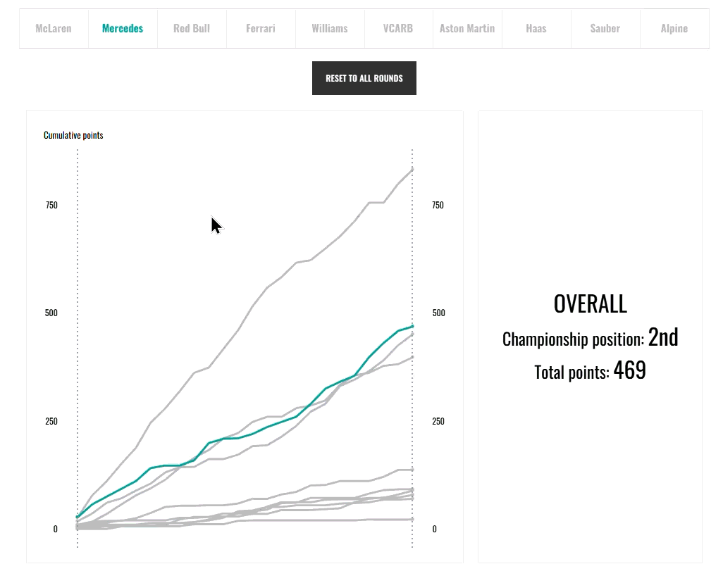
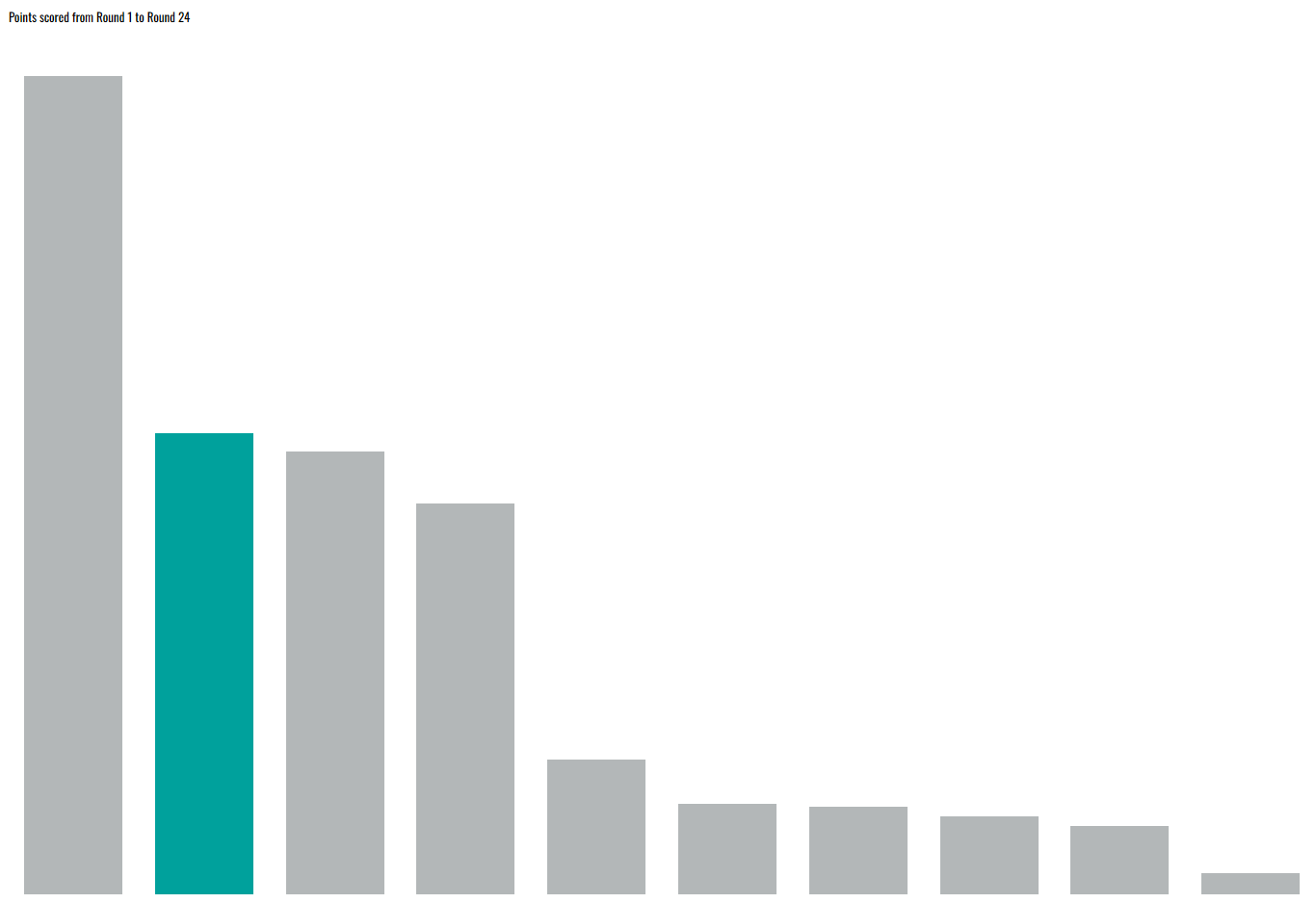
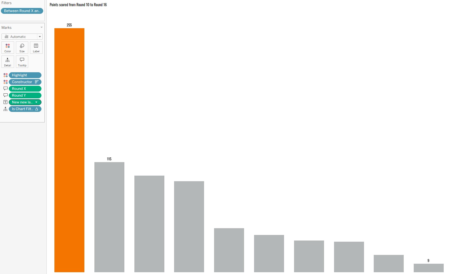
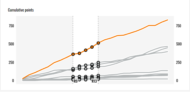
To create the chart filter, you first need to understand the logic behind what you're creating. With the click and drag action, the user is highlighting an area of the chart that they want to know more about. They might want to know the profit made across different categories in that specific timeframe for example. In my visualisation, the user can explore the points scored by each constructor across the chosen rounds using a bar chart that more clearly represents and compares those values.
As you want to show values within a timeframe, this is where your parameters come in. As you're looking 'within', you need to find the values that are greater than the minimum boundary and less than the maximum boundary.
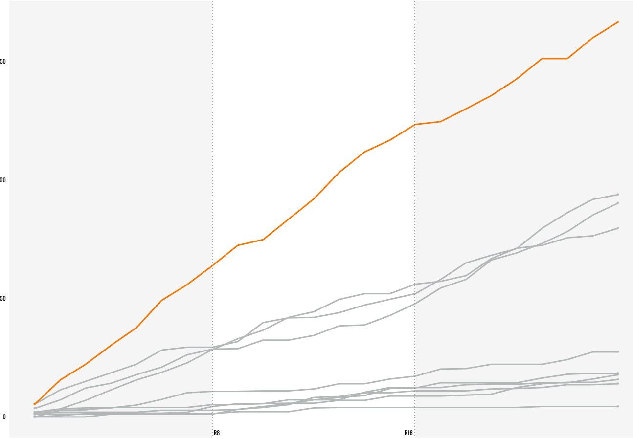
In the example above, the minimum boundary is round 8 and the maximum boundary is round 16 and we want to see the points scored between rounds 8 and 16 inclusive. As a result our calculation looks as follows:
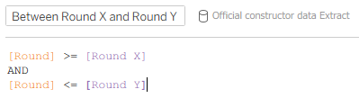
As I wanted to include the boundary rounds, I used an equal to sign as well but that can be up to you depending on what you're showing.
Drag your new calculated field to the filters pane of your secondary chart (for me, the bar chart) and select 'True' in the pop-up window. This is so that you see the values that meet the criteria we set in the calculated field. It might be that your pop-up window has true as the only option at the moment. That's okay, check the box anyway and click ok. You can either change the parameter values now to check that everything's working for your own peace of mind, or just wait until we implement the action in a bit.
Step 5: Dashboard it all.
To implement the filter action within the dashboard, everything first needs to go into the dashboard itself. Plop it all in and arrange it as you'd like. You don't need to make everything perfect just yet, just functional. My example below is the one I created earlier for practice so it is completely done, but as long as everything is in place, you can sort the finishing touches in step 8.
Step 6: Add your filter action.
To set up the filter action, you actually need to create two actions because one sets the lower boundary and the other sets the upper boundary, all in one click and drag motion.
To set up action one, head to dashboard > actions > add action > change parameter. Note: even though we're creating what we've called a filter action, we're actually changing the parameters with the actions which then impacts the filter.
Set up your parameter action for your lower boundary as I have done below.
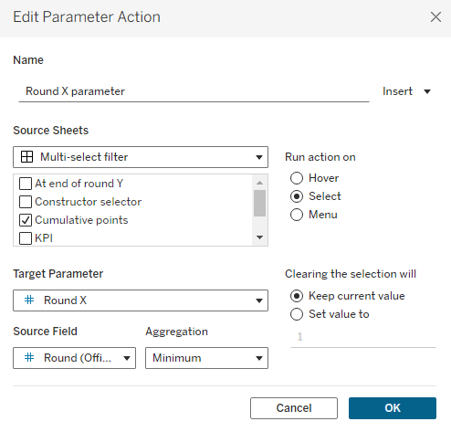
- Source sheet is your line chart alone.
- Run action on select.
- Target parameter is your lower boundary parameter.
- Source field is your x axis measure that sets the timeframe. Aggregation is minimum.
- Clearing the selection will keep current value (it's important to set this, otherwise a later step will be impacted).
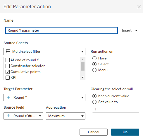
For action two, you need to follow the same steps but complete them for your upper boundary instead. The key difference here is that your aggregation will be set to maximum.
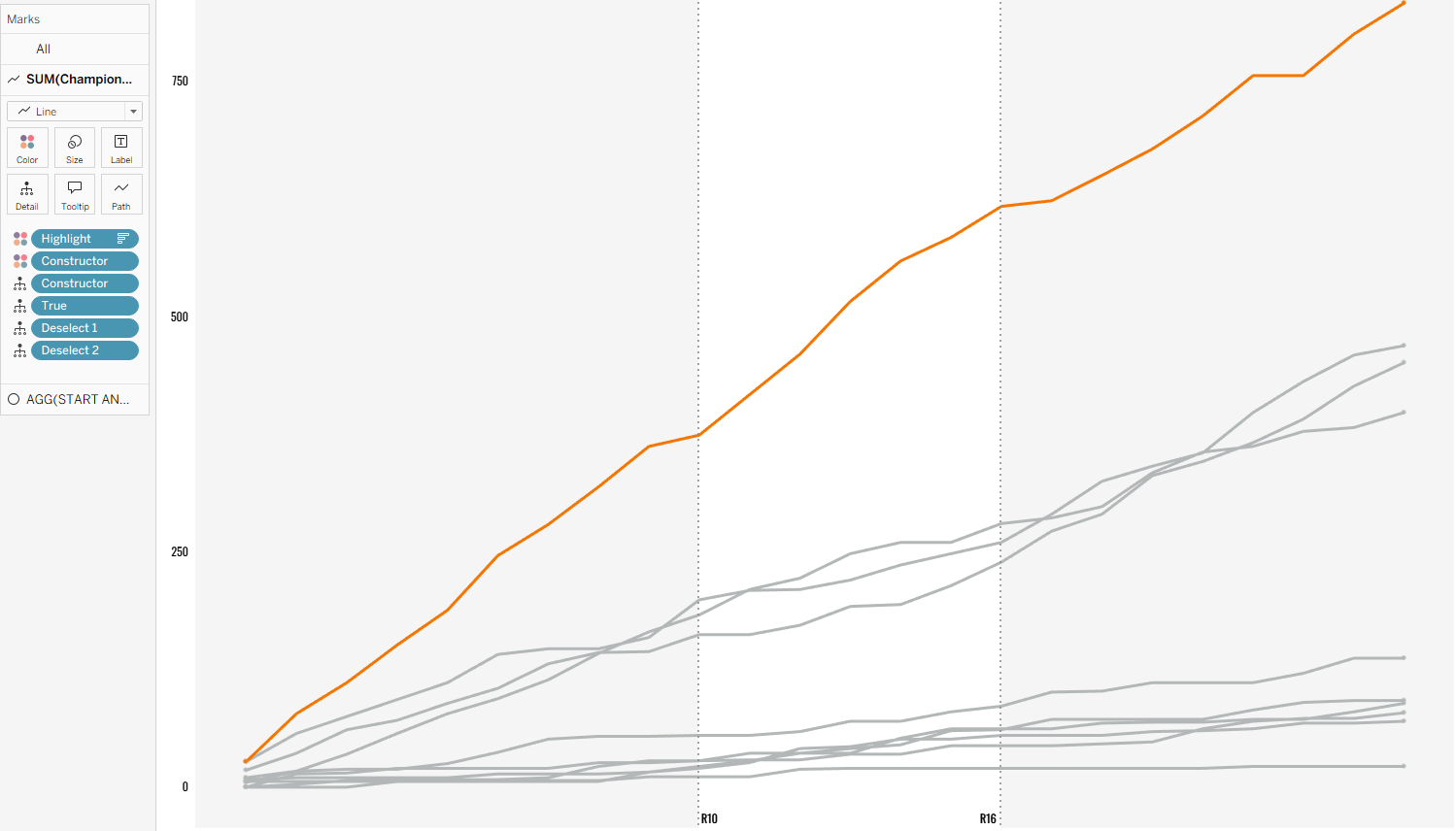
Now when you perform your click and drag action, it should affect your secondary chart. However, the marks within your selected range will likely remain selected like in the image below. How do we get them to automatically deselect without losing the specified range?
Step 7: Add your false filter.
You have to create what is called (or at least what I was taught to call it) a false filter. Essentially you're creating a filter action but the filter fields are never equal so the selection is automatically cleared. Let's first create the action and then go through the logic.
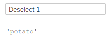
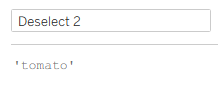
You need to start by creating two calculated fields that will act like dichotomous values. I once used potato and tomato and it stuck so those are the two that I often use when creating a false filter (sometimes other fruits if I fancy), but maybe you could create your own ones that make you smile whenever you create false filters. Once you start using them, you'll probably use them very frequently so why not make it fun?
You then need to add these two calculated fields to detail on the marks card of your line chart.
Now the foundation has been laid, you can set up your filter action. As ever, head to the dashboard > actions > add action > filter.
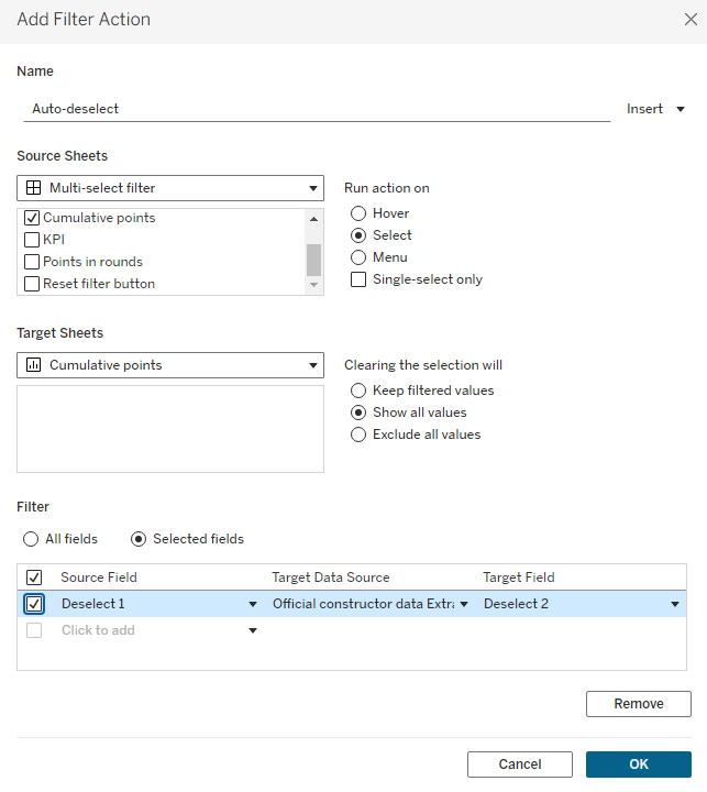
Set up your filter action like I have done in the example above.
- Set your source sheet to the line chart in your dashboard.
- Run action on select.
- Set your target to the worksheet that your line chart is in.
- Clearing the selection will show all values.
- Then you need to filter on selected fields where your source field is calculated field 1 and your target field is calculated field 2.
To explain how this works, essentially you're using a filter to say when I perform my selection, I want to filter my 'deselect 1' field to equal my 'deselect 2' field in the line chart. But potato can never be equal to tomato so it automatically clears the selection to show all values. However, as in our other parameter actions we have set them to keep the current value, the boundaries remain the same even when deselected.
Step 8: The finishing touches!
With everything filter-action-wise complete, you can do the other things that you want to do. Here are some examples of things that I did to improve my dashboard at this point:
- I customised the tooltips on both charts.
- I added the KPI cards.
- I included dynamic zone visibility for when all rounds are included.
- I added a reset button to go back to include all rounds (I'll be writing a blog about this if you're interested in how to reset parameters).
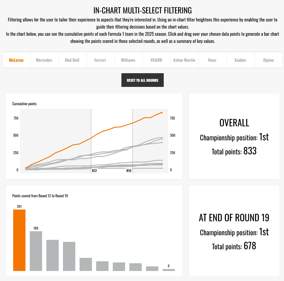
And there you have it - an in-chart multi-select filter action which the user can use to implement their selected range in other charts. I hope you feel like you've learnt something new and maybe a little fun with this interactivity. Until next time, happy filtering!