


I'm having a great time exploring toggling in Tableau, as is probably evident from the numerous blog posts that I've written recently on the topic. I just think they're such a fun way to use a parameter and are much more creative visually too. So after learning how to create a regular 2-way toggle (that works sort of like an on-off switch) for a personal project, I kept charting and realised a 3-way toggle might be effective for my next set of charts. As to why, that's a bit of a long story but essentially I was creating an 'actual' view, a 'both' view and a 'theoretical' view which made the 3-way fluidity make sense, like a scale. I think that's the scenario when a 3-way toggle would work best and make the most sense however, if you'd just like to give it a go, I've created an example that essentially squeezes a parameter into a toggle and that works just fine too. In this example, I'm using sample superstore but feel free to follow along with your own dataset too. Now that we're ready, let's get toggling!
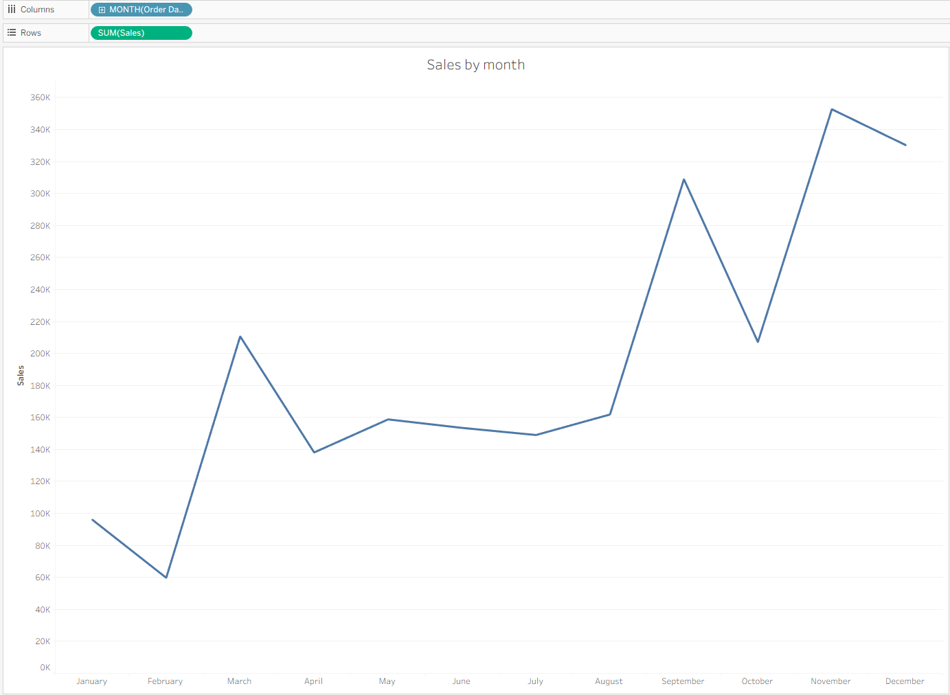
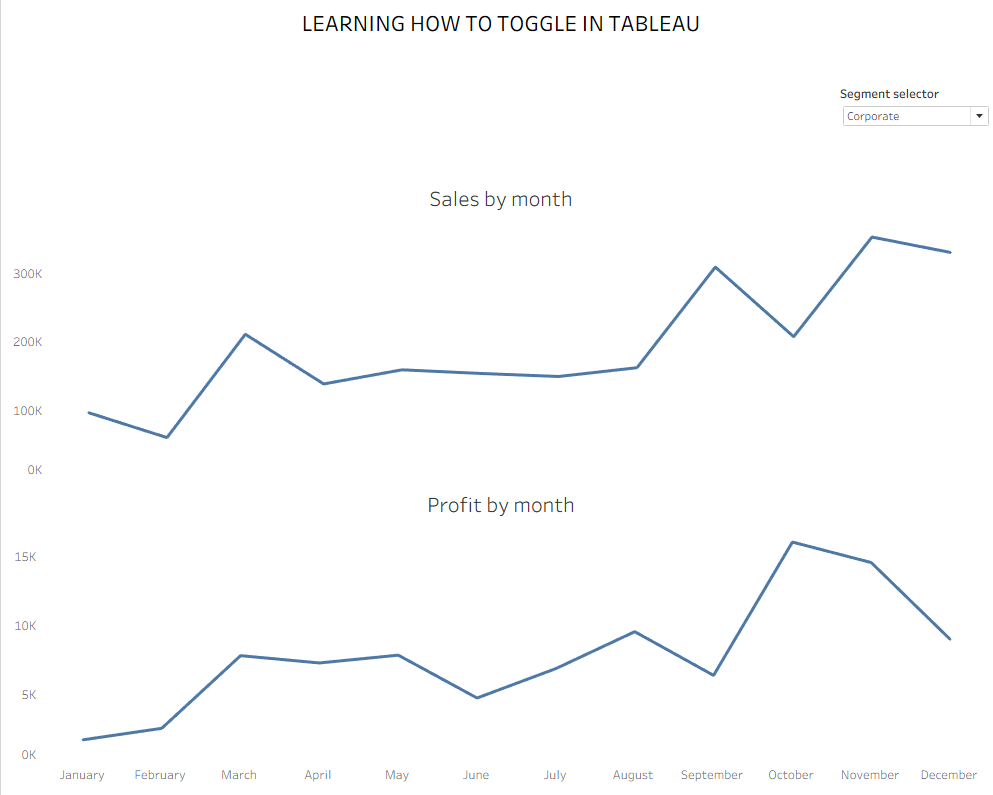
Step 1: Create the charts that you'd like the toggle to work on. As this is only being used as an example, I created two simple sales and profit line charts to evaluate seasonality within different customer segments.
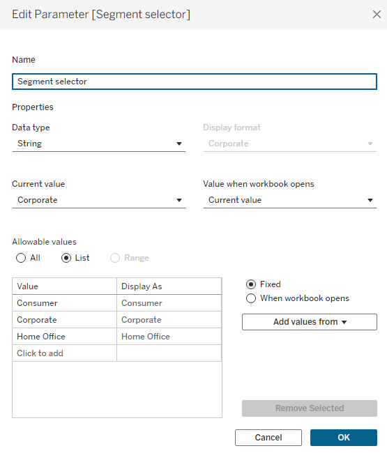
Step 2: Create the parameter to control your toggle. I called mine segment selector but as no-one will be seeing this anyway, you can name it as you like as long as it makes sense to you. I made the data type a string, converted allowable values to list and then added values from the segment field.
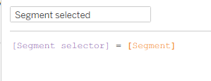
Step 3: Create the calculated field to filter your charts. To ensure that only the segment selected in your toggle is being shown, you need to create a Boolean calculation which can then be added to the filters pane. This calculation is saying when your parameter specific segment equals your field specific segment, return true (e.g. if your parameter is showing corporate, it will return true for your corporate value within the segment field and false for the other two values).
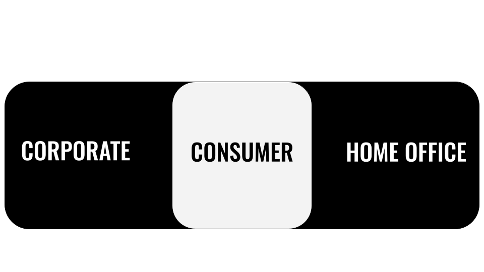
Step 4: Create your 3 toggle images. Unfortunately for a 3 way toggle, you can't really use online images as they likely won't be specific enough to your use case. I haven't ventured into the world of AI for this either although that could potentially create your 3-way toggle. My preferred method though is using google drawings which I have, of course, discussed before (If you haven't read my other toggle blog posts, where have you been?). I found it quite easy to make my 3 images in this way and I'd like to think they look quite smart (I didn't know what word to use that meant good but better than good, kind of like chic but less fashionable as it's a toggle. Instead, I've now ended up sounding like my dad trying to compliment one of my outfits).
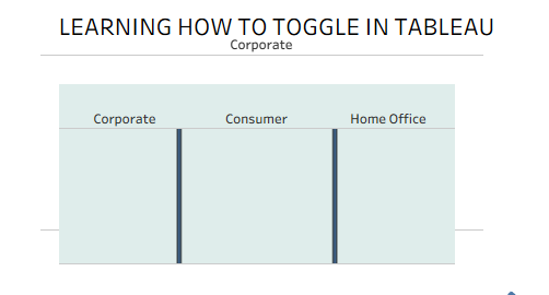
Step 5: Create your toggle chart. Start by adding segment onto columns, setting the screen to 'entire view', setting your marks to shape and then adding segment onto shape as well. Now you can assign your toggle images to the appropriate segment.
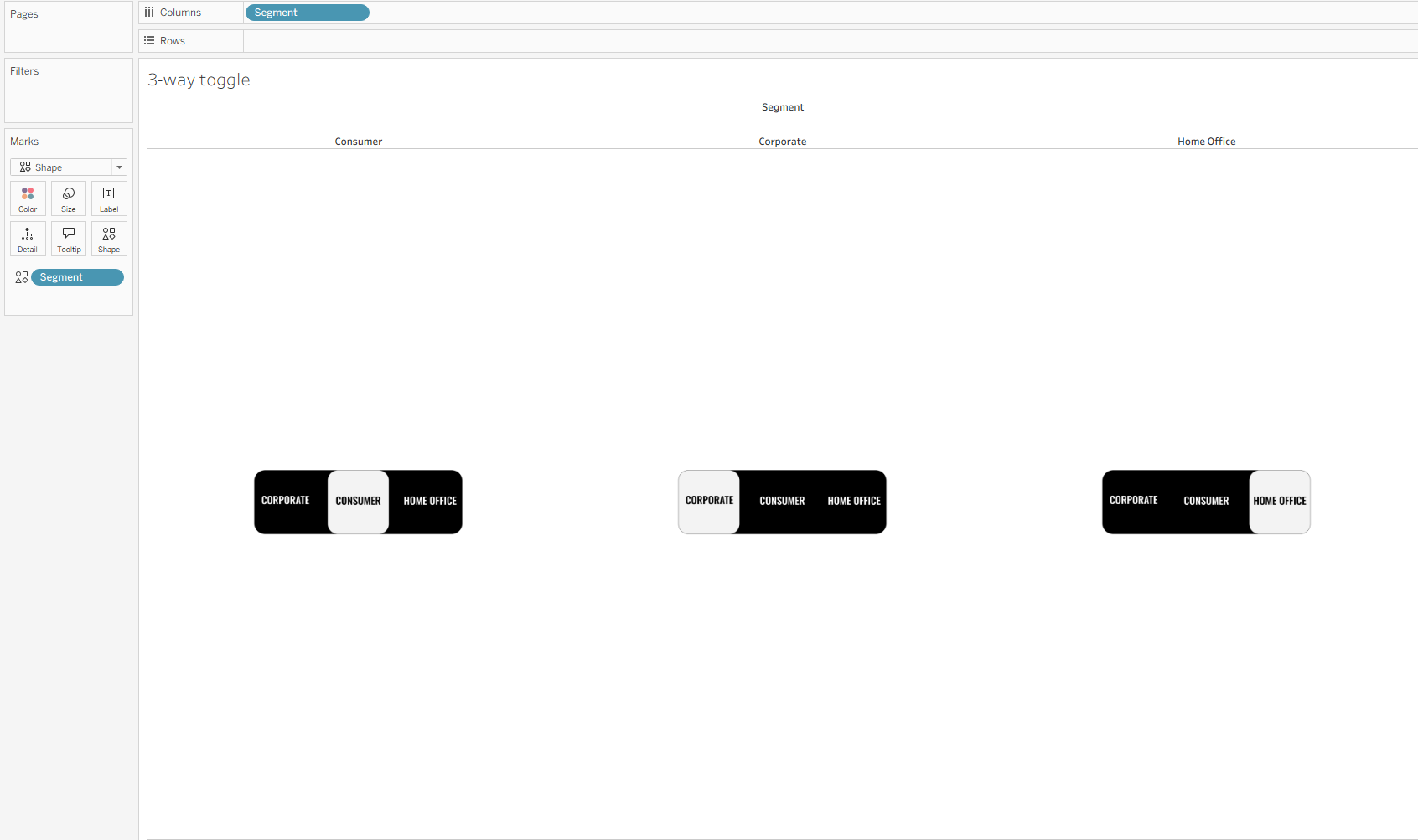
I was lucky enough the first time around not to encounter this problem but as it turns out, the way I set up my buttons is not the same as the order that they've come out in Tableau as they aren't alphabetical. For example, I have consumer in the middle of my toggle and it's on the left of the pane. This won't be an issue in a second but might prove to come back to bite you if you just ignore it. So, I'd recommend switching the columns around forcibly in your sheet by dragging consumer to the right in the header. Before we add the filter, duplicate the sheet for your toggle overlay. Then add your newly created calculated field to the filter pane and select true so you only see the toggle which highlights the value in your parameter. Make the size of the shape large enough to fill your worksheet and turn off tooltips. Now you have the base of your toggle, the visual part at least.
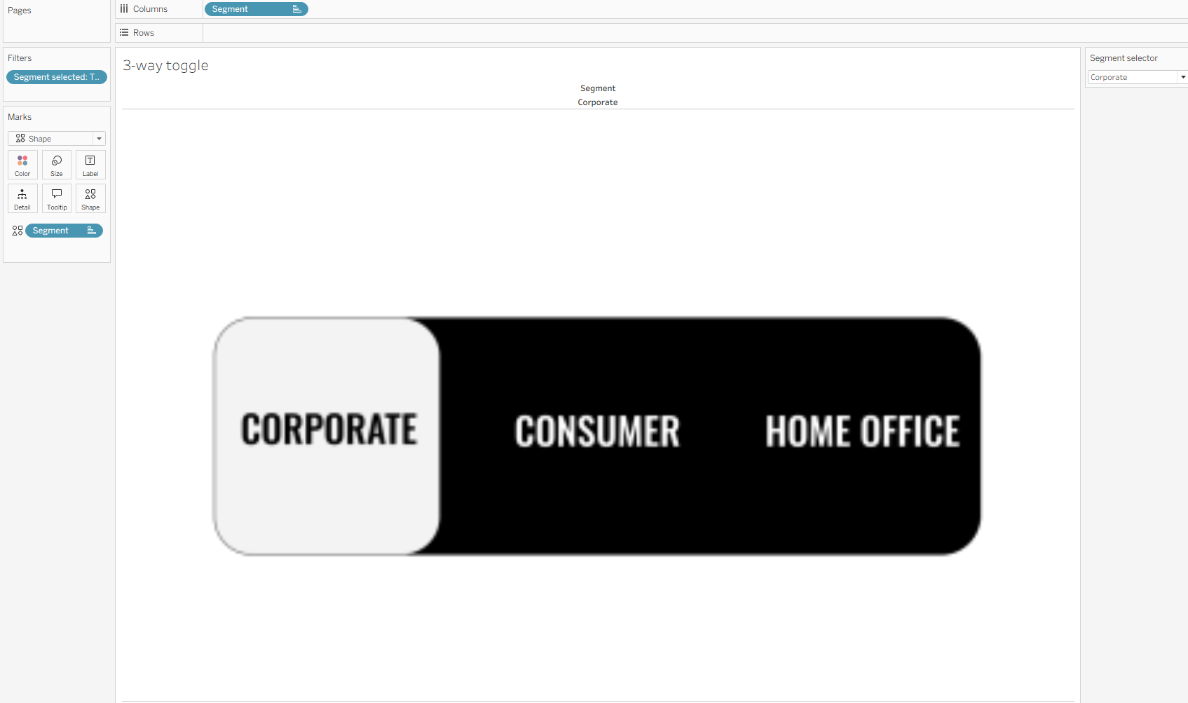
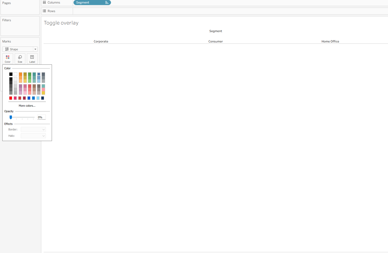
Step 6: Create your toggle overlay. Using your duplicated sheet, remove segment from shape. I like to convert the uniform shape into a square outline because I feel like it fits best with the toggle clicking but it likely doesn't matter too much if you really love circles. Now change the opacity of your shape to zero. It should look something like it does below. I'd recommend getting everything at least mostly set-up before converting it all into a blank sheet, just so it's easier to find on your dashboard or you can colour the background of this worksheet for now.
Step 7: Plop it all into the dashboard. I like to set it all up without the toggle first, just so I know how it's going to be laid out. I also keep the parameter in for the time being so I can check if everything's working.
Once that's done, I add my toggle base and overlay separate floating containers. I'm still keeping the colours just so I can tell where everything is. If you do lose your sheet, either scan over your dashboard with your mouse until you find it floating in space or select in your sheets in the lefthand pane.
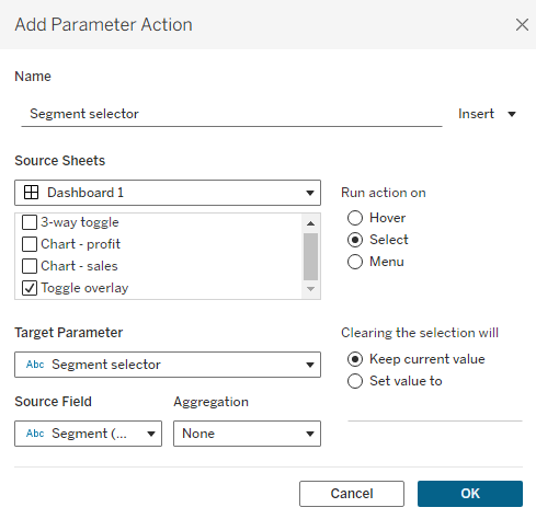
Step 8: Configure your dashboard actions. Set up your toggle by going to dashboard > actions > change parameter and copying how I have set it up below. Ensure that the action source sheet is your toggle overlay - not your toggle image sheet as this is filtered and won't perform the action that you hope it will, which is why we need the overlay.
Now when you click on one part of your toggle overlay, your parameter should change. This will affect your charts and the toggle image too. However, you might have noticed that your toggle overlay stays selected which is not ideal and ruins the seamlessness of the overlay experience. To eliminate this, as we did with the 2-way toggle, you need to create a false filter.
Step 9: False filtering. If you followed along with my 2-way toggle, see if you can remember how to do this part because you can use it on other parameter changes as well which is pretty fun (as you can probably tell, I'm very cool). If you didn't read my other blogs and you're choosing to start with the big-time 3-way toggle, look at you go. Here's what you'll need to do either way. Firstly, create your two calculated fields for your toggle overlay.
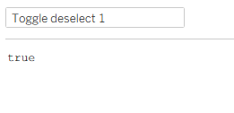
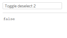
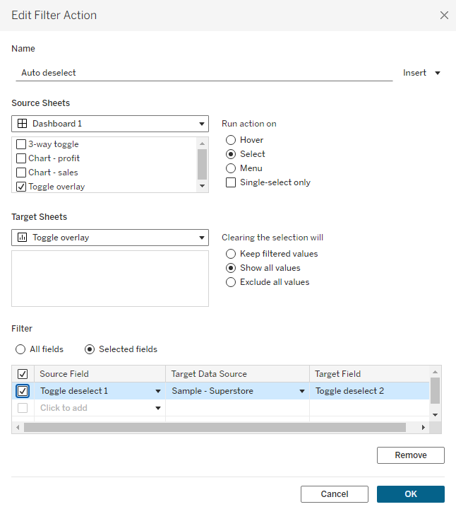
Then you need to add these calculated fields to detail on your toggle overlay sheet. Remember, this is going to work because true can never equal false and therefore nothing will ever be filtered and the selection will automatically clear. Head back to your dashboard and add a filter action. Set it up as I had below, ensuring everything is exactly alike. If something doesn't work, I'd expect that you've muddled up your target sheet or you don't have clearing the selection set to all values. This is only because these are the common mistakes I myself have made in the past but maybe your brain thinks differently to mine so check it all through if something's going wrong.
Step 10: Make it pretty! Now that everything should be working nicely, you can make everything look as wonderfully as your heart desires before publishing.
I hope this has taught you something new that you're looking forward to trying out on your Tableau projects. Until next time, happy toggling!