


The Brief
On our third day of Dashboard Week, we were tasked with analysing our own Sneeze Tracker data. Harry came up with the idea of logging all our sneezes in Google sheets along with who was the first to bless the sneezer and the total amount of blessings for each sneeze.
The brief was to use that data answer our own questions or use the following as SNEEZEperation:
- The Alpha Responder: Who is statistically the fastest "Bless You" in the West?
- The Seasonal Surge: Can you identify a "Spring Spike" in sneeze frequency as we’ve moved from January into April?
- Circadian Rhythms: Is the office more attentive in the AM or PM? Calculate the "Blessing Ratio" for both.
- The Echo Chamber: Which Room is the loudest, and where do you find the highest Bless You Quantity per sneeze?
- The Contagion Effect: Are there specific days where one "Sneezer" triggers a chain reaction across the cohort?
My Approach
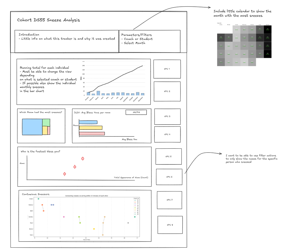
After reading the brief and inspecting the data, I made a quick sketch of how I envisioned the Dashboard would look like based on the key insights I wanted to show.
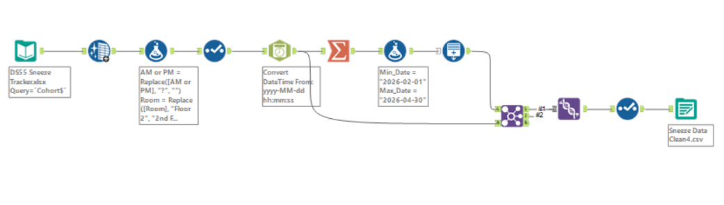
I realised that there were some data quality issues which I had to first resolve in Alteryx before visualising the data.
Data Preparation
Using Alteryx I firstly cleaned the data by removing unnecessary punctuations and trailing whitespace from the fields. I also thought it might be useful to create a new field named "Bless Type" to categorize whether the person saying "Bless You" was part of DS55 or a coach.
Later I also had to generate more rows to fill in the gaps in the date field which would allow me to plot the data on a continuous axis with no gaps. Once I felt satisfied with the output data structure, I've connected to the CSV version in Tableau Desktop and began building charts.
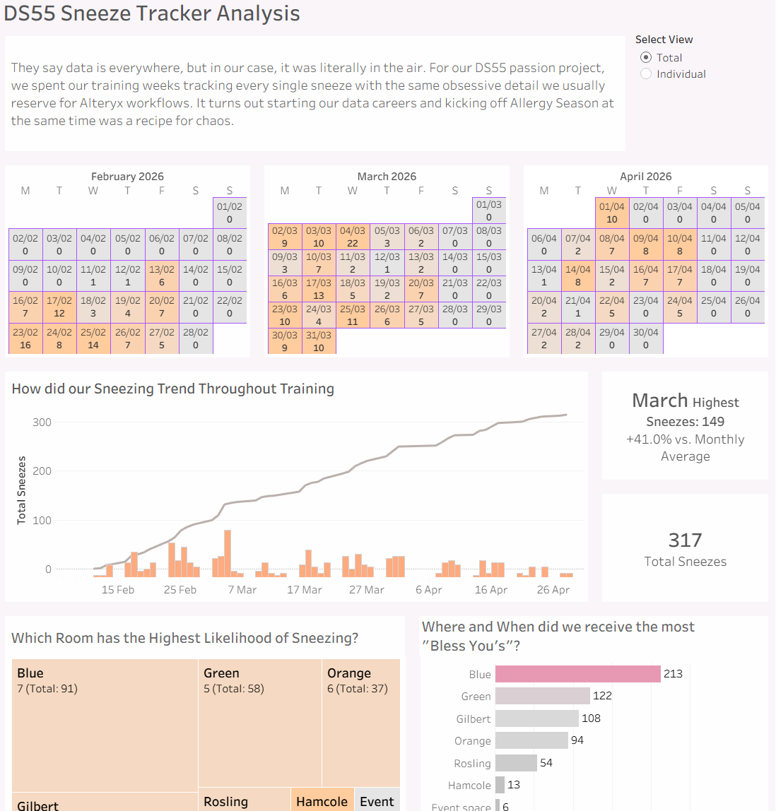
Final Dashboard
Challenges
My main challenge was sticking to the initial sketch, a lot of the charts worked differently than I expected and had to improvise quickly. Other than that, I struggled to drill deeper into analysing the insights like standardizing the number of sneezes per room to find the most triggering room. That was not in my mind at first but I was inspired at a later stage after sharing my Dashboard with Rosh 1.
Feedback
One of the suggestions I received was on the last chart, to show hour on the axis to better group the sneezers into clusters. I also received feedback from DS55 which were the cast of the show! They all enjoyed it and laughed at some of the insights too. I will really miss my cohort after training.
Personal Reflections
I really enjoyed today's challenge, and apart from practicing everything we learned in the past few months, this Dashboard really helped pinpoint the time where everyone's hayfever kicks in. I think Harry was brilliant coming up with this idea as we can now be better prepared for next season!