


The Brief
Our second day was amazing! The task was to join and clean LEGO data using SQL in Snowflake and analyse it in Tableau Desktop based on either the Botanical or Animal Kingdom. The overall mission was to document the "natural history" of the LEGO universe for Sir David Attenborough’s 100th birthday.
Requirements:
- Field Research: Download the Rebrickable CSV tables and upload them individually to your own schema on Snowflake (feel free to add additional data if you can find it)
- Species Identification: Use SQL to clean and join your data. You must choose your "kingdom": focus your analysis on Botanical/Floral sets OR the Animal/Creature kingdom.
- The Hunt for Keywords: Use keyword analysis to isolate your chosen species—search for everything from "Orchid" and "Wildflower" to "Elephant," "Shark," or the elusive "Moulded Dinosaur."
- Biological Evolution: Map the trends in the data, such as:
- Biodiversity: How has the variety of specialised animal or plant parts increased over the last decade?
- Camouflage & Pigment: Analyze the color palettes—are we seeing more "Earth" tones or vibrant "Floral" hues?
- Growth Patterns: Compare set complexity (part counts) between nature-themed sets and traditional City or Technic builds.
- The Broadcaster’s View: Connect your Snowflake data to a visualisation tool you haven't used yet this week. Build an interactive dashboard that even Sir David would find "simply... magnificent.
- Archive the Findings: Commit your SQL scripts, dashboard links, and "field notes" (documentation) to a GitHub repo.
My Approach
Soon after reading the brief, I made sure to navigate to the Rebrickable CSVs (simple google search) and downloaded those files. I then created a new schema inside my Snowflake workspace before uploading the files as tables.
Data Preparation
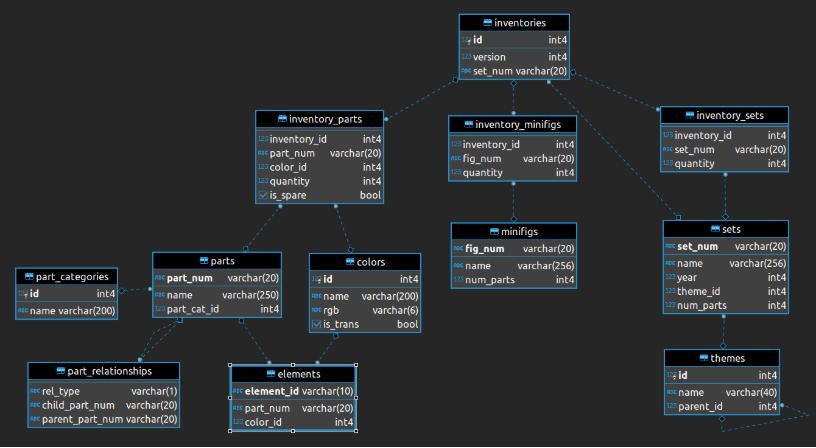
Using SQL I managed to pull the necessary fields from the joined tables to then visualize in Tableau Desktop (use the below data model). This resulted in having two tables in total, one for my Sets and Themes and another for Parts and Colors.
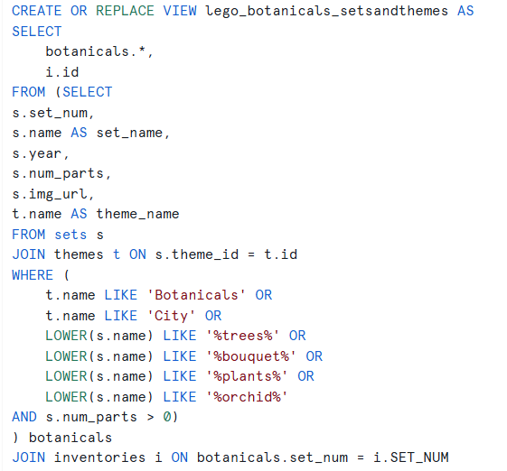
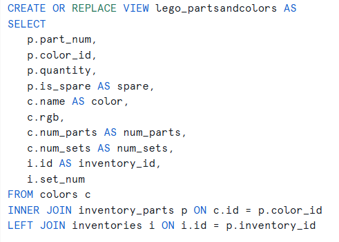
Below I've listed the SQL queries that helped me get to the final data output:
Connecting the Data Source to Tableau Desktop
For this part, I had to install Snowflake Driver and then authenticate using a Key Pair (Username and Private Key File). Then I simply had to configure Tableau Desktop based on the location where I saved my two tables. Once that was successfully done, I've joined the two tables using a relationship and the Inventory ID.
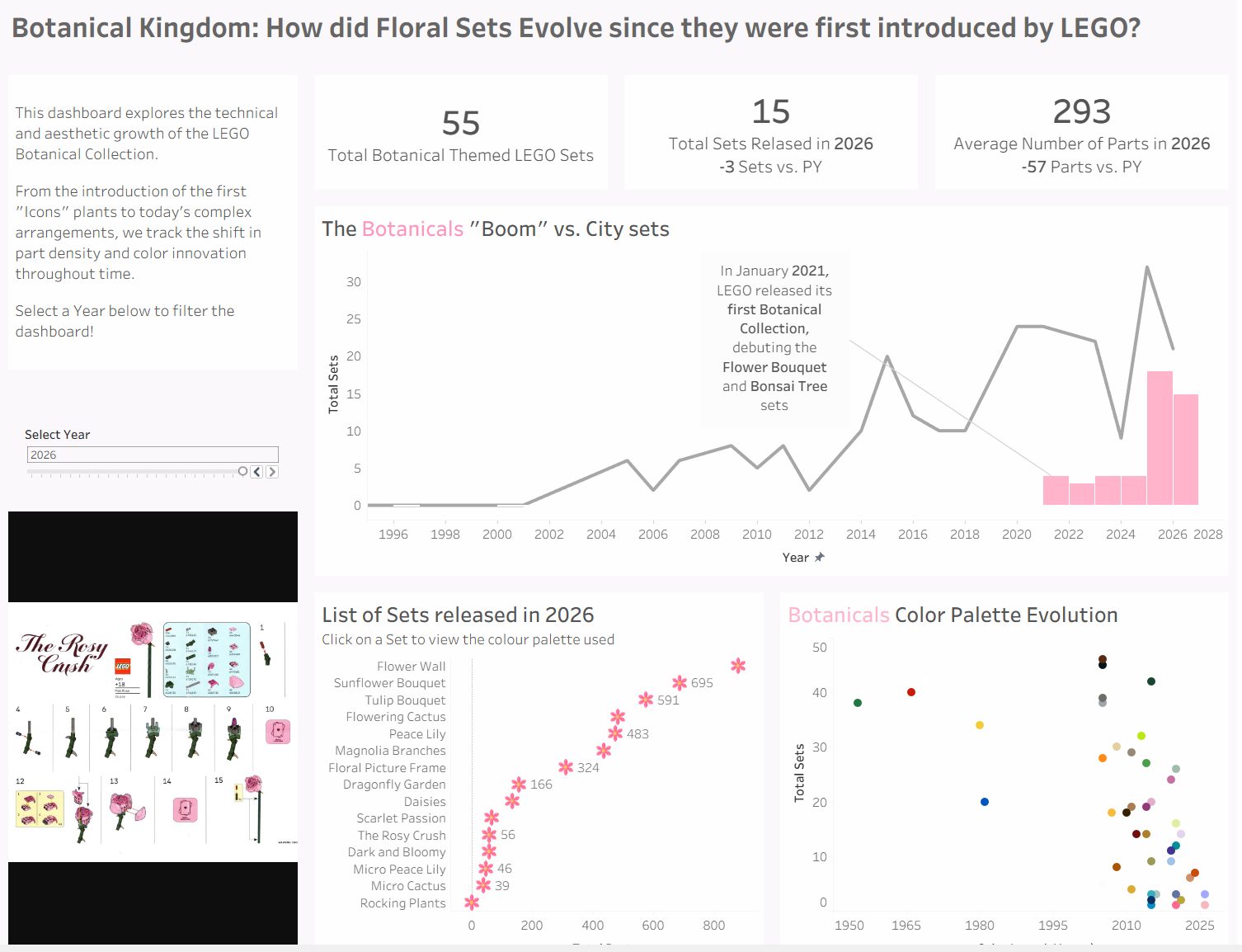
Final Dashboard
Challenges
It was intimidating to work on a project using Snowflake for the first time, but after consulting other TIL members the approach path quickly became a lot clearer. I also initially thought it would be challenging to reflect changes later down the line in Tableau Desktop but due to the live connection I could easily go back and forth with changing things in Snowflake which updated the charts upon refreshing.
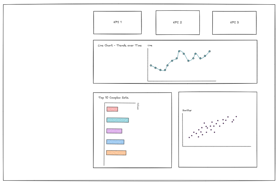
Another challenge was switching back to sketching before jumping into Tableau Desktop, partially because I was really curious to see how the data would look like. You can see below my rushed sketch that I somewhat followed.
Feedback
The Feedback I received was to be more mindful when comparing values to the previous year when the current year is incomplete. It's always worth mentioning it when reading the KPIs or saying something along the line of "Up to the release year of the set".
Another thing was the coach noticed how I manually typed in the hex codes to color the marks in the scatterplot, and advised that this could be done by entering the html code in Tableau Repository.
Personal Reflections
I really enjoyed today's challenge, it was the perfect opportunity to practice SQL (Snowflake) and also understand how it can be directly connected as a live Data Source in Tableau Desktop. I think this narrowed the gap between the theory we learned during training and the application in real life.