


On the last two days of Dashboard Week we used data that we webscraped from letterboxd.com the week before, to produce an infographic dashboard in Tableau.
The Brief
- Using Tableau or Power BI.
- Define the Narrative (Scope & Analytics)
- Don’t just "show" data—tell a specific story. Before building, decide what your infographic is trying to prove. For example:
- The Indie Underdog: Which low-budget films are outperforming blockbusters in user ratings?
- The Critic/Fan Divide: Identifying the most polarizing movies of 2026.
- Genre Evolution: How has the "Popular" page changed over the last decade of cinema?
- Don’t just "show" data—tell a specific story. Before building, decide what your infographic is trying to prove. For example:
- Storyboard & Sketch (The Visual Plan)
- The 17-Week Premiere (Skills in Practice). This is your chance to use every tool in your kit.
My Approach
After inspecting the data I've webscraped last week, I realised that I didn't have enough data to do what I was planning to do. The data had information only on 29 films from the list "Films You Should Watch At Least Once In Your Lifetime" but I wanted to have at least 100 films from the current year's list and another 100 from the first ever list created (turned out to be 2013). This would help me investigate the change in viewers' taste in films comparing today's generation to that of 13 years ago.
Data Preparation
All data used for this project was webscraped from letterboxd.com and TMDB, in Alteryx. I really enjoyed this part of the process as it helped me put what I've learned during training into more practice!
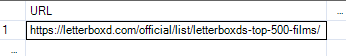
The initial part was fairly easy to set up, beginning with a text file that contains the website URL that you want to webscrape the data from.
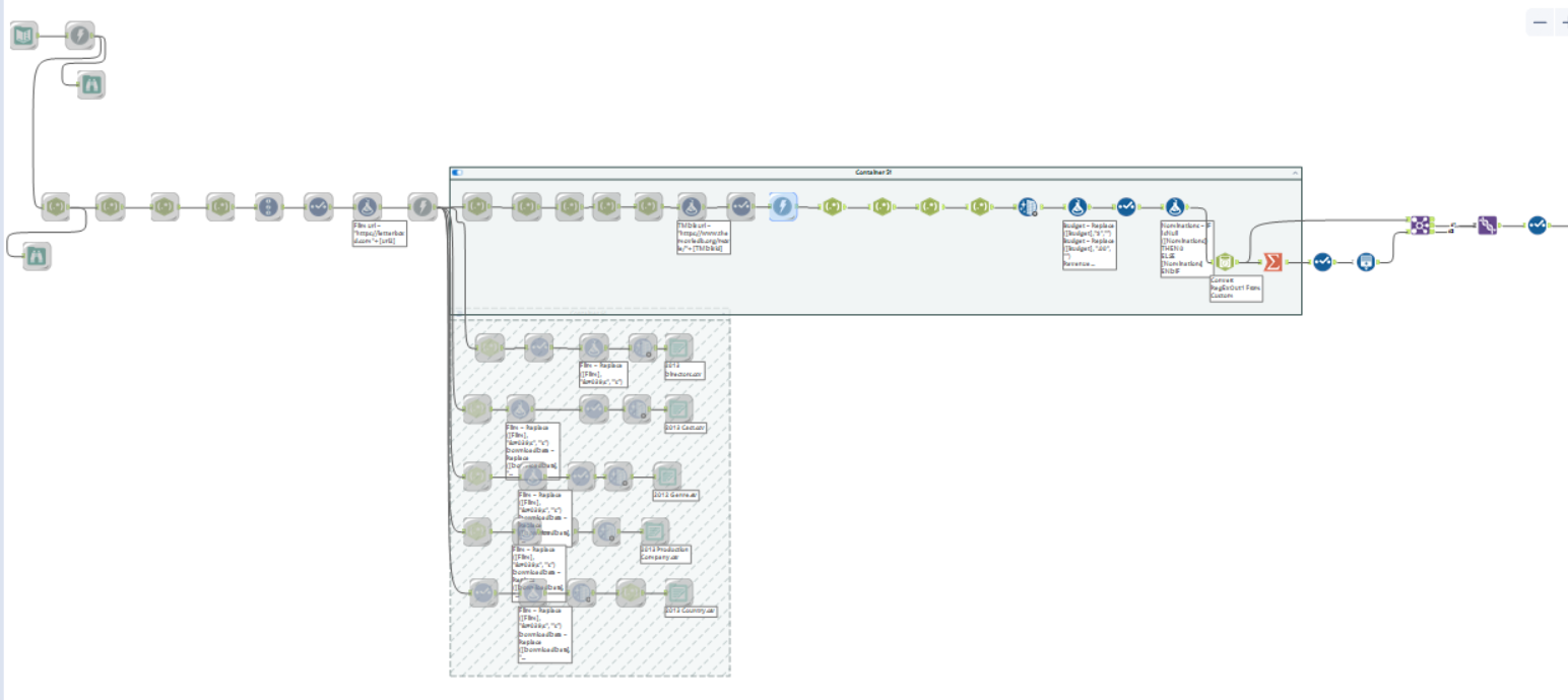
Following that single step I've built the below flow, with a Download tool whenever I wanted to bring data from a different page and RegEx to parse or tokenize the data that will make up the different fields I needed. The process is quite repetitive after that and you can compose the next URL you want to webscrape with a Formula tool. Once I was happy with the output using the current list I then used the same workflow but changed the input text and the output files to get more data from 2013.
I also thought it was a good idea to have lookup tables apart from my main facts table (at the top) as otherwise if I had all the data in one table this would result in a massive dataset that could negatively impact Tableau's performance.
Connecting the Data Source to Tableau Desktop
In Tableau, I merged the 2026 and 2013 with a Union inside the physical model and then in the logical model I used relationships to connect the rest of the tables.
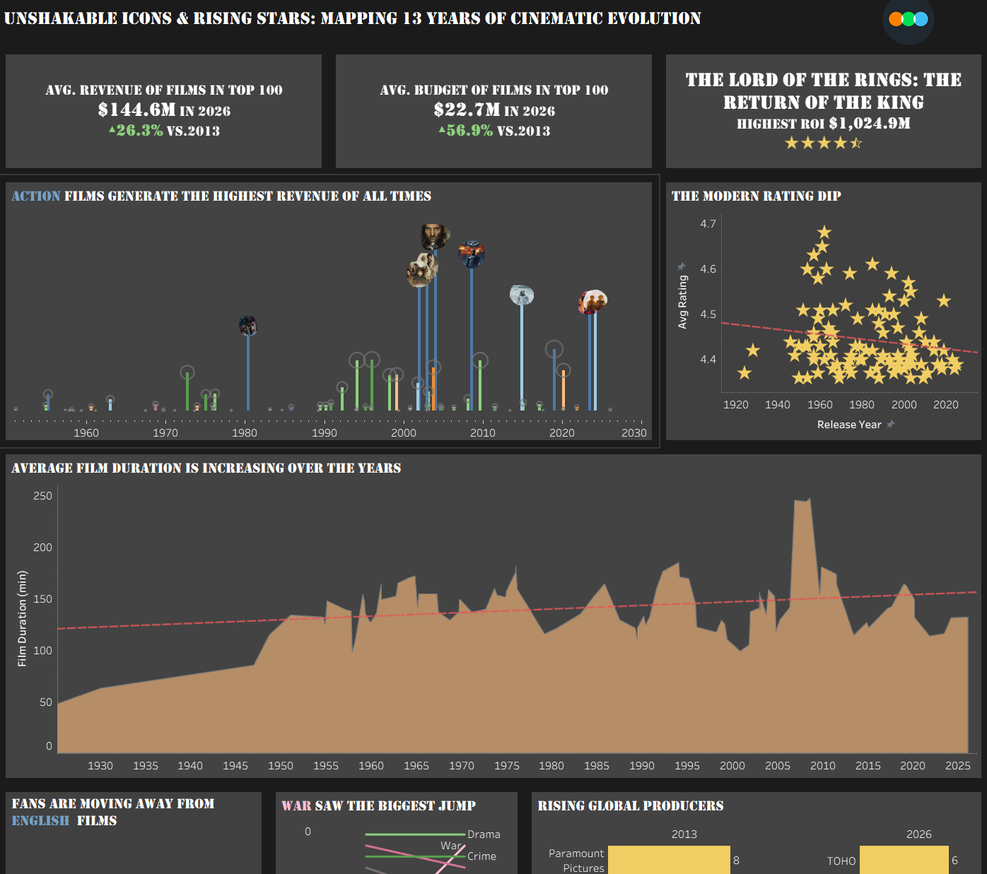
Final Dashboard
Challenges
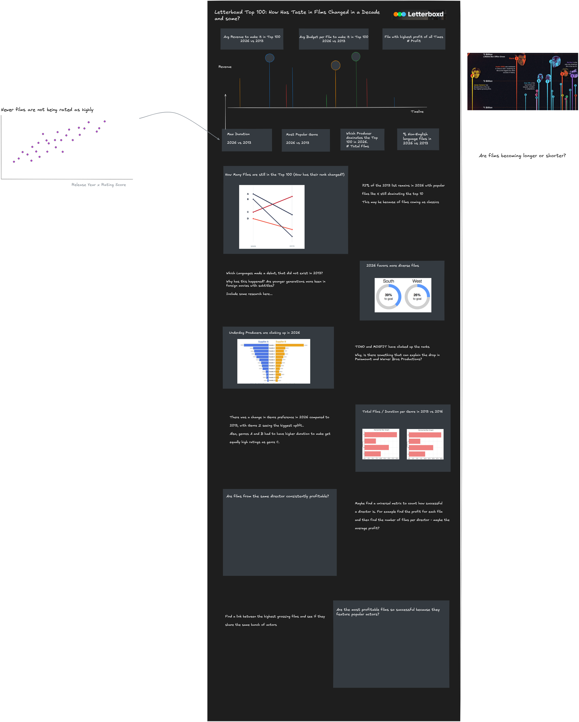
The biggest challenge for this project was planning! I spent most of my time ensuring the data was as complete as it could get which resulted in getting the data in Tableau around 3pm of the first day. I also managed to do a quick sketch of how I wanted my dashboard to look like which I was then having second thoughts about as I wasn't sure if it was infographic enough. However, on the final day I decided not to stick to the sketch but use the sketched charts in a different layout than I originally I had planned. Lesson learned though, planning is very important even if you think you don't have the time to plan..
Feedback
The feedback I received was to include a color legend and minimise the use of color to keep things more organised. More key suggestions were to ensure that the title is reflected throughout the dashboard with charts that reinforce the key takeaway, and to include some form of interactivity such as parameters and filters to allow the users to explore the insights themselves.
Personal Reflections
I think personally I wanted to do more for the grand finale as Lorna put it. But I think the win for me happened in Alteryx, where I finally understood how websrapping works. Now I feel more confident to use those tools to get data that doesn't exist in a dataset already and know how to configure those tools to get to the desired output!