I wrote this post while listening to this song. Hit the play button and enjoy!
You are going to see how to map an image background in 5 steps in Tableau.
Some weeks ago, I was given a dataset about board games to create a visualization within 3 hours. I wanted to create a different way to see the data, so instead of using charts, I decided to use an image of a board game I made.
At first, I thought it was a good idea, but then I realized I didn't know how to add points, tooltips, etc to the image background, so I asked for help to Juliana and she taught me how to map a background image in Tableau. As I think this is a cool resource to create unique vizzes, I decided to share how to do it in this post.
Due to the way maps function in Tableau, as long as you know the coordinates of a point on the vertical Y-axis and horizontal X-axis, you can map anything you would like! This provides some unique possibilities. So let’s build one of these. For this tutorial, I will use this image I created for the dashboard about board games.
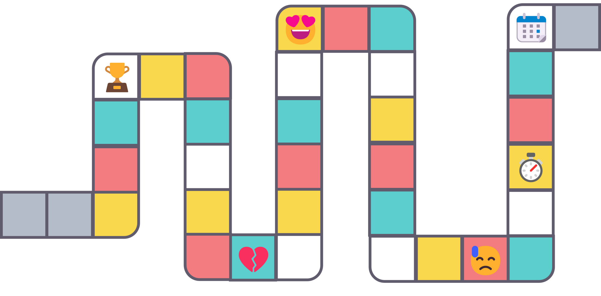
I want to create a point for each square with an emoji, so I can use the tooltip to add more details. To create this visualization we need to plot 6 points.
Step 1. Create a dataset with the X and Y coordinates
We need to create a dataset that has at least three fields: (1) Each point you want to plot (in our case it’s emoji position), (2) X Position, and (3) Y Position.
For the first row, just put an arbitrary name in the cell for the point you want to plot, such as “Background”. The X value will be the width of the image, and the Y value will be the height of the image, in my case the image is 4400 x 2172 pixels. At this point, my dataset looks like this:
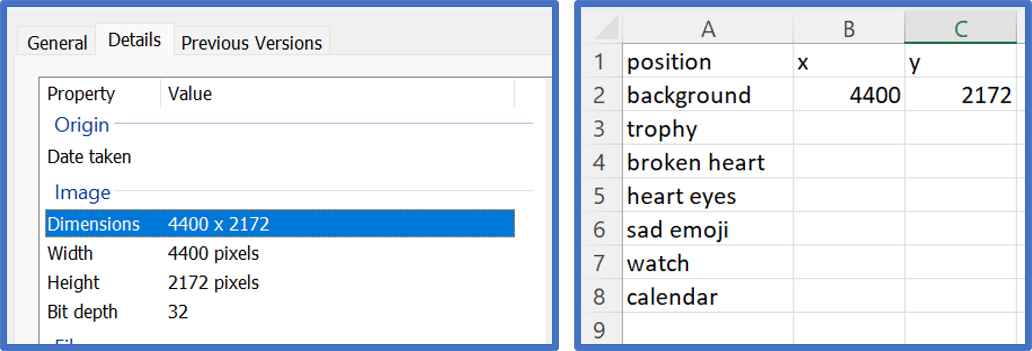
Step 2. Adding a background image
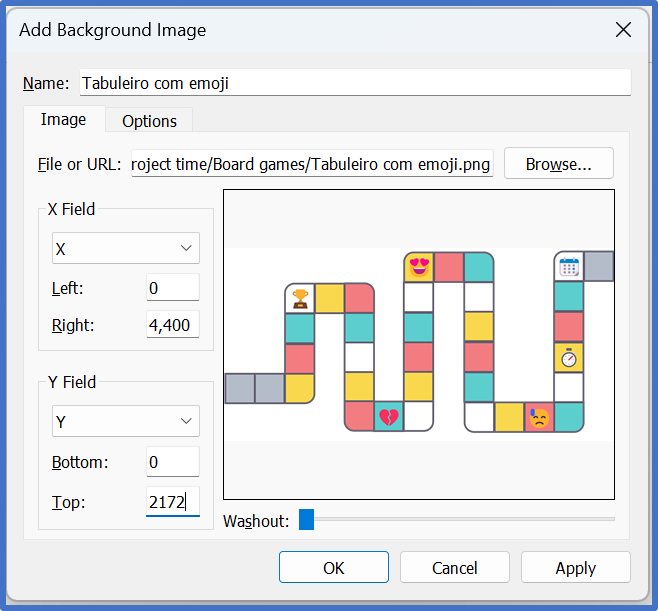
Start a new workbook in Tableau and connect to the data from the previous step. Navigate to Map > Background Images, and click on the data source. This will open a new dialog box where you can choose Add Image... in the lower-left corner. This is where you can choose which image will act as the background.
All that is left in this step is to put the maximum value for the X and Y coordinates. If our image is 4400 wide by 2172 high, we would make the following entries:
X Position: 0 Left, 4400 Right
Y Position: 0 Bottom, 2172 Top
Also be sure to change the “Y Field” from “X” to “Y”. At this point, your screen should look like this:
Step 3. Looking up X and Y coordinates
Start your new custom map by placing the X measure on Columns Shelf and the Y measure on the Rows Shelf. Ensure both axes are fixed at the maximum X and Y values. If you need to change an axis, simply right click on the axis, choose “Edit Axis”.
In order to look up the X and Y coordinates for each position, right-click on the view, hover over “Annotate”, and click “Point”. If the X and Y measures are the only fields on your view, the annotation will show you the X and Y values by default. This is what we want, but you may want to make the font larger so that it’s easier to read.
Now drag the end point of the annotation to each location you want to plot, and see how the X and Y values change. For best results, format the annotation so the line end is a circle; this way you can precisely drag the circle to the exact location you want plotted. Here is one example showing the coordinates for the trophy:
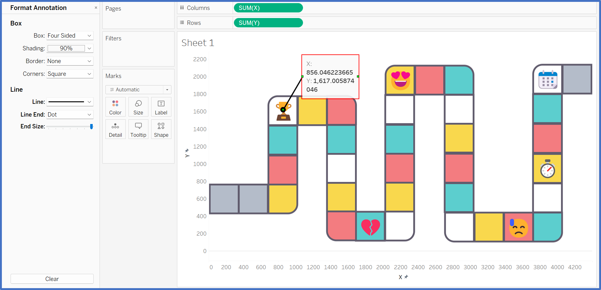
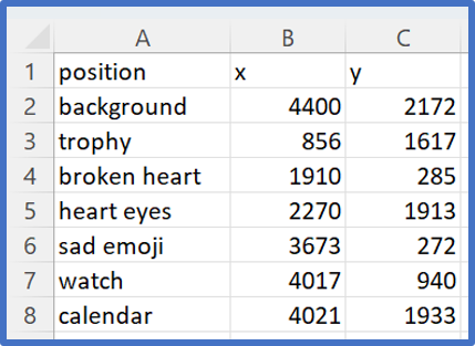
Drag the annotation to each point you want to plot and record the coordinates in your dataset. Note that you don’t need to record the decimals. Here is a look at my data with the X and Y coordinates for each player position:
Step 4. Refresh your map
After all coordinates have been recorded in your dataset, save your data and refresh the data source in Tableau.
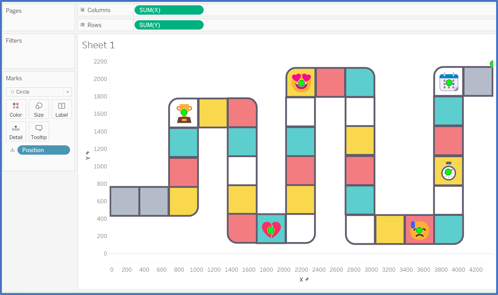
Drag the field you are plotting, to the Detail Marks Card. You should now see a circle at each position, like this:
Step 5. Finalizing the custom view
There are a few items you can do to finalize your custom Tableau map:
- Hide the axes by right-clicking on each one and deselecting “Show Header”.
- Format your marks;
- Filter out the “Lookup” X and Y coordinates. You will notice a mark in the upper-right corner of your new custom map. You can filter this out by either right-clicking on it and choosing “Exclude”.
- Optional: You can now add measures to your underlying data for each position to visualize different metrics on your customized view.
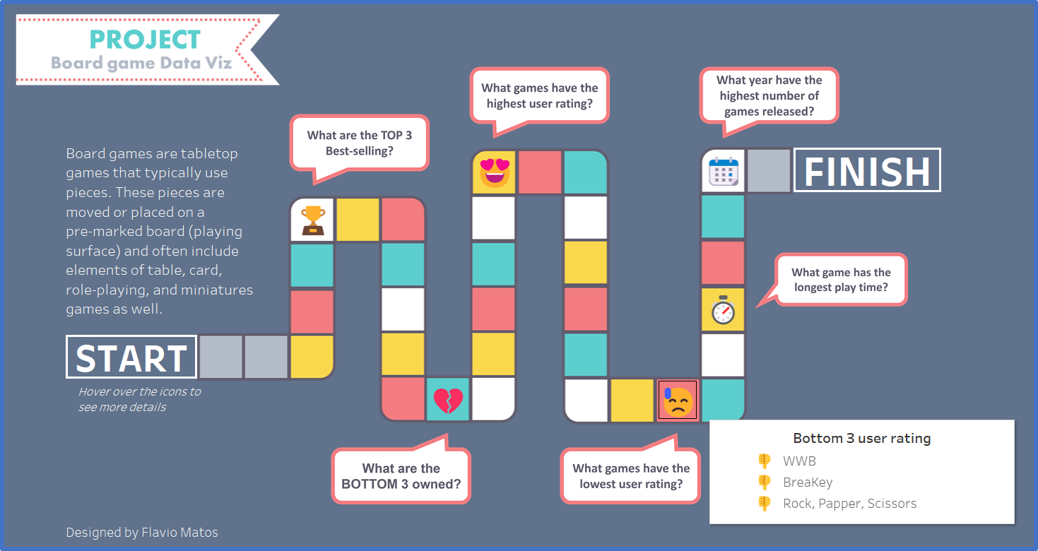
In my case I don't want to show the points as I will use only the tooltip, so I changed the shape to Square and reduced the opacity to 0%.
The final dashboard looks like this:
Now it's your turn to map an image background and If you have any question, just drop me a message!
- For more tips follow me on LinkedIn and Twitter.
- You can check out my portfolio on Tableau Public.
